Following the first class, I started reading Rick Rubin, the highly successful music producer (see below), whose work I had read about but never read myself. I also bought and read a couple of others writing in the same mode as Rubin, although with not quite such a comprehensive approach.
- Rubin, R (2023) The Creative Act: A Way of Being Canongate
- Saltz, J (2020) How to be an Artist Hachette
- Kleon, A (2012) Steal Like and Artist Workman
I decided these three would be my core reading for the remainder of the year and had some initial thoughts:
- Process/concept – which comes first? How to tell them apart/how to proceed creatively if the intended outcome has already been (prematurely?) selected?
- Raises question – does a project that is planned in advance and executed exactly as first intended (eg making a birthday card) count as art or is it ‘merely’ a mechanical act, however skilled it may be?
Various quotes from Rick Rubin help raise questions about the creative process: see Rubin, R (2023) The Creative Act: A Way of Being Canongate.
“In th[e experimental] phase, we are not looking at which iteration progresses the quickest or furthest, but which holds the most promise. We focus on the flourishing and wait to prune.”supra p 50
“A practice is the embodiment of an approach to a concept.” supra p 43
“All art is a work in progress.” supra p 78
“Art made accidentally has no more or less weight than art created through sweat and struggle.” supra p 300
“Do not let the scale of your imagination get in the way of executing a more practical version of your project.” supra (p 173)
“The work is done when you feel it is.” supra p 194
Introductory work
At this point, I had no real idea of what I would do for the project but decided to trust to the process and see what caught my eye and just go where it might lead except to be fairly clear that I would be worked in 2D and in sort of a combination of media (ink, graphite, charcoal, paint, digital, printmaking).
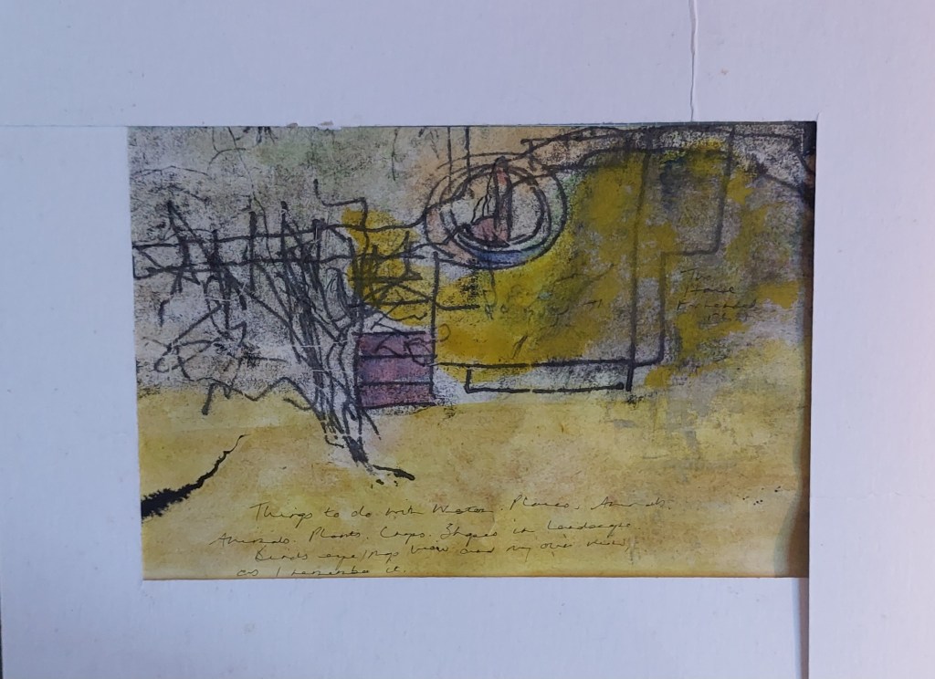
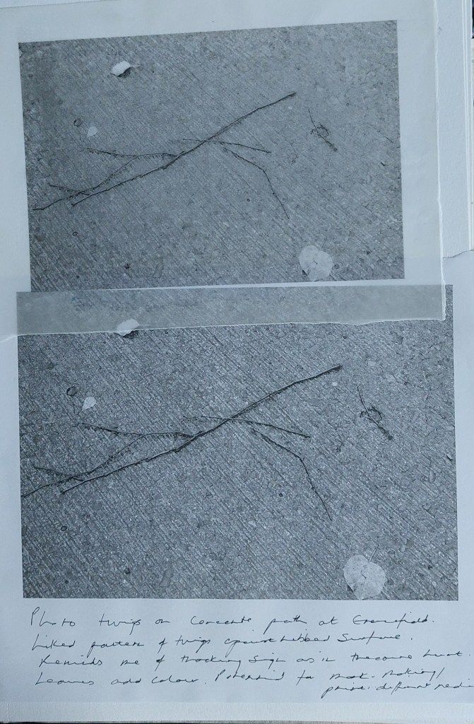
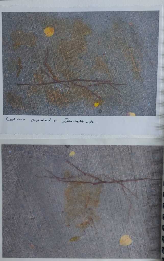
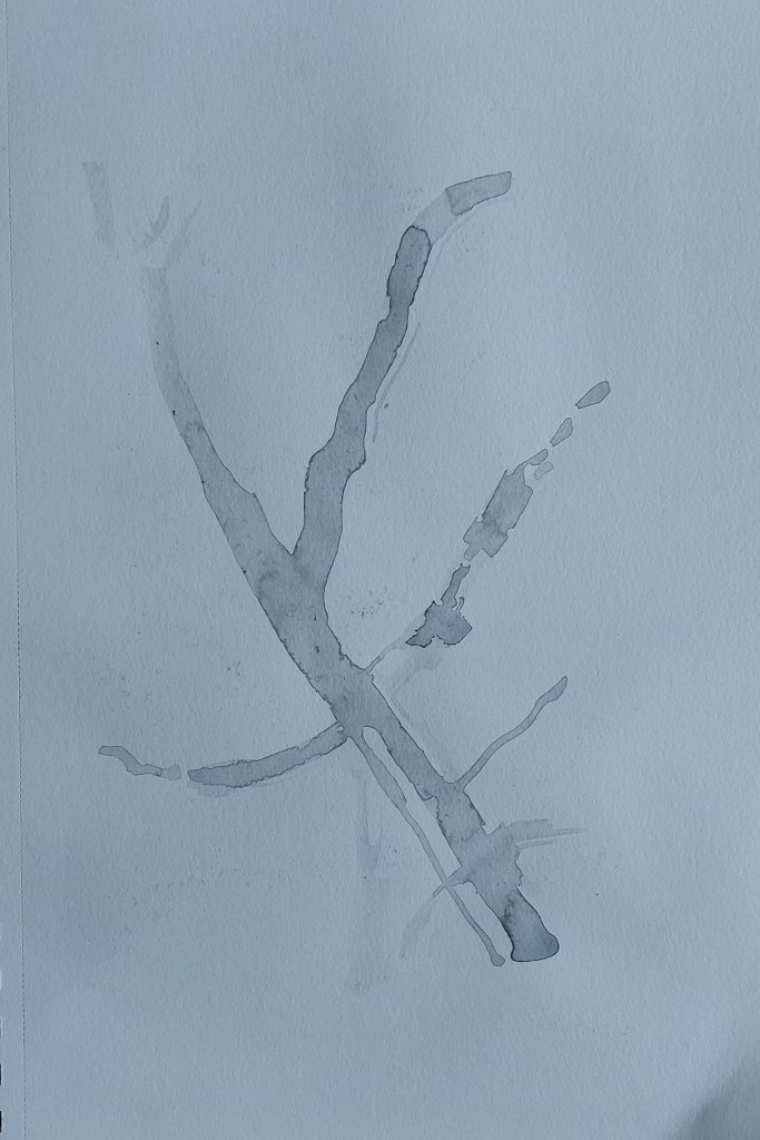
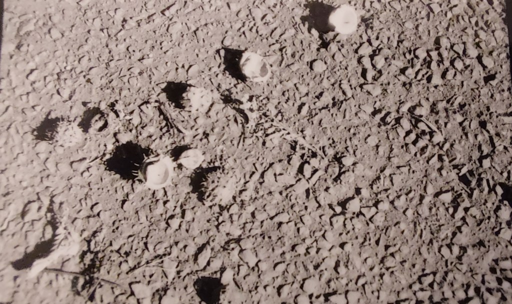
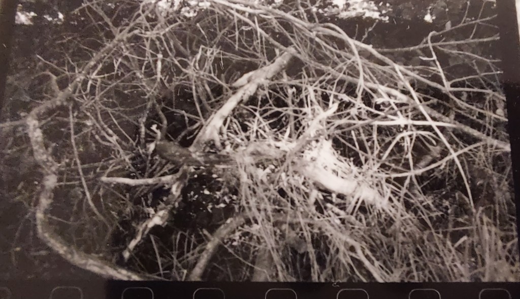
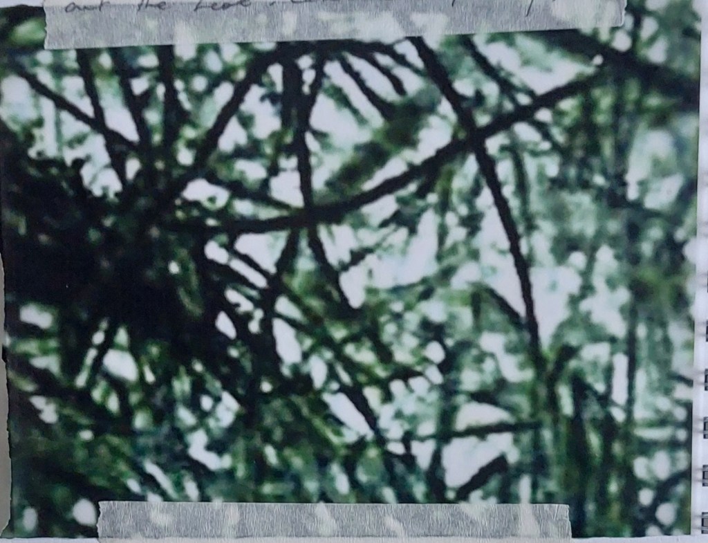
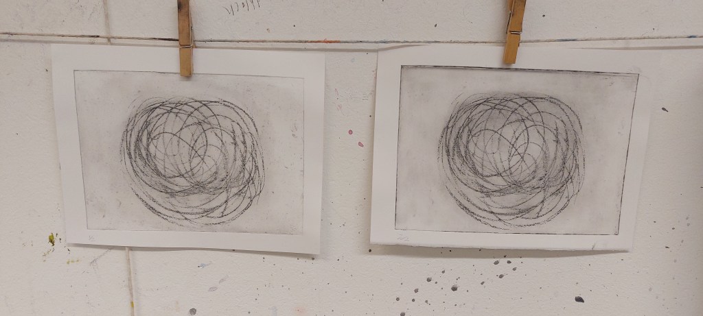
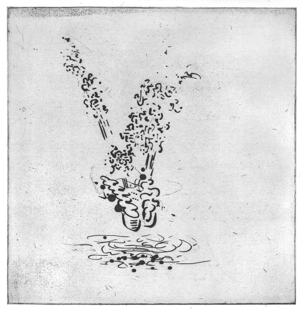
The diagonal lines of sticks lying on the scored concrete ground outside Gracefield Arts Centre on 11.9.25 caught my eye. Took a snap on my phone and went back the following day with my Fujifilm camera. The leaves stood out as splashes of bright yellow but my printer refused to print in colour. Then I experimented using Sketchbook app to add colour to the composition.
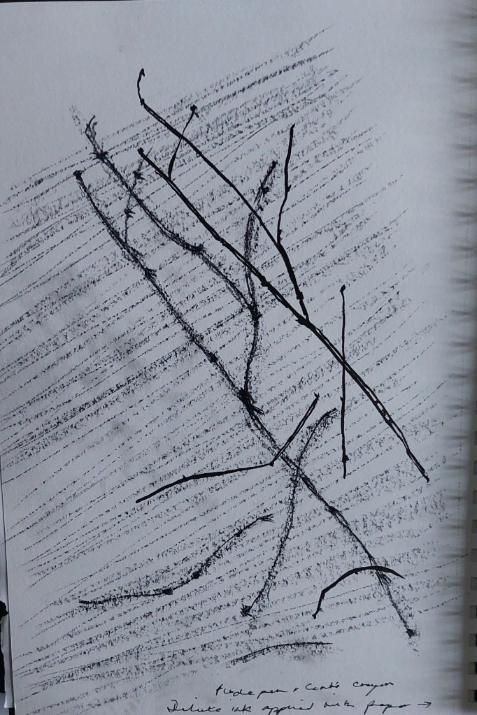
I then did a couple of sketches to think more about the composition and how it might be developed, using charcoal and ink.
On 22.9.25 I used an analog camera belonging to the tutor and went out to shoot photos around the Crichton campus in black and white. We were then shown how to develop and negatives and left them to dry until the next week.
On 29.9.25 we developed the negatives into contact sheets and printed off one image in A5 format. I can’t describe the technical process in any detail and there wasn’t the opportunity to take any notes.
To help me choose which of the 36 images to print, I took phone photos of the contact sheets so that I could enlarge them to see better, as even though the eye glass was helpful I wanted to see the whole image at the same time. I selected a few to consider.
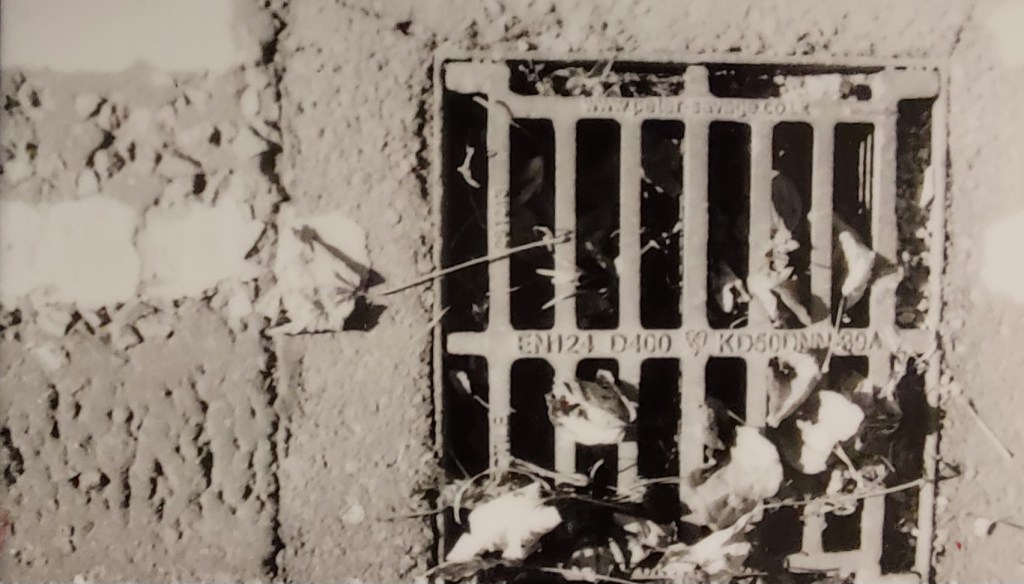
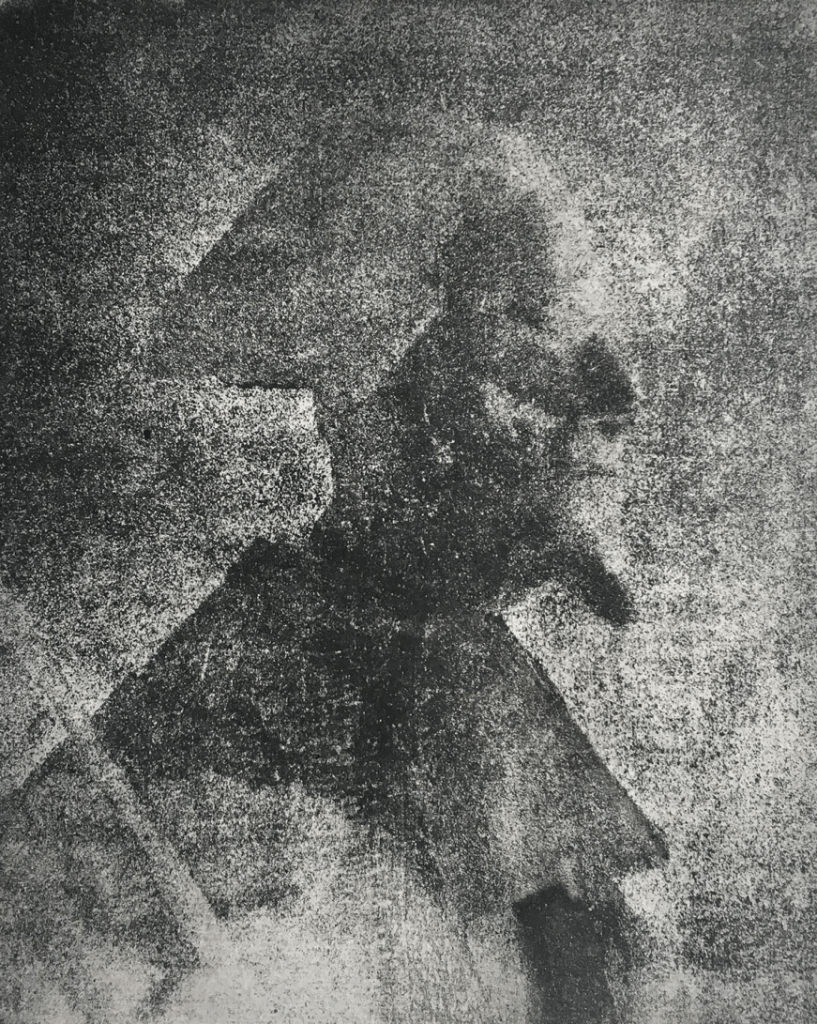
I chose the one below to print because of the high contrast and the potential for abstraction from it.
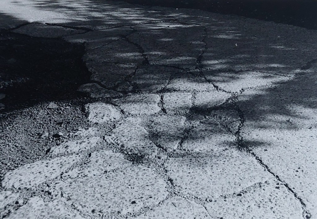
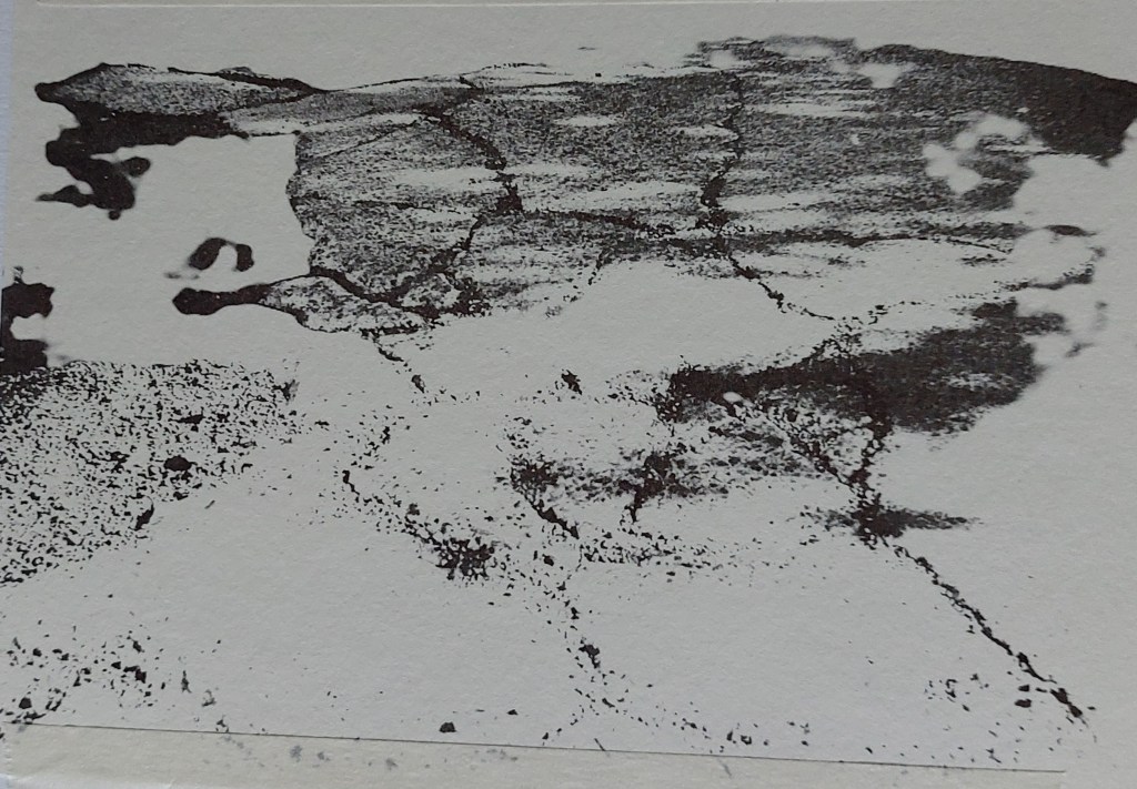
This was the second print – the correct contrast and definition was achieved by the expertise of the tutor and him understanding why I had selected the image. Otherwise, it would have been completely beyond me technically.
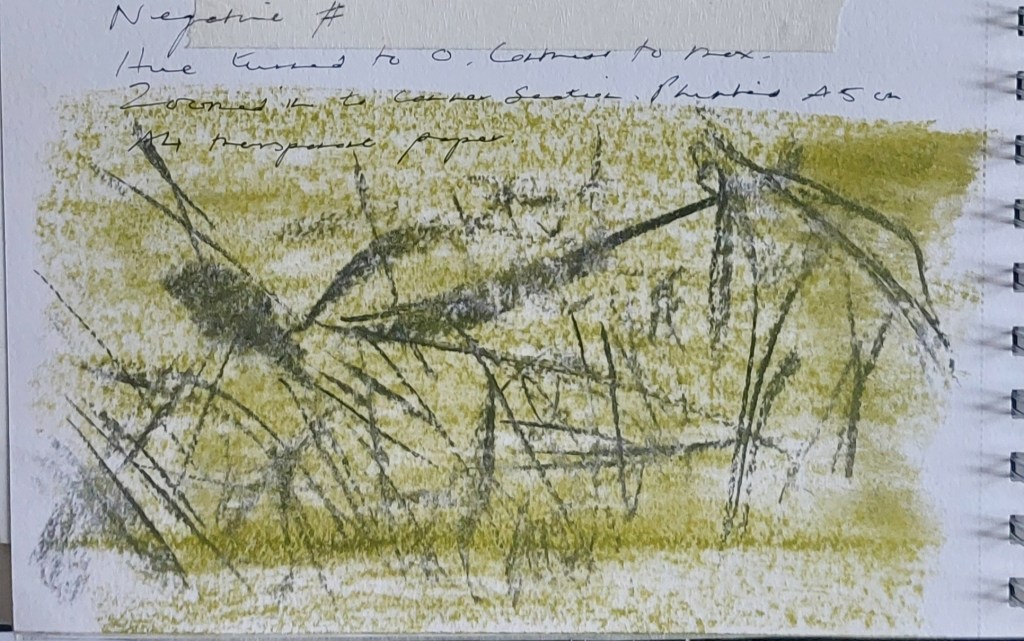
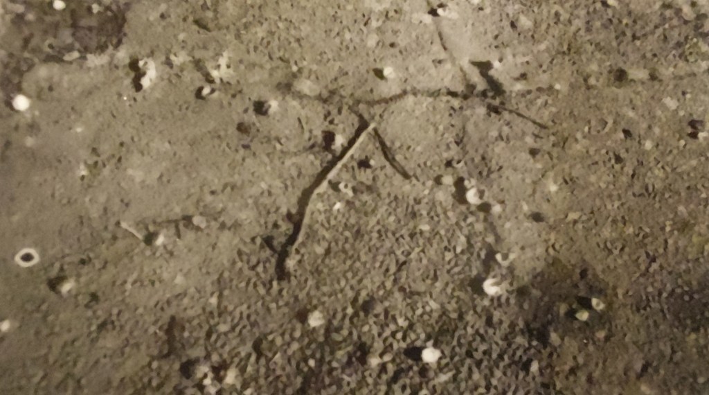
Later in the day I played about with transforming the print into negative shapes by photographing and manipulating it on my phone.
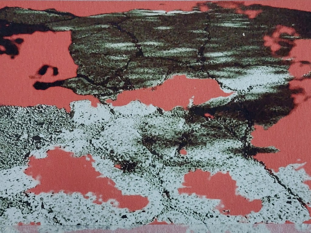
I cropped the photo of one of the images on the contact sheet and manipulated the hue to give a cool green tinge to it.
I then made a quick sketch with charcoal and coloured graphite

At a privately arranged workshop held outwith the campus on 3 October, I carried out some work on composition in a variety of media.
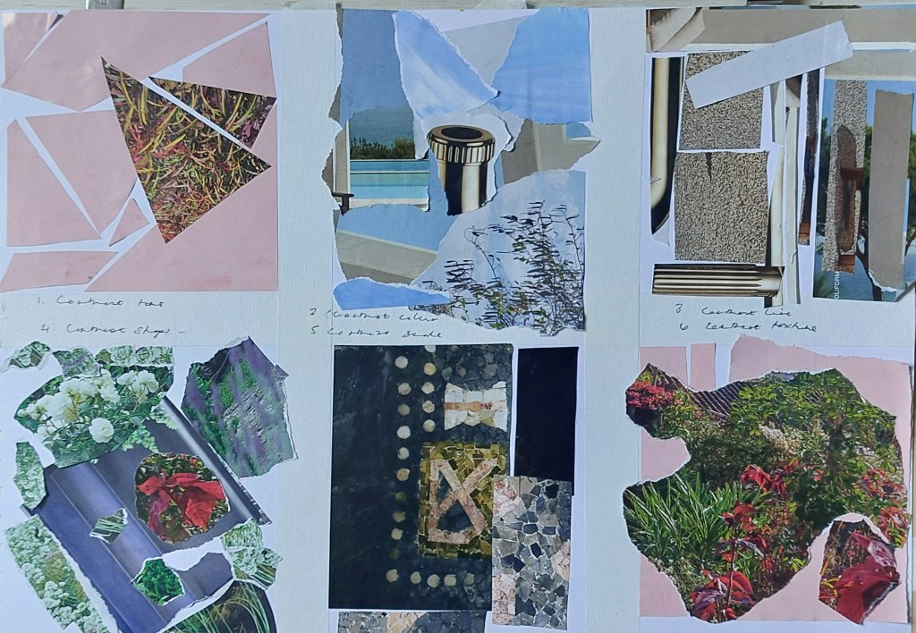
Different compositional formats in collaged sheets torn from World of Interiors. Top row (left to right): tonal contrast, tonal contrast, linear contrast. Bottom row (left to right): contrasting shapes, contrasting scale, contrasting texture.
Watercolour wash with ink creating variation on rule of thirds
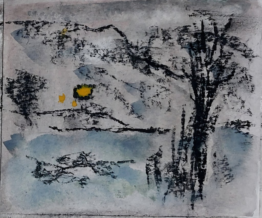
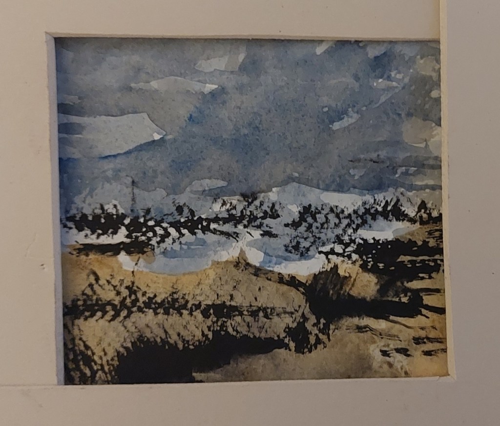
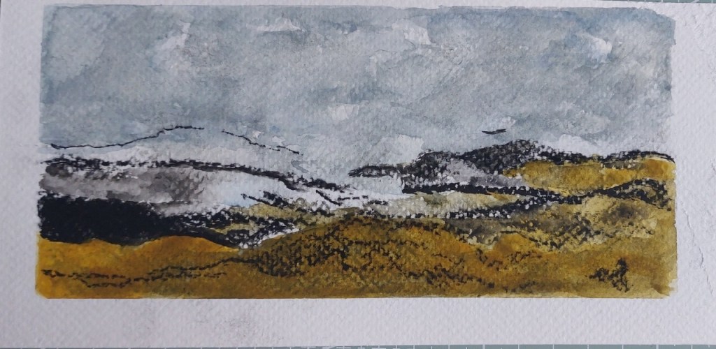
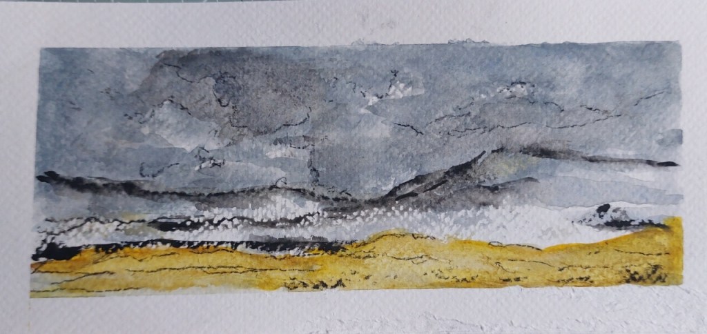
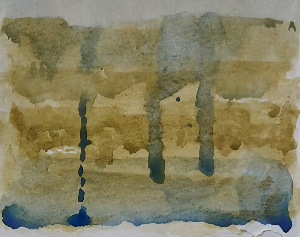
Experimenting with pastel and watercolour landscapes with strong lines
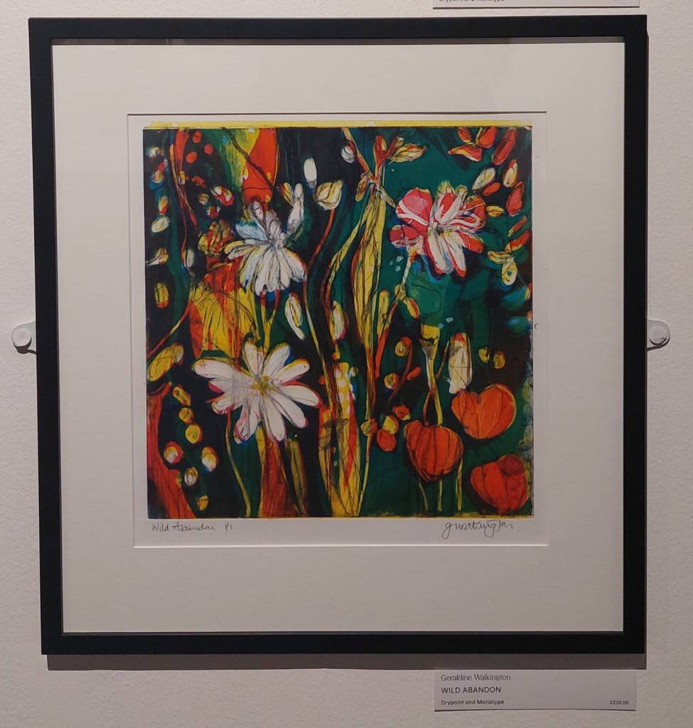
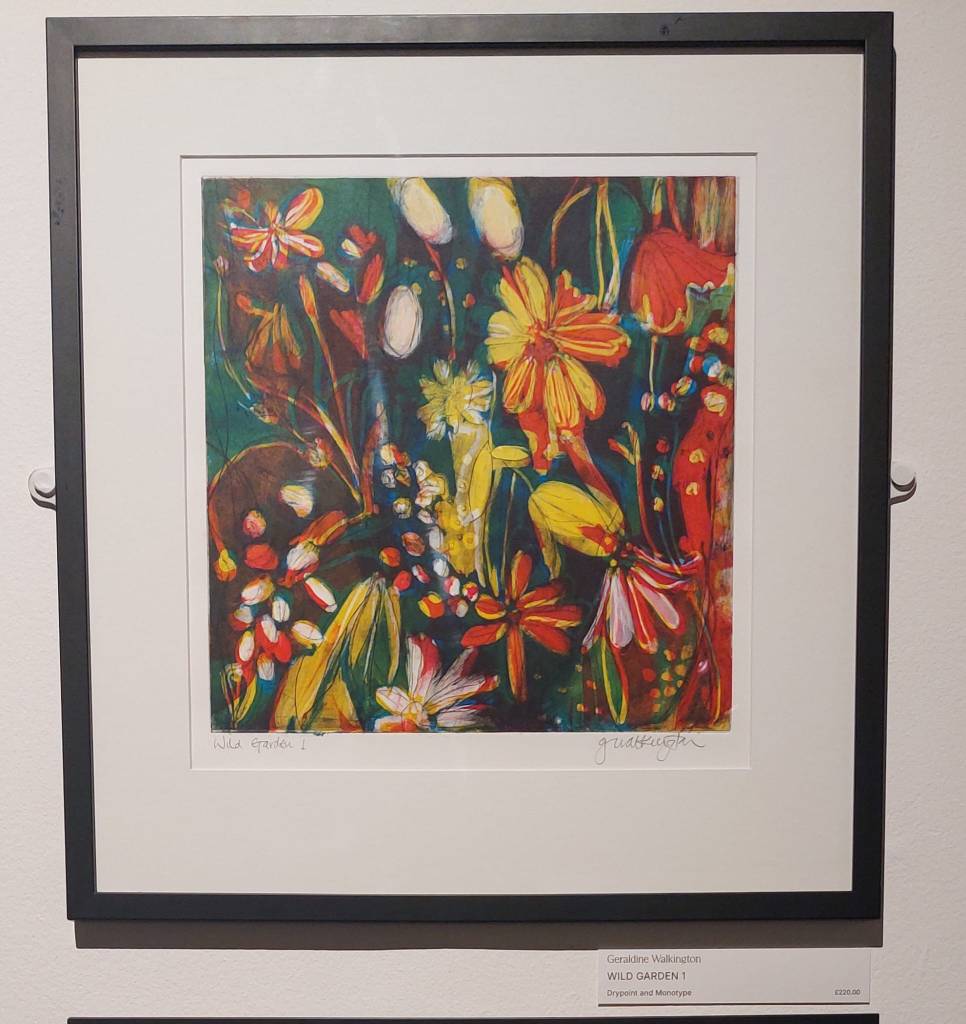
I then began thinking of how interested I was in printmaking (one of my final pieces for the HNC was a screenprint on fabric finished with hand embroidery). An exhibition at Rheged had re-inspired me with some amazing images in a wide variety of print techniques. For example: etching, monotype, carborundum. The following are some images I took at the exhibition to remind myself of the amazing range.

I went to another exhibition at Rheged and saw several prints included in it. One artist stuck out for the combination of monoprint overlaid with drypoint etching.
I became interested in making images using monotype techniques and decided to learn something about it.
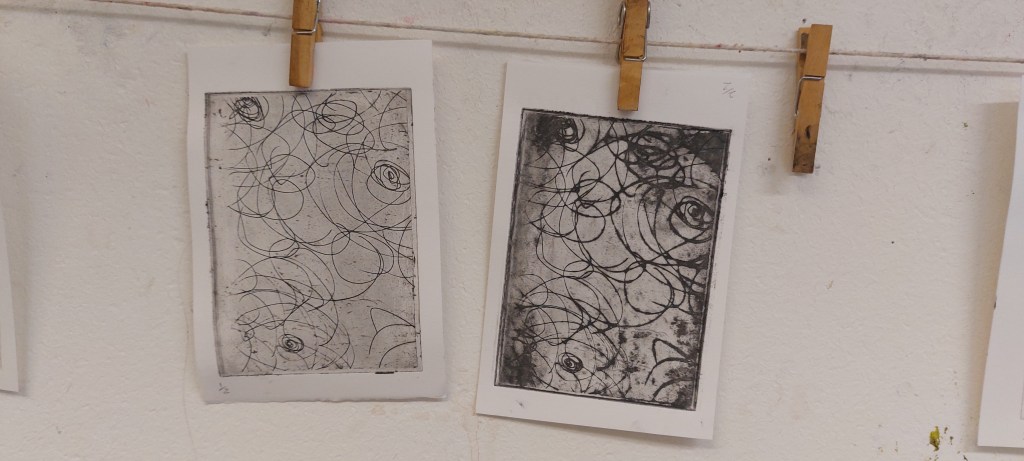
I did some experiments with monoprinting.
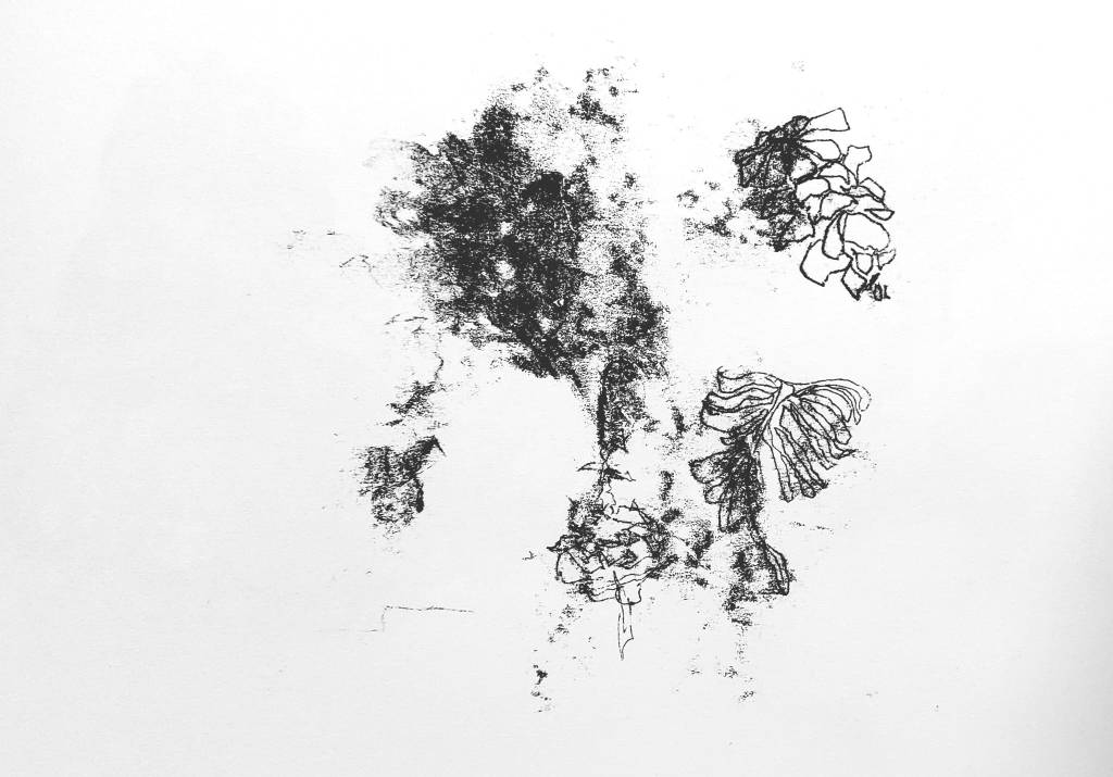
I didn’t get any further with monoprinting as I decided to focus on learning more technical methods before in order to help broaden my skils and help inform the future direction of work towards a final piece.
I was interested to see what would happen making loose, semi-abstract drawings with a view to trying out different printing techniques to see what worked best for particular images and particular drawing media and which was the most useable. I also realised it will take considerable time to try different methods at the same time as thinking about what sort of images and what sort of styles I would want to develop going forward. This means that it is unlikely to be until well after Christmas that I get to the point of resoving what a final piece might look like. In the meantime, I will continue with learning and developing skills while thinking about this.
Solar plate etching
Having attended a workshop on solar plate etching a couple of years ago, I decided in the meantime to purchase some solar plates, on the basis that after drypoint, this is the most straightforward way of transferring images for intaglio printing. I didn’t feel confident about using the UV machine so, with the help of the tutor, I exposed them in the UV machine to etch the plates. I then inked them up and printed them on 3 November. Unfortunately, I discovered problems with the plates.
I had gone to Gracefield Arts Centre a few days before to cut the plate from A4 into 1 x A5 and 2 x A6. Unfortunately, I had not cut a solar plate before and it turned out I had made the cut too slowly so that the A6 plate was slightly curled up on the cut edge. In addition, the plate was not hardened sufficiently. This meant that one long edge did not print. The first print was not too bad and could have been cropped. On the second attempt, I wiped the plate less to darken the image but the ink stuck to the insufficently unhardened edge of the plate on second print. I then found I could not properly clean the plate.
The A5 plate was over-exposed, at 70 seconds instead of 10 (as the test plate had been inserted the wrong way round). The drawing did not etch deep enough into the plate so that regardless of any printing techniques such as inking and wiping, the image was not clear and would never print dark enough. I decided to purchase new plates and re-etch at a later date.
In the meantime, I thought it would be interesting to digitise one of the images and see how it would be with colour added. In the absence of a useable plate to experiment with colour on an infinite number of possible printings it made sense to try this out digitially as a preliminary step to printing with different coloured inks and/or hand colouring after printing
Ther results surprised me. I had not at all been thinking of Art Nouveau far less the Glasgow Style version of it in the work of Margaret Macdonald when I began either the drawing, the printing or the digital manipulation but this was what it turned out to remind me of (maybe being Glasgow born and bred was an unconscious factor here!).
Margaret Macdonald, The Heart of the Rose, 1902
Zinc etching
Following my attendance at the Gracefield course, I decided to try making a zinc etching myself. I used a drawing I had done previously for screenprinting and edited it to make sure it would fit the smaller plate. If it is successful, I could etch a bigger A5 plate with the whole design in the coming weeks.
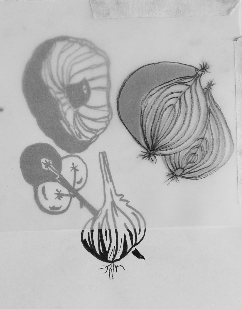
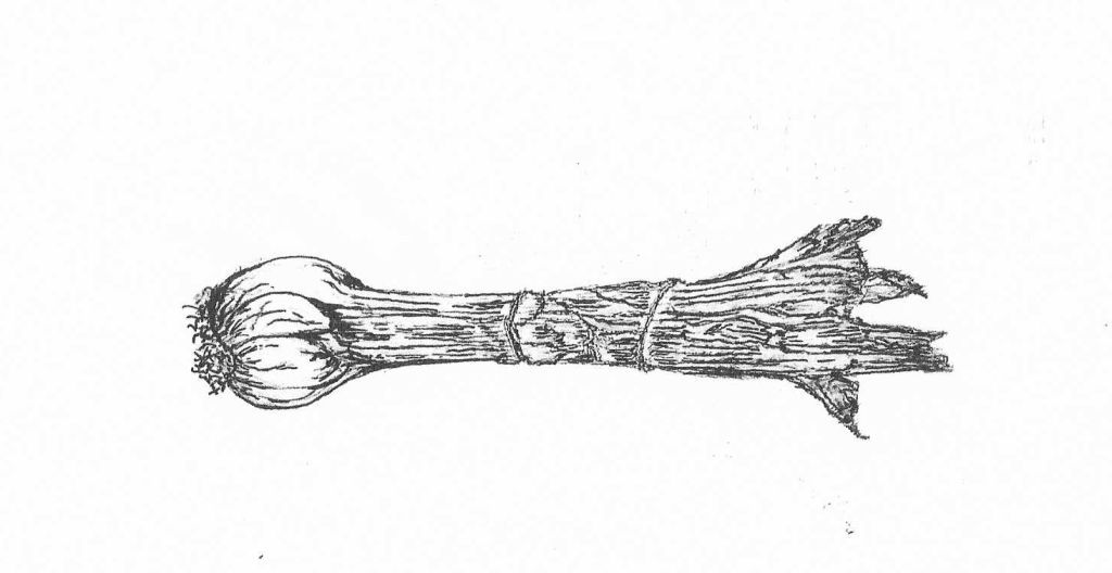
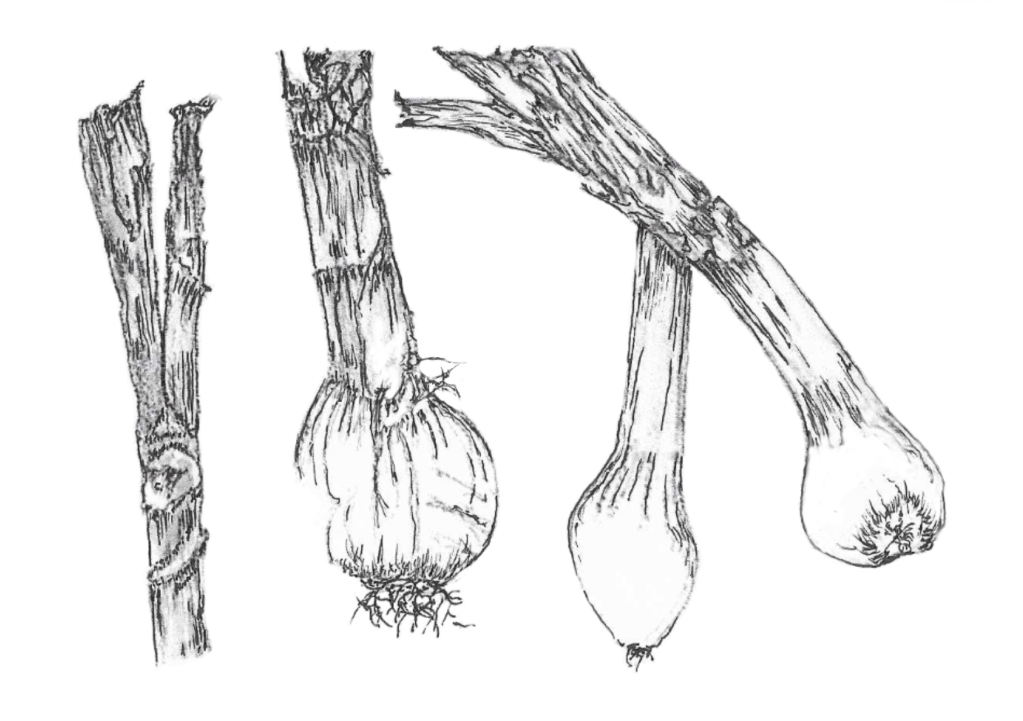
Drawings for zinc etching
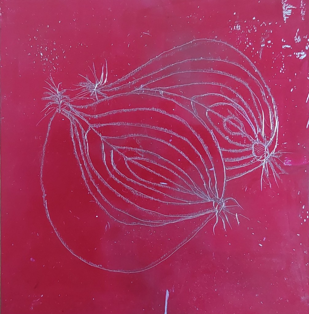
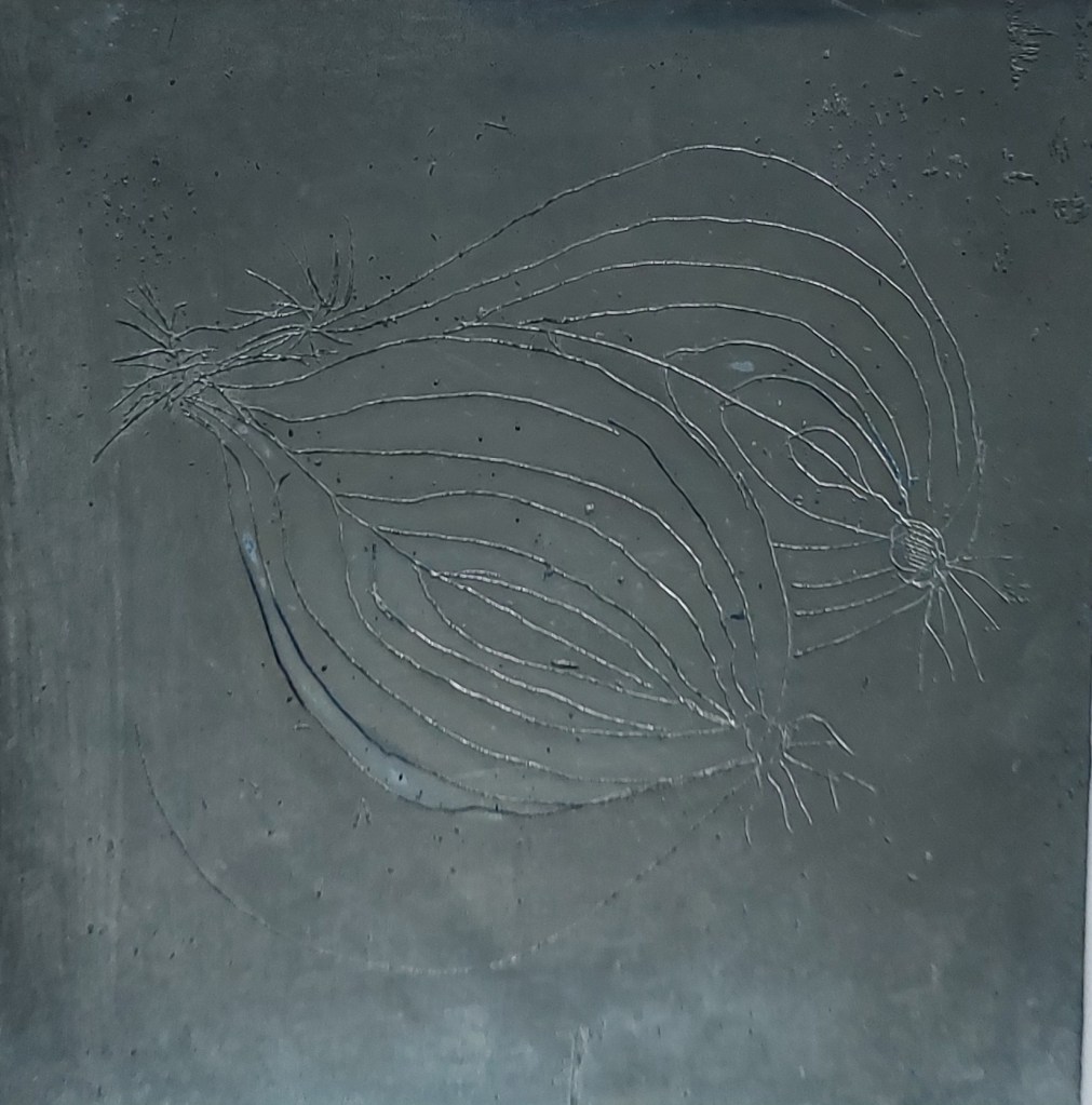
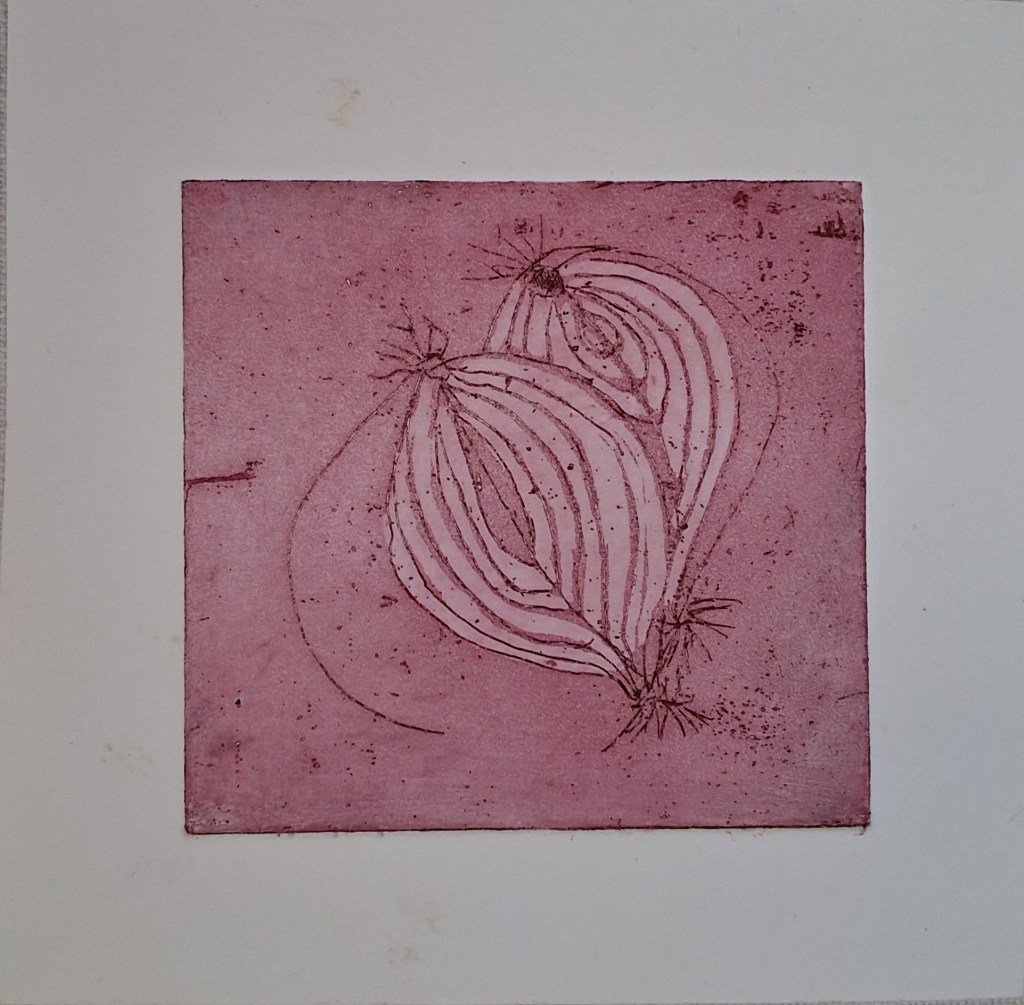
Zinc plate drawn on etching ground (top), plates after etching and aquatint (middle) and print in oil based Intaglio printing ink in Raspberry Red.
Several problems/flaws with the plate and subsequent print became very clear.
- Because of the difficulties baking the BIG ground and the fact that I scratched it in the process of moving it from the hotplate, this meant bubbles and a deep scratch appeared on the etched plate (as not protected by the resist)
- I used transfer paper to transer the drawing to the prepared plate and then drew over the marks with the etching needle. Because the light was poor and the fact that I hadn’t done this before meant I wasn’t alert to what could go wrong, One thing that was a difficulty was that the etching needle was much finer than the transfer, even though I have a double ended needle and had used the widest one. This meant I had to make instant decision about where on the thicker line the needle would go.
- The quality of the actual drawing with the etching needle is very poot. The lines are not as fluent as they would be with more practice because I was afraid of the needle slipping and found it unsettling to have to move the needle through the ground rather than making direct contact with the plate – it was a bit like walking through mud. Apart from the wobbly lines, an even bigger issue was that I pressed too lightly on the bottom curve of the onion – it came out on the drawn plate but failed to etch deeply enough to come out in the print. In time, I would hope that practice will make perfect
- The use of aquatint is poor. I think I should have stopped out the entire plate apart from the base of the onion for the first etch as this had been intended to be the darkest part of the image (as per the initial drawing). I only added stop out once and etched with aquatint only twice – I think it should have been etched at least three times and for a total of at least three minutes.
However, overall this was an excellent learning experience and I feel fully confident to repeat the process again.
Solar plate etching

Drawing for solar plate etching. The original drawing was in ink and watercolour. I digitised it to remove the colourand, copied onto acetate and went over some of the lines directly onto the acetate with a fineliner pen. This made me realise that I could draw the whole image directly onto acetate another time and I will also experiment with using this method of transferring onto the solar plate entirely. It also allowed the opportunity to try out the aquatint screen as part of the process of experimentation.
I first made a test plate. After marking the back of the test plate for both acquatint and the artwork. After doing the test, the test plate was exposed to the aquatint screen for 20 seconds and then to the artwork for 20 seconds. The plate was developed for around two minutes at 25 degrees then rinsed and dried. It looked obvious that the plate had not worked as expected. The top part of the leave looked blurry and felt very slightly sticky and it was difficult to make out the root at all. It was decided that the only way to see properly was to ink it up and print it.

Despite making careful test strips, the result was worse than the previous attempts as only a partial image emerged and the aquatint was too strong, perhaps obscuring some of it. There were also issues with development/hardening as when I printed the test strip, part of it stuck to the paper.
While the unintended result is not unpleasing, it is not what was intended – one of the advantages of the solar plate method is that it can be controlled more effectively than metal plate etching but this depends on becoming more skilled and knowledgable about the process. I recorded carefully each step taken and considered where mistakes could have been made so I could try to rectify them the next time.
I then had another attempt at producing a useable plate and this was more successful. The main difference was not making the exposure in 5 second increments but making the full 15 second exposure at once. However, I forgot to give the plate a final rinse after development and I wondered if this was the reason that some smudgy marks appeared on bottom left of the print.
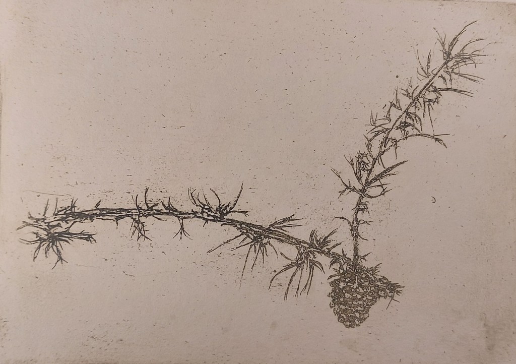
A6 solar print in sepia
I prepared another drawing onto acetate in the same way as the previous (unsuccusful) print of a single spring onion to make an A5 plate for printing using the same method as for the pine cone above.
Overall, I feel my research into printmaking and printmaking methods is the direction I want to take in the next part of the course. I intend to experiment with litho printing on both metal and polyester plates. This method is simpler than traditional stone lithography and I have done some initial research into how to do it.
I have thought carefully about why I have chosen this particular medium and have concluded that the printmaking process appeals to me because:
- It requires a high degree of attention to detail
- It gives the opportunity to develop new technical skills
- It combines technical skills and creativity
- It is traditionally a medium for highly figurative work (eg Durer) but also has the scope for abstract development (eg Baselitz, Richter)
- It is unforgiving of mistakes – the lack of scope for correction means a total commitment to the risk of failing to realise intention
I will use the time over the Christmas break to reflect more on possible subjects for the work but I am already clear that in the next trimester, my main focus will be on producing a set of prints with a degree of relative competence that I would not be ashamed to exhibit using at least two intaglio printmaking processes.
A few of the artists who have inspired include the following:
David Mach (2017) The Artist’s Loop, etching
Peter Freeth (2010) Prospero, aquatint
Jason Hicklin (2017) Tolsta Head, aquatint
Norman Ackroyd, Cartmel Fell (1996) etching and aquatint
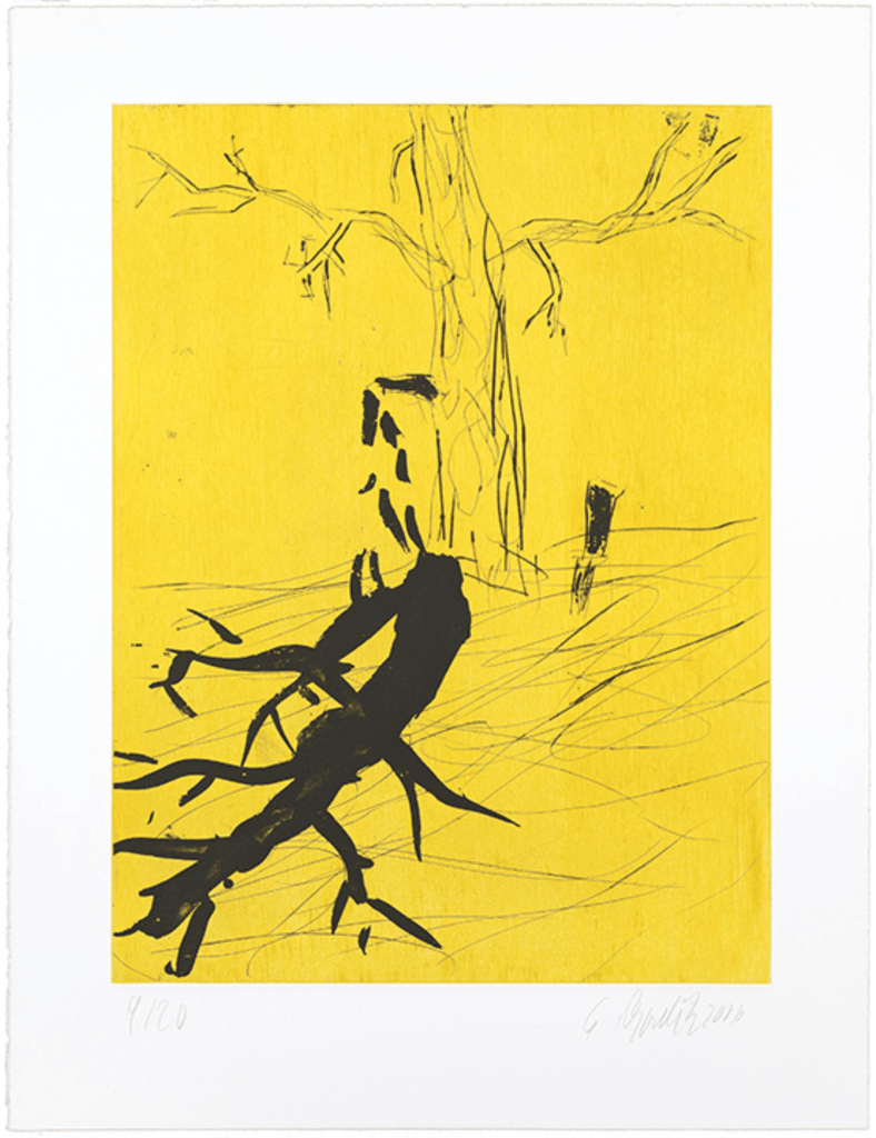
George Baselitz (2006) Der Baum etching
Semester 2
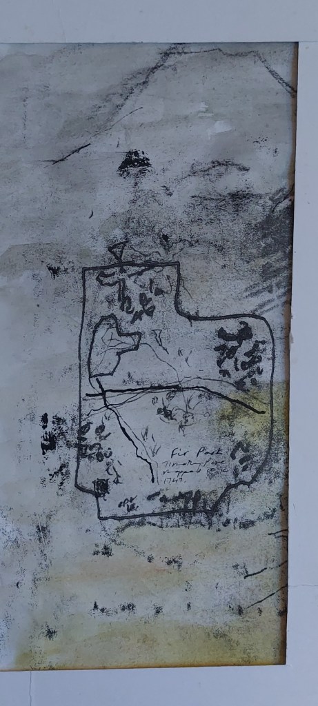
Decided to make an artists’s book using prints as the medium and my former farm as the subject.
Started making maquettes.
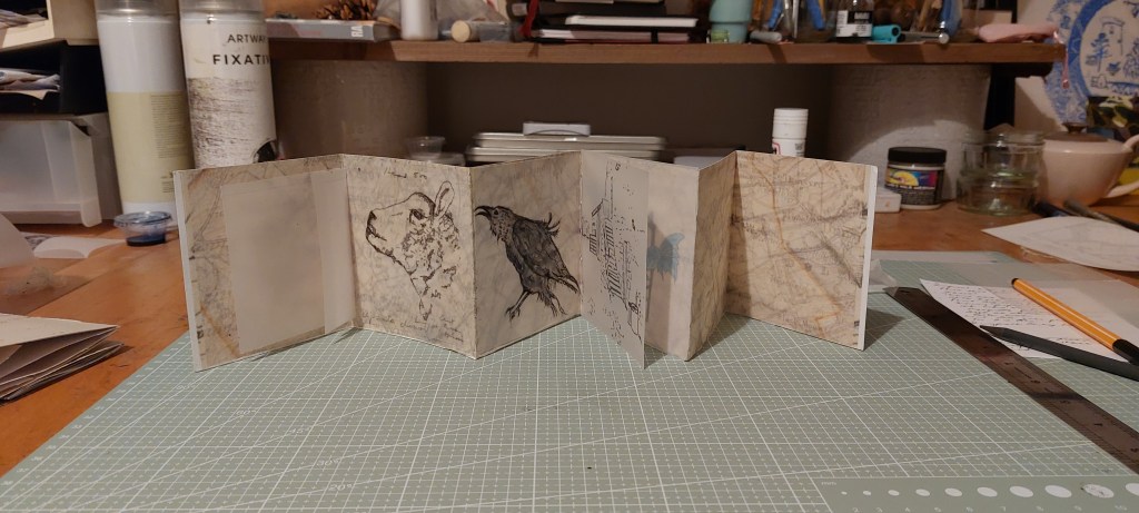
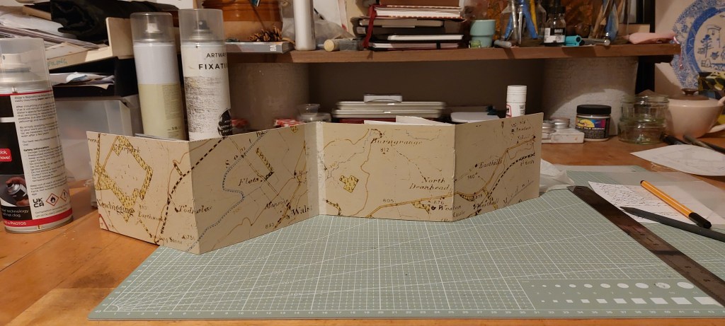
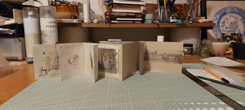
13 February
I spent th6 weeks working on the artist’s book and have just about worked out the format and layout and completed seven drawings to make solar plates for the inserts which I will sew in once the book has been printed. I will make the plates this week. I also spent time shopping for the surface and was undecided about the colour but decided on white in the end as the prints may come out clearer than on buff.
After a productive group meeting at college, I felt I hadn’t been bold enough. Also, I was getting very tired of the finicky work involved in the tiny A6 book. I decided to experiment further, using monoprint, watercolour, gouache, conte crayon and ink to make a composite image of the book contents..
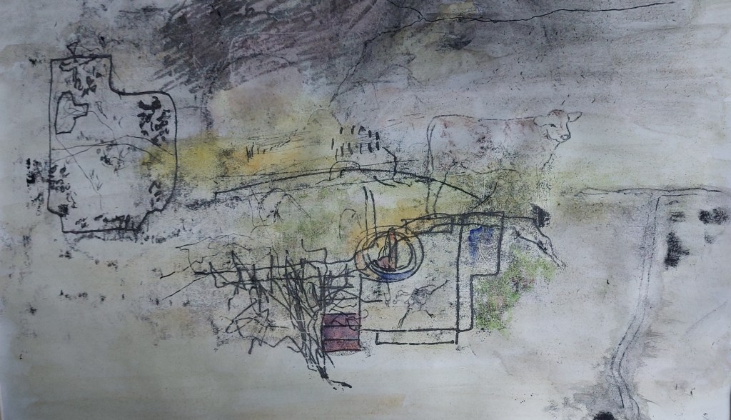
This was a very quick and random experiment but I felt it had potential. I wasn’t sure the image worked as a whole so I cut it up into four pieces.