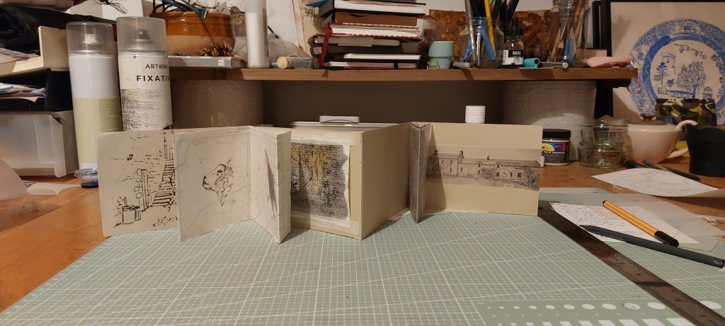
I decided to make a concertina book incorporating printmaking as the medium form my former farm of Weston as the subject.
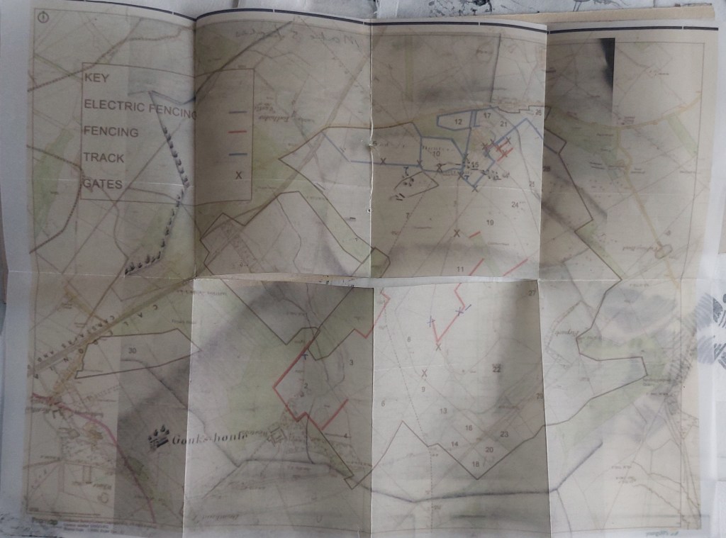
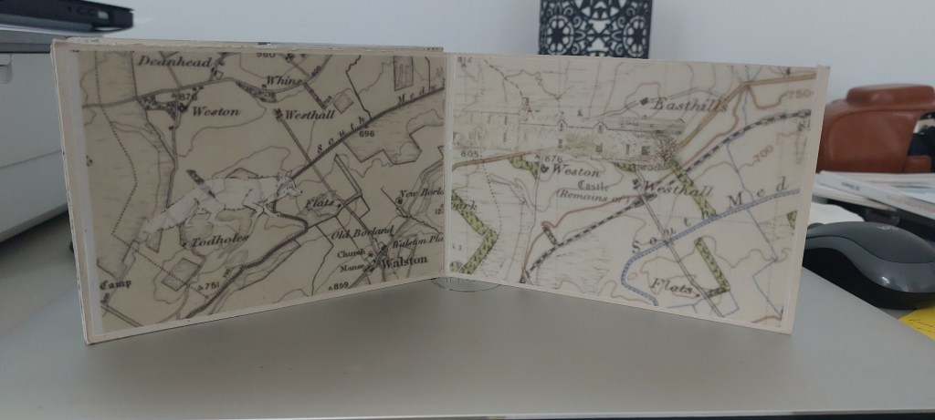
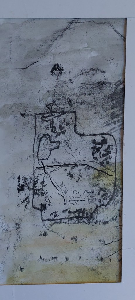
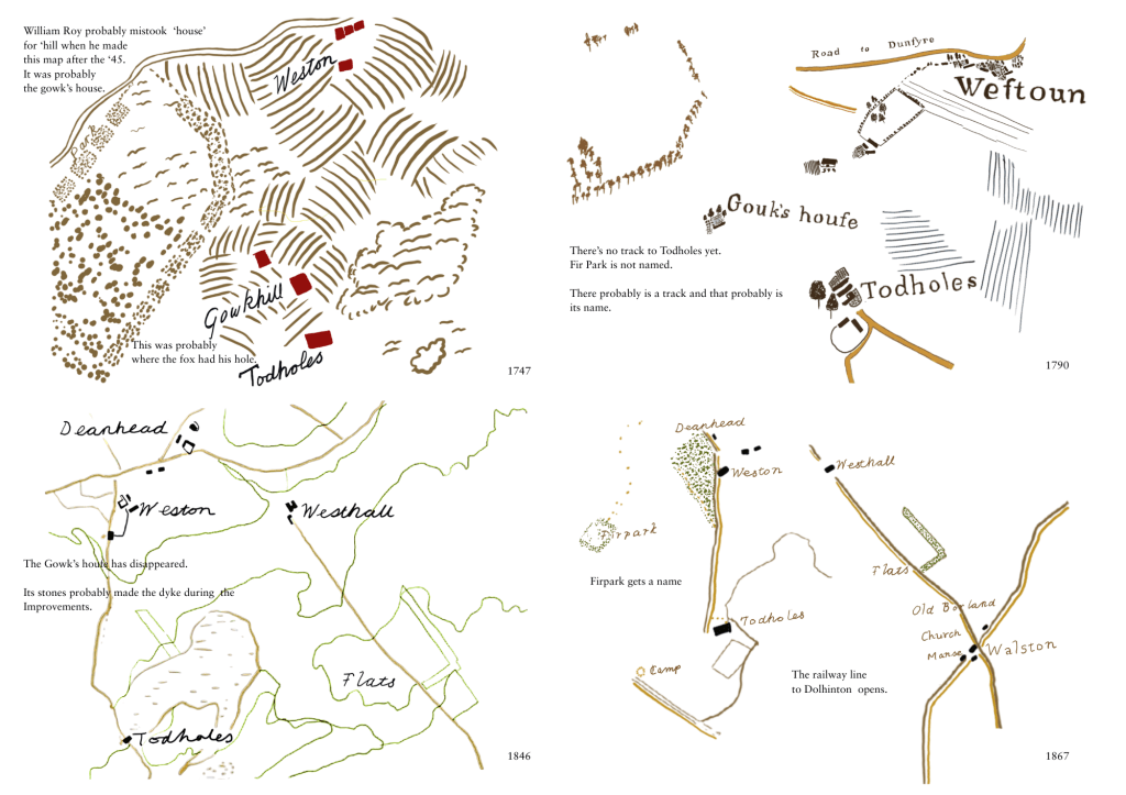
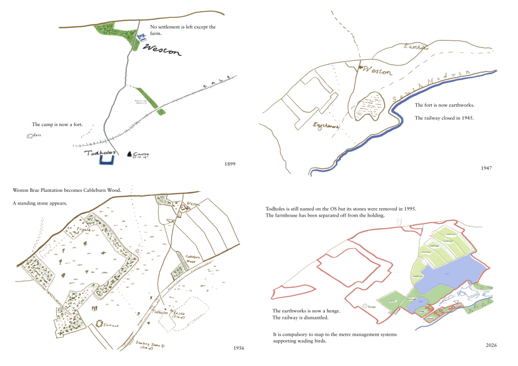
I thought about the history of the place and realised this could be portrayed through maps and the different styles they had taken over a very long time, together with what was chosen to depict on them. The valley where the farm is situated has been steadily depopulated since the eighteenth century and many buildings have fallen into disuse, dilipidation, ruin and demolition. The stones from them were used to build dykes during the period of Improvement in the eighteenth century as enclosure came in, farms were consolidated into bigger and bigger units and rural labourers ‘cleared’ and relocated to the cities.
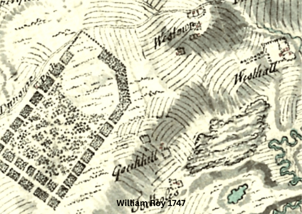
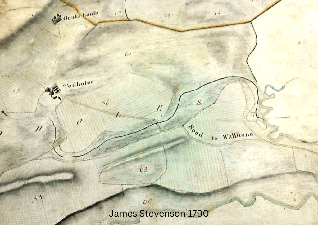
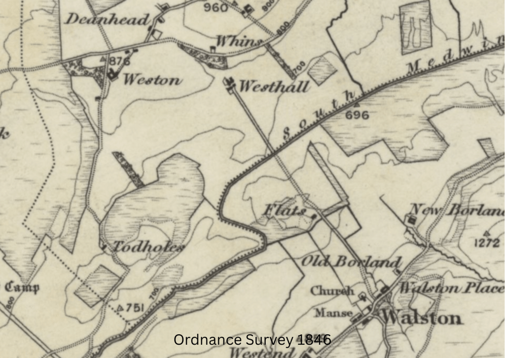
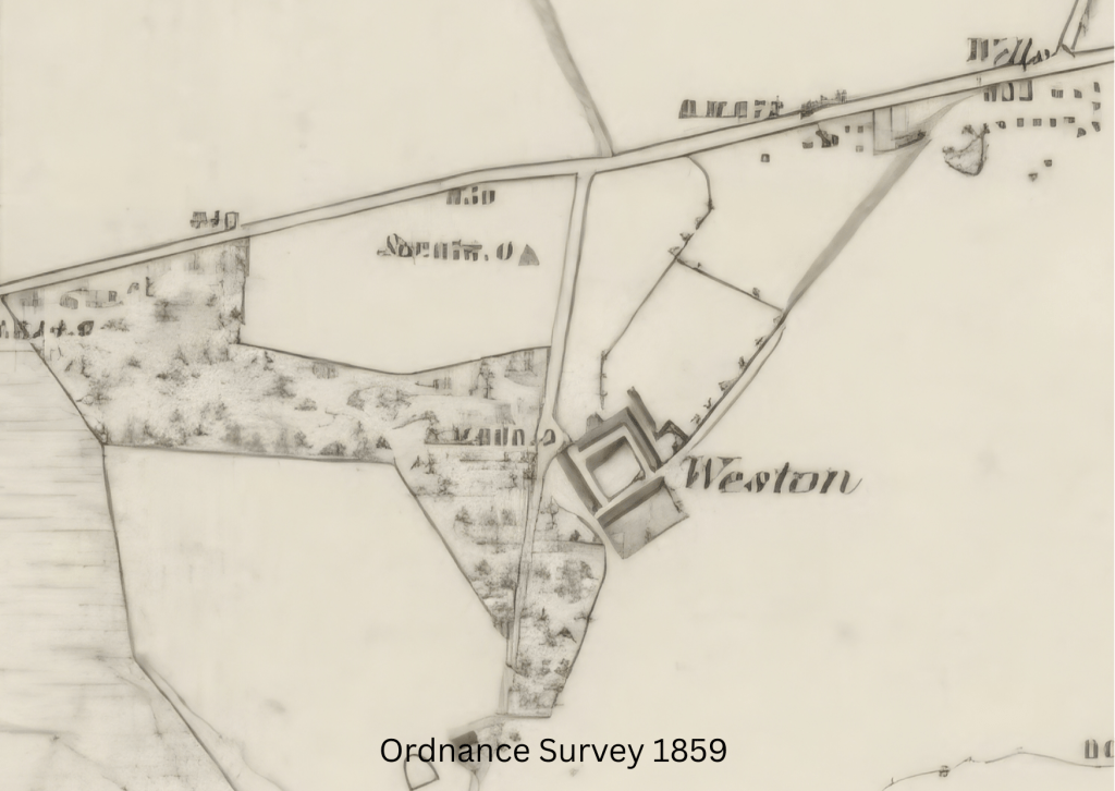
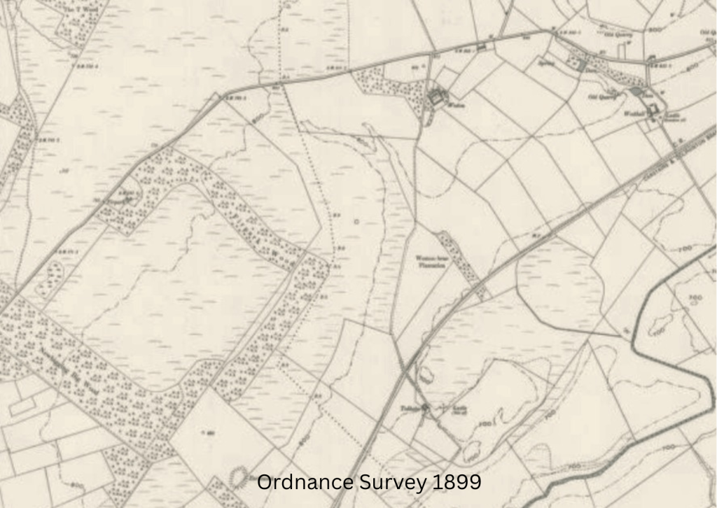
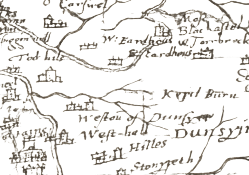
I began by studying maps using resources at the National Library of Scotland. These can be searched by place name and the entirety of available digitised maps appears. https://maps.nls.uk/geo/find/marker/#zoom=15&lat=55.7098&lon=-3.5217&f=1&z=1&marker=55.7099,-3.5311&from=1449&to=2001&i=188145660
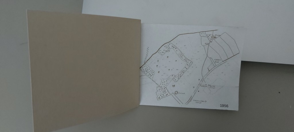
The oldest is dated 1596 and I found an estate map dated 1790. From the middle of the nineteenth century Ordnance Survey began mapping. After careful consideration, I narrowed the available maps down to a provisional six and cropped them to make the farm the main focus.
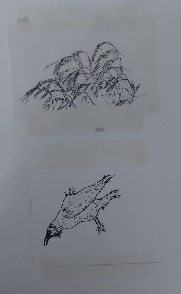
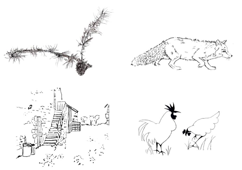
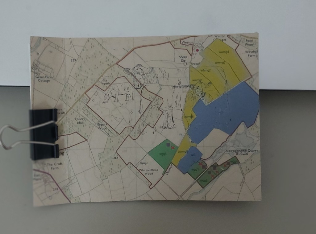
I then thought about some of the sorts of things would be seen on the farm throughout the centuries, to show continuity as well as change.
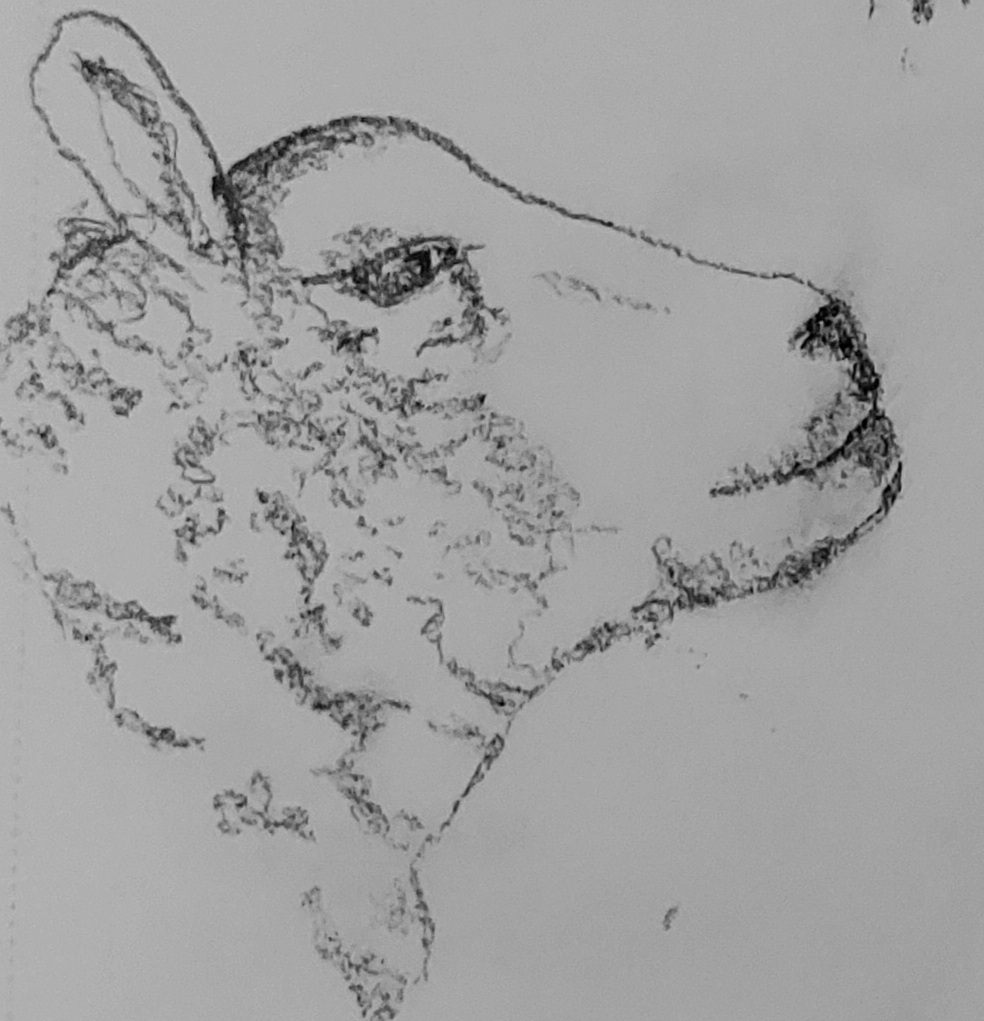
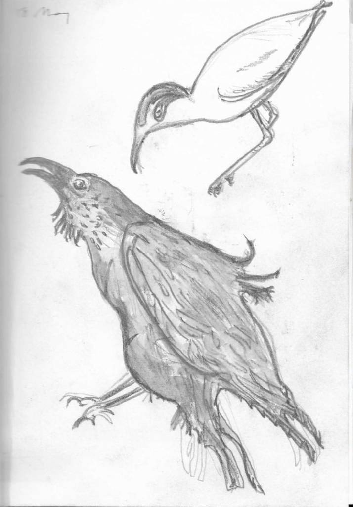
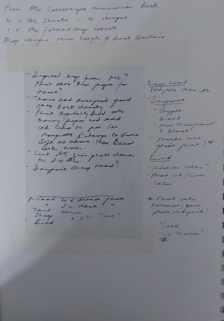
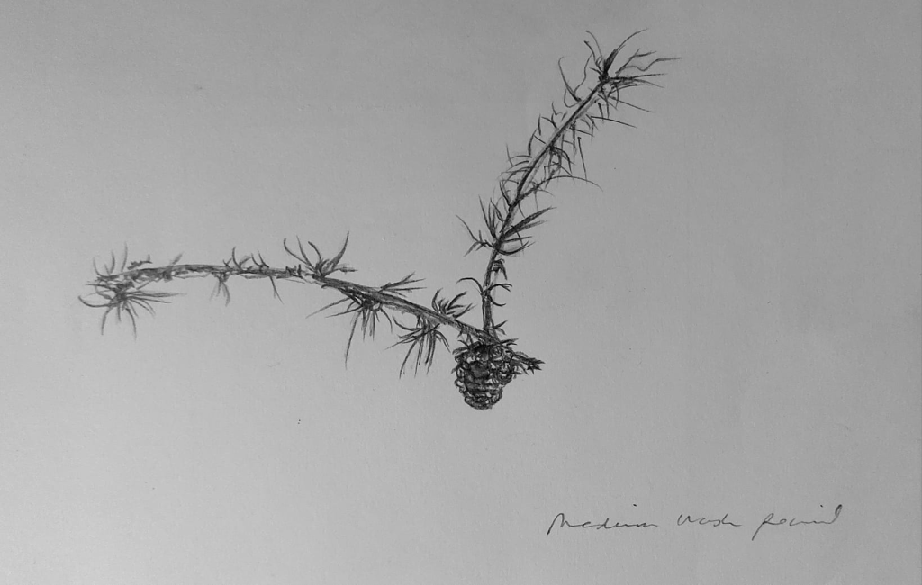
After a lot of thinking about what to put in and what to leave out in relation to the overall concept, I started drawing images to put inside the book and looking through a couple of drawings I did last year that I thought would suit.
I started making maquettes. I printed directly onto two different supports (Bristol board and buff Paint On mixed media) from my home printer and decided to have some images as inserts sewn into the valleys of the concertina.
I also began investigating book binding, looked at a lot of artists books and methods of folding. Books included the following:
- London Centre for Book Arts, Making Books (Pavilion, 2017)
- Golden, A Making Handmade Books: 100+ Bindings (Lark, 2010)
- Kyle, H and Warchol, U The Art of the Fold (Laurence King, 2018)
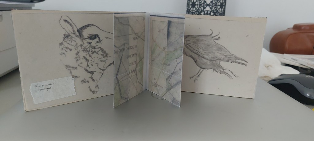
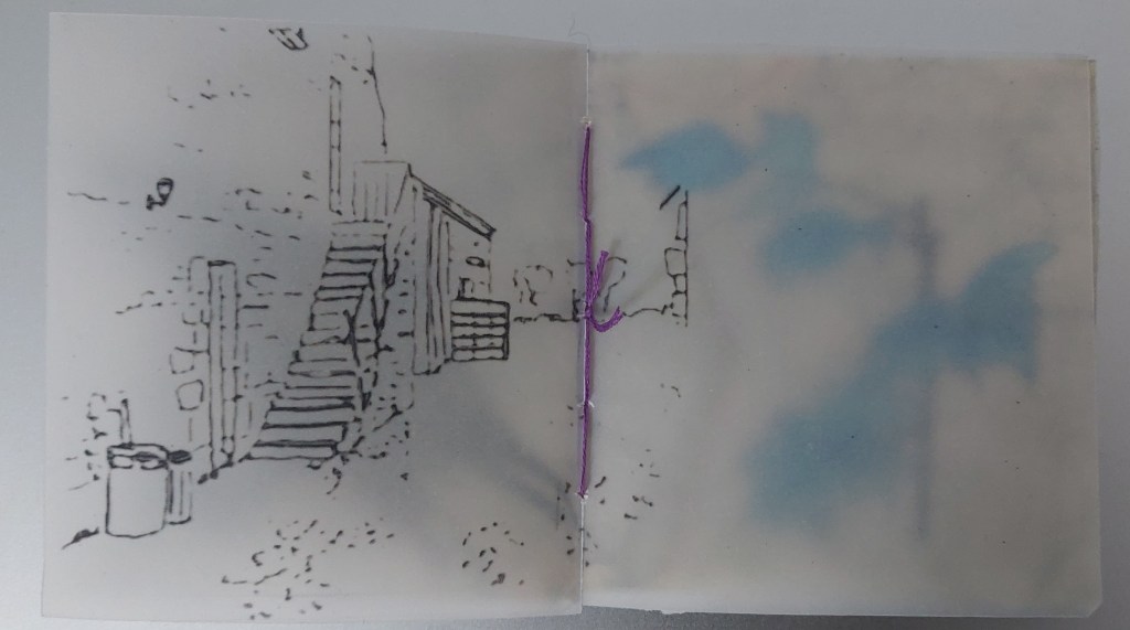
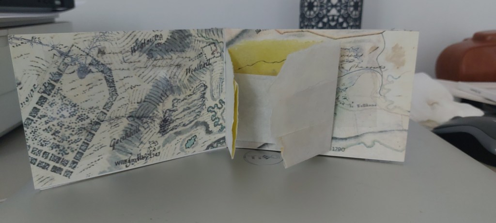
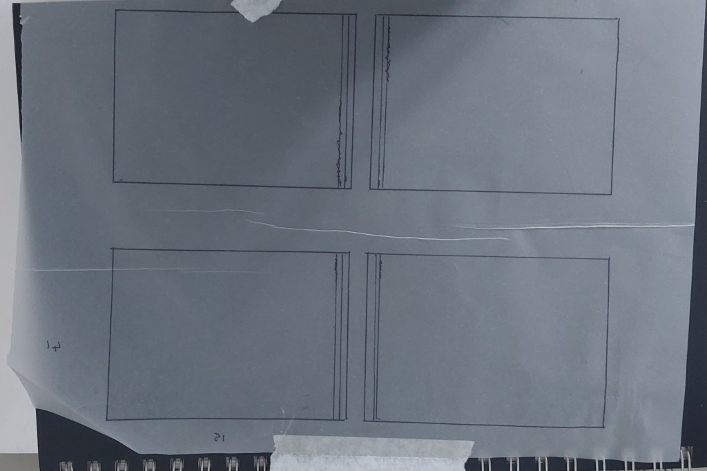
This was the first maquette, printing directly onto the small square surface (A6 squared of) and stitching in a folded A4 map printed on tracing paper. I then decided the format was too small and a postcard size would in any case be more in keeping with the concept.
My inkjet printer takes only A4 maximum so I fitted four images onto one page and cut the pages horizontally to make two pages of the concertina. I researched different tapes but decided in the end to simply use masking tape for the joins.
I experimented with using an awl and bone folder and stitching in pages using three holes.
I thought initially about printing maps one on top of the other to make abstract patterns. However, without spending £20 per map to buy high resolution images from the National Library, they became too blurry to make aesthetic or conceptual sense.
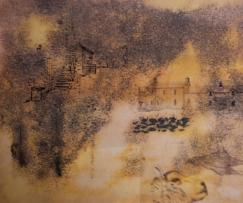
A range of experiments trying out different surfaces and different media, including paint, ink and soluble graphite.
To get the drawn images onto the surface, I digitised them using a combination of the Sketchbook app and Canva (I got a month’s free trial of Canva for business which allowed me to removed backgrounds and add filters) and spent a lot of time making corrections, removing the background and re-sizing.

I made a number of different maquettes, with some failures in relation to how they sized and formatted. There was so much measuring and cutting involved that I bought my own rotary trimmer from Ebay.
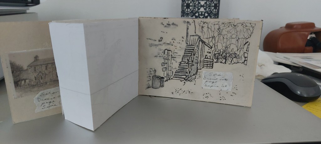
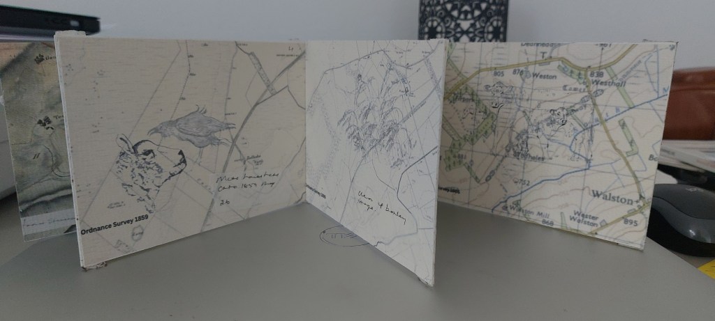
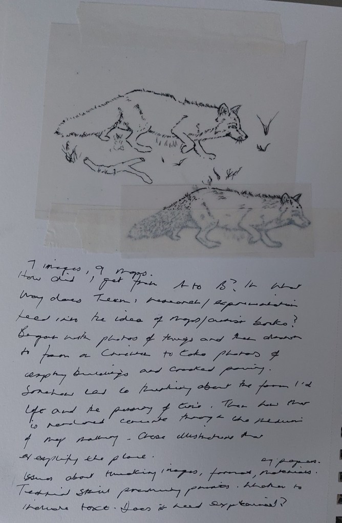
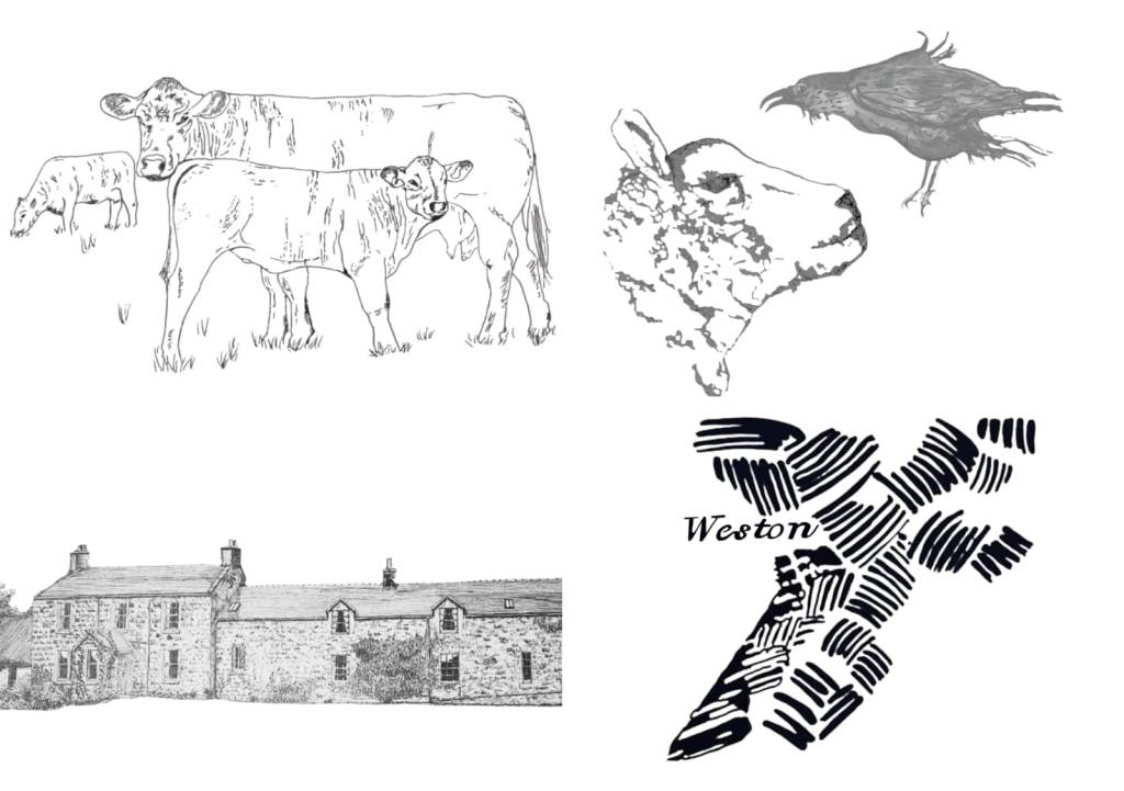
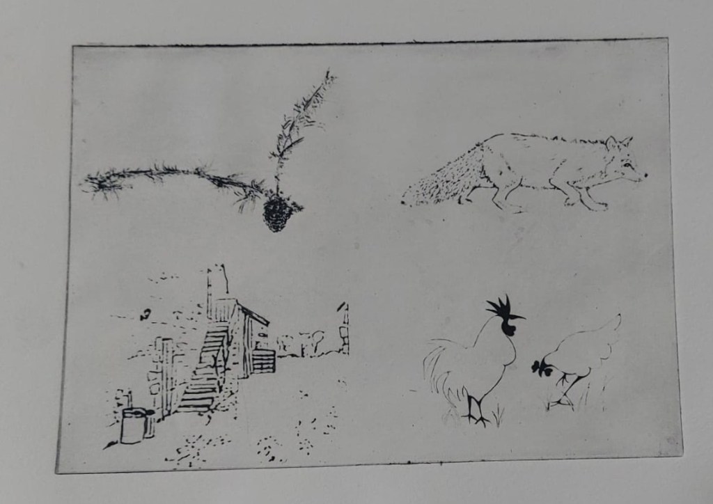
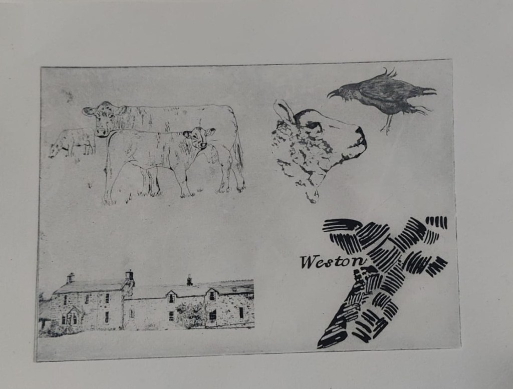
I worked out a provisional format and layout and completed the eight drawings. I rejected some on technical grounds. These are some pages from my sketchbook, questioning how this plan led from or related to earlier work.
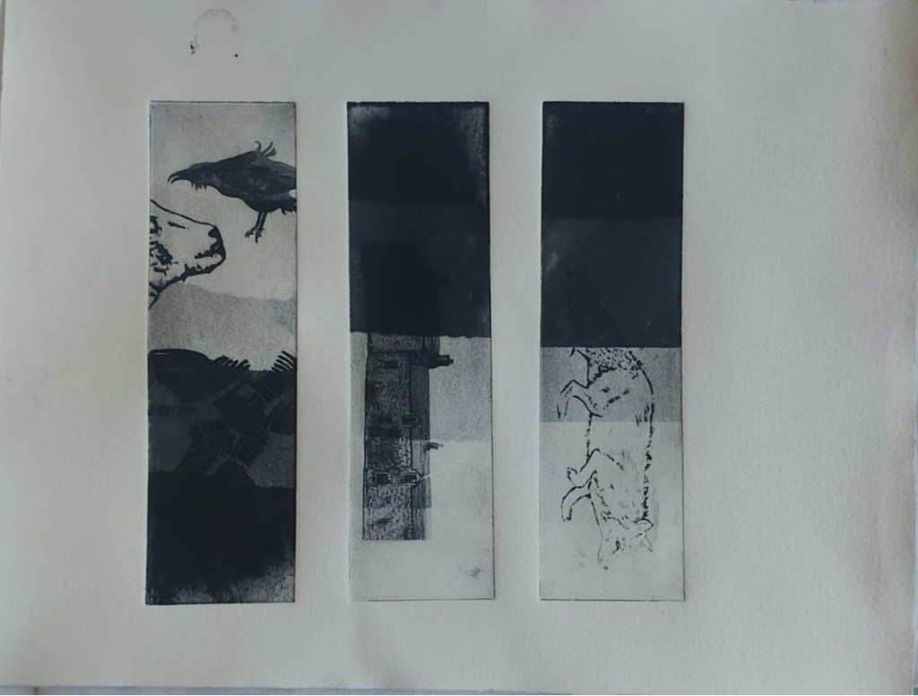
I also experimented with monoprinting. in case I might want to monoprint instead of or as well as etch images.
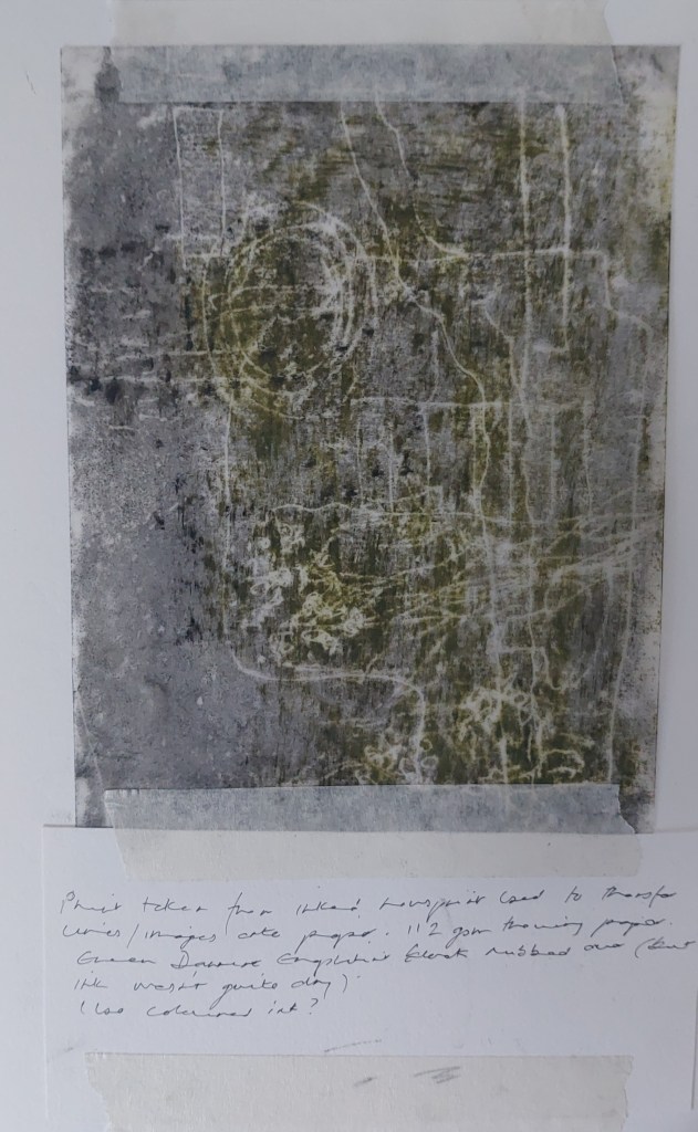
I had started by wanting to insert images on a transparent surface, maybe with tracing paper but then began researching the thinnest Japanese papers that would take intaglio printing – having experimented with it in the first semester, I knew the tracing paper could not handle this without buckling. After trying a sample pack of papers, none of which were standard A4 or A5 so would not fit in my printer and having re-sized all the images to fit, I bought a 10 m roll of Washi Hosho and made the monprints above. It turned out that while my own rotary trimmer would cut it, the trimmer at Gracefield would not without damaging the paper.
I then experimented with what the images would look like if printed onto painted/monoprinted sheets by laying acetates over the top.
I then thought about making larger mixed media images to fold and sew inside the concertina.
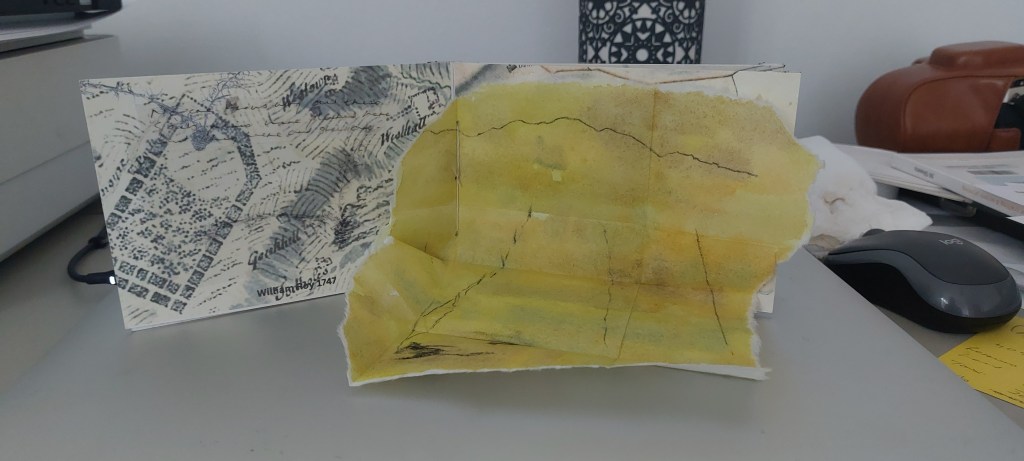
I found the Hosho paper took watercolour very well and could also take monoprint on top, It could also folded very small and flat. I experimented with tiny velco dots to keep the page closed but it was a little bulky to then fold the concertina flat.
I decided on a change of aesthetic. I decided to make solar plate prints on a Hosho surface, to be sewn into the concertina. I made arrangements to get help at Gracefield Arts Centre in working out the correct exposures for the UV unit.
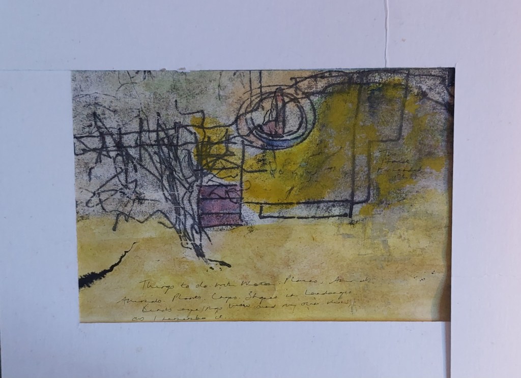
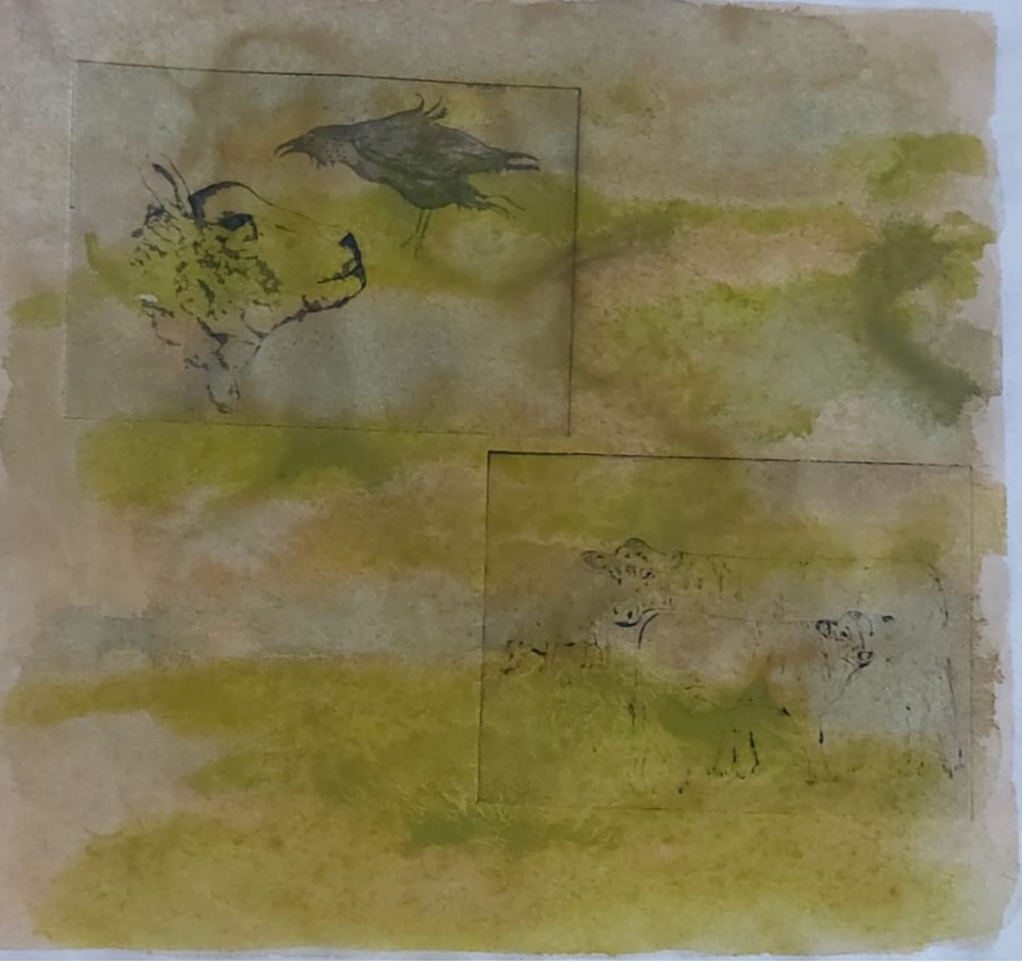
Before I could do this, I began to wornder if I hadn’t been bold enough. Also, I was getting very tired of the finicky work involved in the tiny A6 book. I decided to experiment further, using monoprint, watercolour, gouache, conte crayon and ink to make a composite and more abstract image of the book contents..
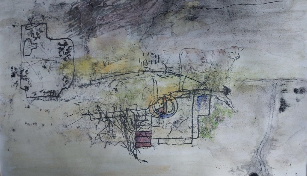
This was a very quick and random experiment and I had used cartridge paper which was not really suitable but it was all I had to hand and I felt it had potential. I wasn’t sure the image worked as a whole so I cut it up into four pieces.
I re-considered again and decided that as time was becoming short to finish the piece I would stick to the original plan and for practical and conceptual reasons, I decided to keep to a simple format.
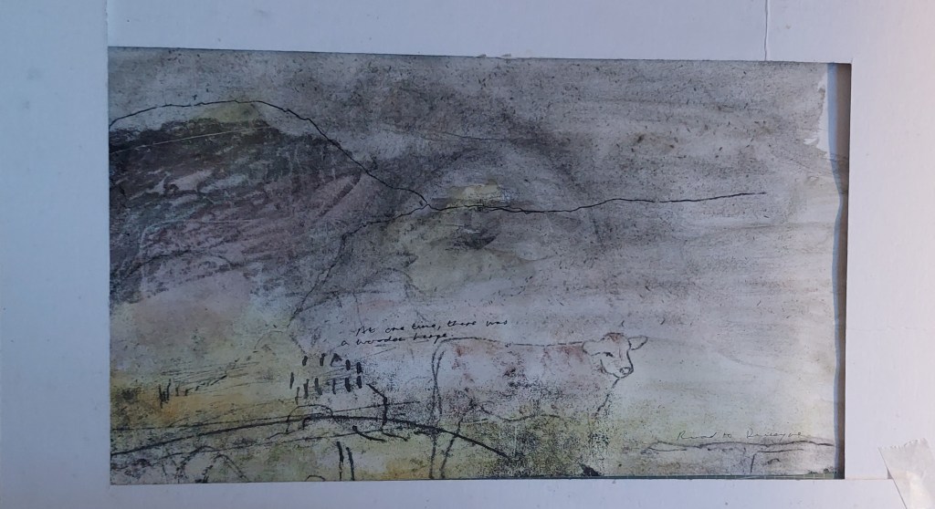
I experimented with the images I had drawn and decided not to use a couple of them as I didn’t think they would come out well on a solar plate. I took a new drawing from monoprint I did showing ridge and furrow and the name Weston, scanned it and digitally cleaned it up using Sketchbook to make an acetate. In the end, I selected eight images, two more than the original six I planned.
I then had to decide finally in what order the images would be presented and which maps they would sit on top of as I couldn’t make the plates until I had done this. Also, although I could have made the process simpler by cutting the prints themselves horizontally, rather than cutting the two A5 plates into eight separate plates, this would mean the plate marks would not sit symmetrically within the book. Since the printmaking is a major part of the project, it seemed important to make clear that each image was a separate work in its own right.
Pamela advised me to cut the plates after the images were etched onto them but this meant there was a high risk – only a few millimetres out would destroy the symmetry of the book. I made two acetates of four images each and etched the plates at Gracefield on 4 and 5 March. There were a few mishaps and I wasted a complete plate in the process. Fortunanately, I was able to buy an emergency plate at Gracefield but with a slightly different spec. This was another variable to add into the many printmaking variables.
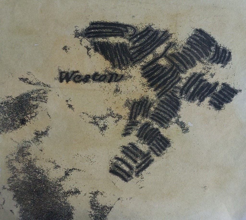
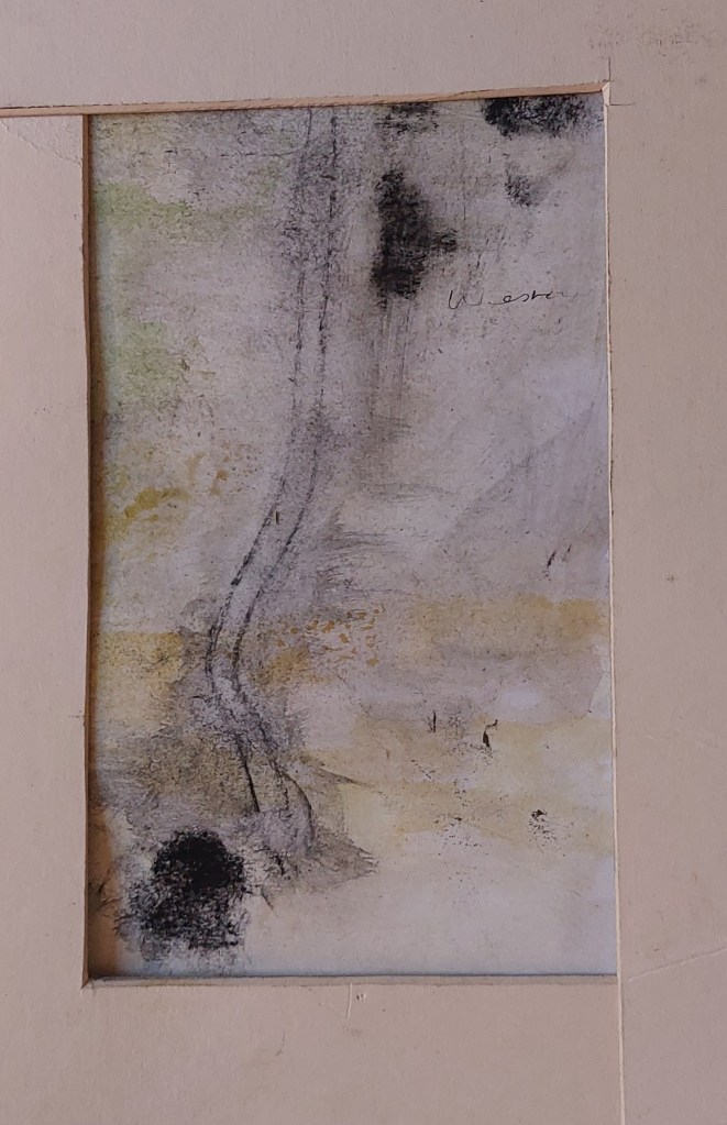
My test plates.
I wondered how the prints would turn out on the Hosho paper so took an injet print of the 1596 map then cut up and printed my test plates on top.
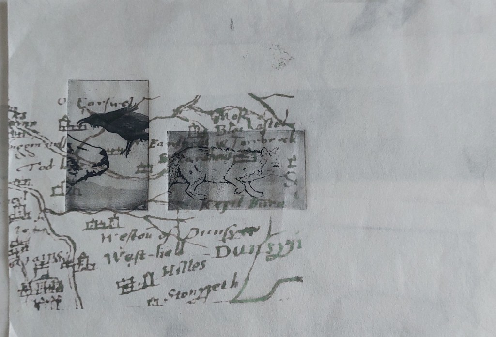
I also tried printing on top of painted and monoprinted Hosho paper.
I went back the next day to make some test prints on Hahnemuhle paper as it turns out the Hosho paper requires to be cut to size from the roll by hand as it tears in the rotary trimmer at Gracefield and I didn’t have the time left in the studio to do this.
To fit the format I had decided on, for the final prints for the book I would have to align four sets of two plates very precisely to keep them straight and evenly spaced within the pages and then trim them.
In between making the plates and printing them, I thought of how much I liked the test plates on the 1596 map printed on Hosho paper (above) and experimented with changing the format entirely and making a Japenese stab binding book instead of a concertina. I would use watercoloured Hosho paper printed with maps in my inkjet printer and print the etched plates of drawn images directly onto it. I re-formatted all the images to fit the changed layout, in order to allow space for the spine of the book, as per the instructions in Making Books.
I cut the Hosho paper to A4 to fit the printer and printed a couple of the maps before trying out the required folds for the spine.
I ran into significant prolems with printing on Hosho – the first prints appeared as a fluke because after that the paper kept jamming or inky marks appeared as the paper did not run through smoothly. I discovered Kozo paper, which is very similar, is available in A4 sheets for inkjet printers but it costs £38 per packet and would have taken up to 10 days to arrive so I had to abandon this idea.
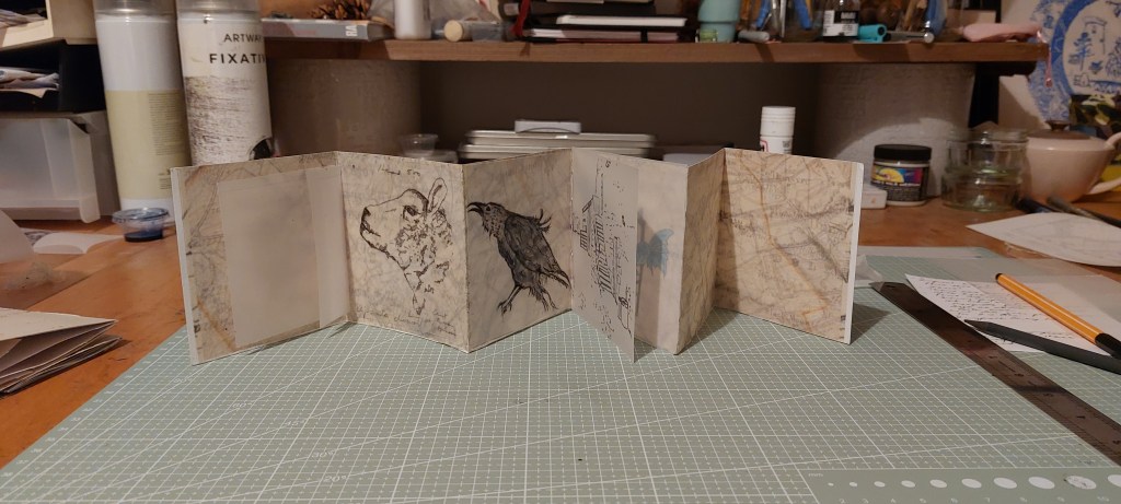
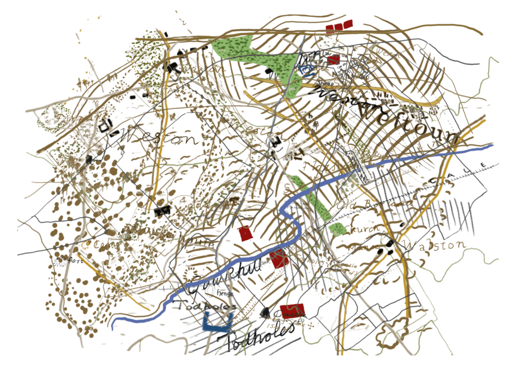
I then decided not to use copies of the original OS, Roy, Pont and estate maps but to use them instead as the basis for hand drawn maps. I took some licence with them in terms of deciding what to put in and what to leave out and how to colour them and write the names In my own handwriting. I came up with eight digital drawings in the same chronological order as before. I then added text for context but in digital typeface (analog handwriting will be added to the etchings once assembled).
I printed over two full days at Gracefield on 11 and 12 March. This was a complex procedure. I made a carefully measured template to ensure accurate registration but mistakes were still made and I ended up with a limited number of acceptable prints, meaning there will be no room for error in assembling the final piece.
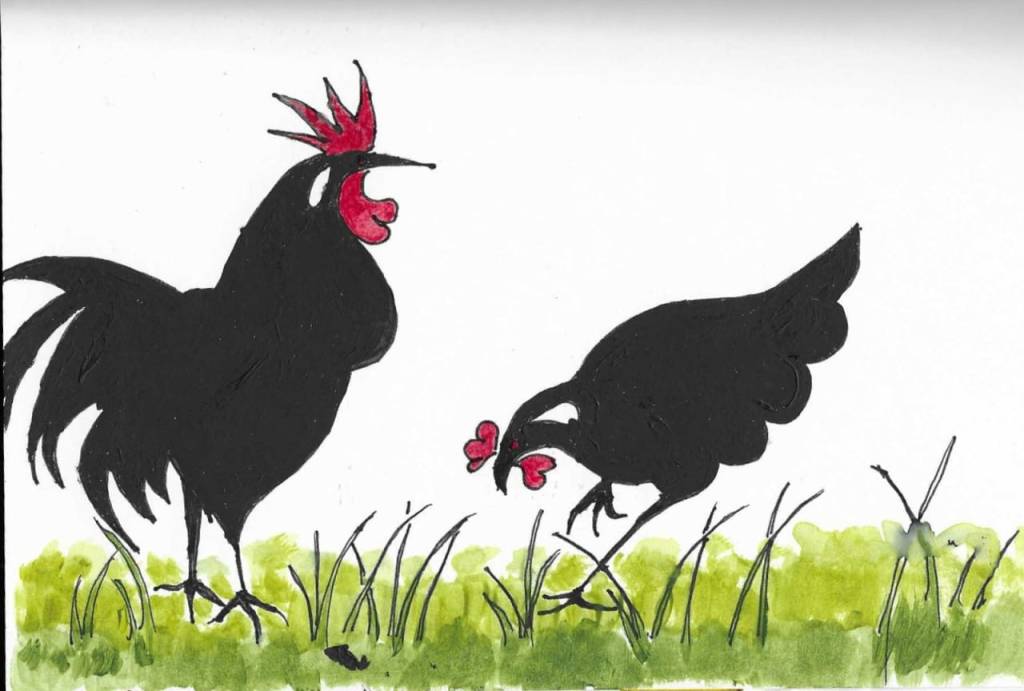
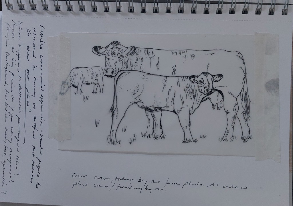
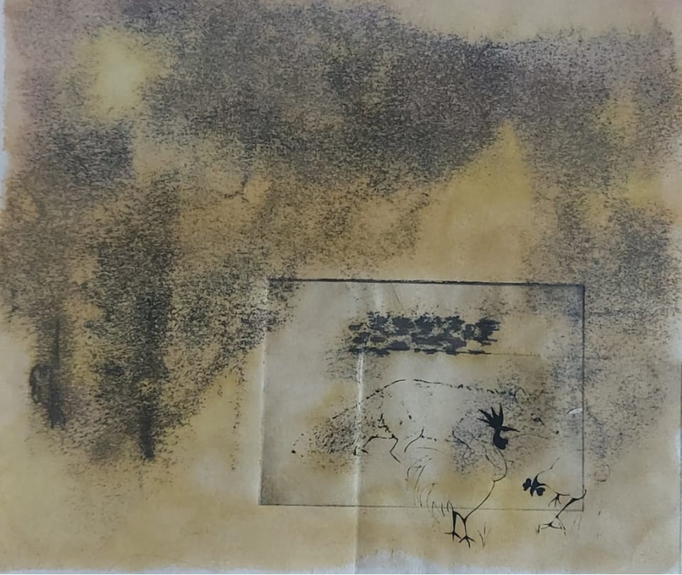
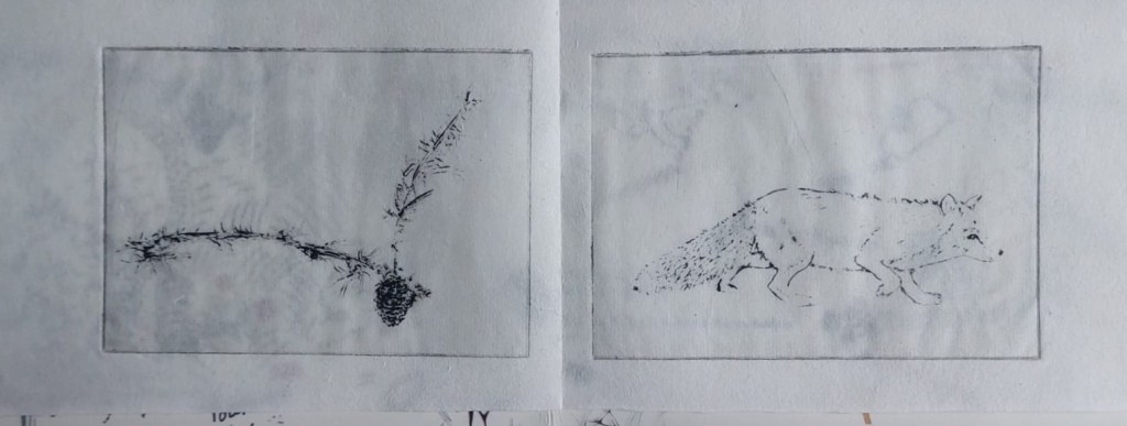
These are two of the finished images. The cow and calf are slightly underexposed because of the very fine lines.

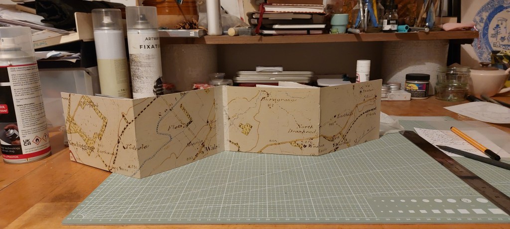
After a lot of agonising about the surface to be used, I discovered that the colour of white Somerset Velvet tones very well with the colour of Hosho to print the maps on so I bought large sheet at Gracefield to cut to the required size, hoping there are no problems with using it with my inkjet printer. A few days later I printed the maps onto the Somerset with no problems and cut them to size.
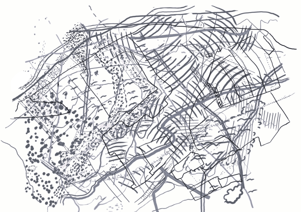
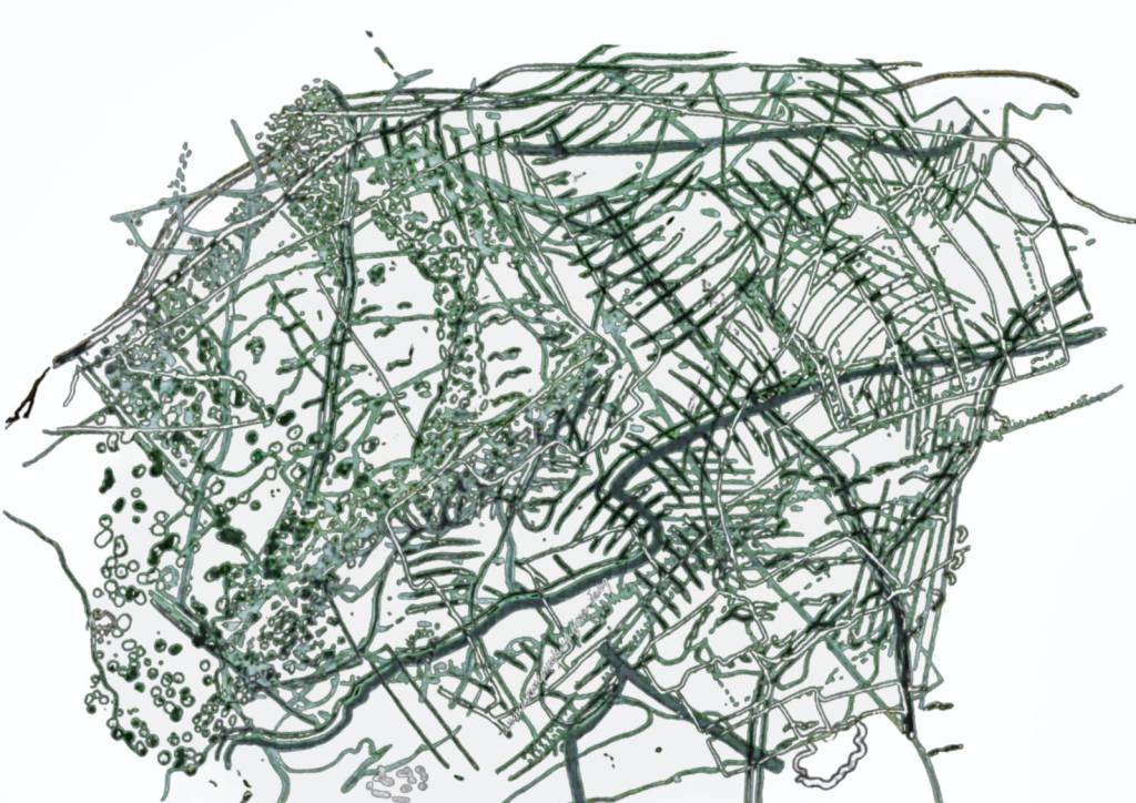
Meanwhile, I began experimenting with overlaying the drawn map images using Sketchbook, Canva and Adobe Light room and became quite excited about the results. It turned out that my photographs of linear patterns on the ground taken in the first two weeks at the start of the course were re-surfacing. I am considering either making a cover with one of them or a separate piece.
“
I spent two days working out the best way to assemble the piece. I planned to cut up the acetates I had used to make the plates but, after making another maquette using previously rejected OS maps to see if I could actually stitch throught it, I abandoned this. With considerable difficulty I found I could stitch the inserts in but despite scoring and flattening the fold with the bone folder I then discovered the pages would not shut property. I then reverted to my first plan of using tracing paper.
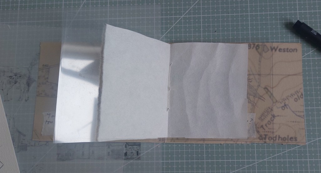
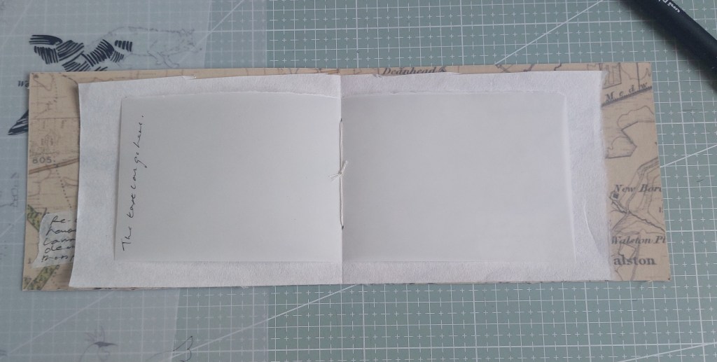
I then had the dilemma of whether to put the tracing paper inserts in front of or behind the etchings. I wanted to make them the exact same size as the plates but not the prints. I liked seeing through the paper and text to the map if the traced and handwritten image was directly on top of the map. On the other hand, I like the nesting of the different sizes of support, with the smaller tracing paper image on top. Either way was good. I considered making the tracing paper images the same size as the etching so that the discrepancy in symmetry was resolved but eventually decided that the disjunction could be slightly more interesting and enabled a small element of surprise when the pages were turned to discover them.
Given the resources that have gone into the project, I decided to present it within a box file containing the images I chose not to include in the finished book, experimental paintings and monoprints, maquettes etc and to place the finished book randomly within it.
I then realised that after all the agonising about scale, paper, texture, consistency etc that no-one would be seeing the physical finished piece as submission of the project had to be in PDF format. Why then assemble the piece at all? However, I would anyway for my own satisfaction.
I decided that in this case the best way to virtually showcase the work would be to direct the persons assessing it to this page and decded that the best way to submit would be to submit a PDF with nothing on it except a QR code.
