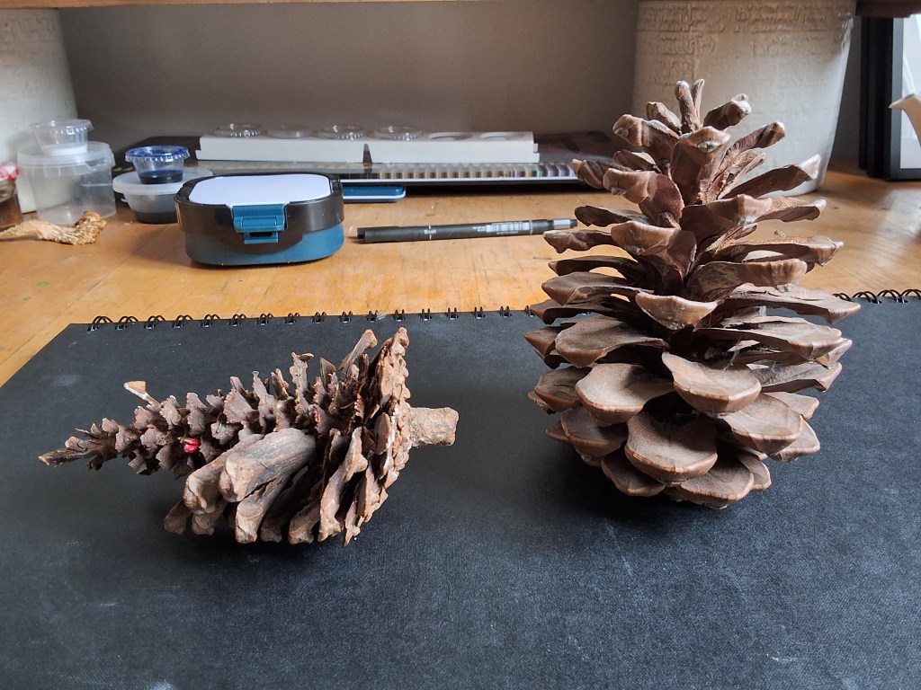
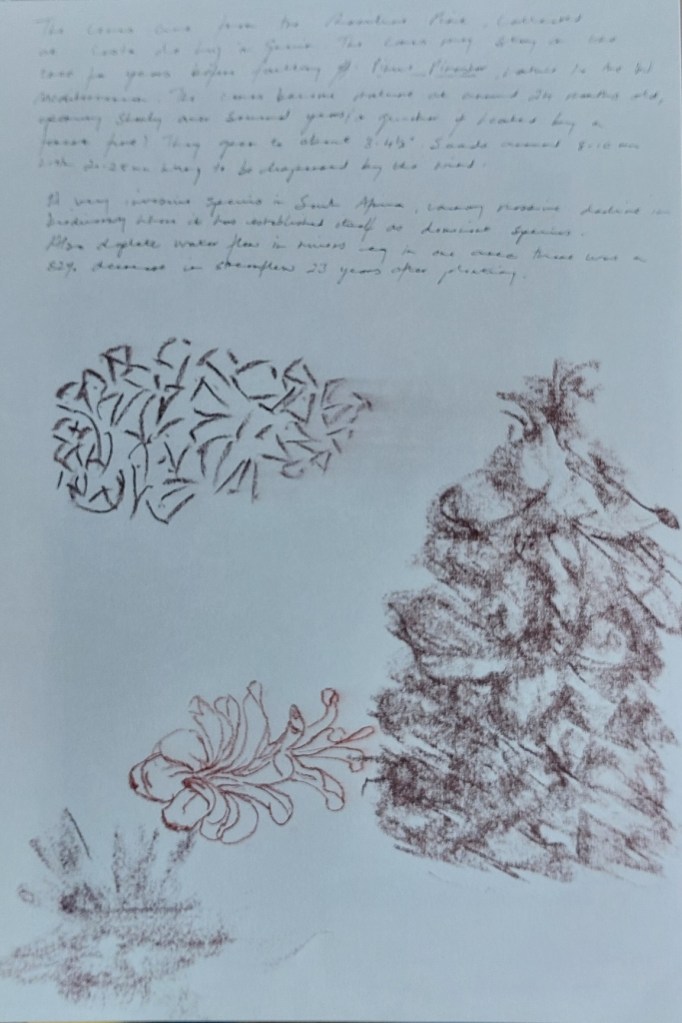
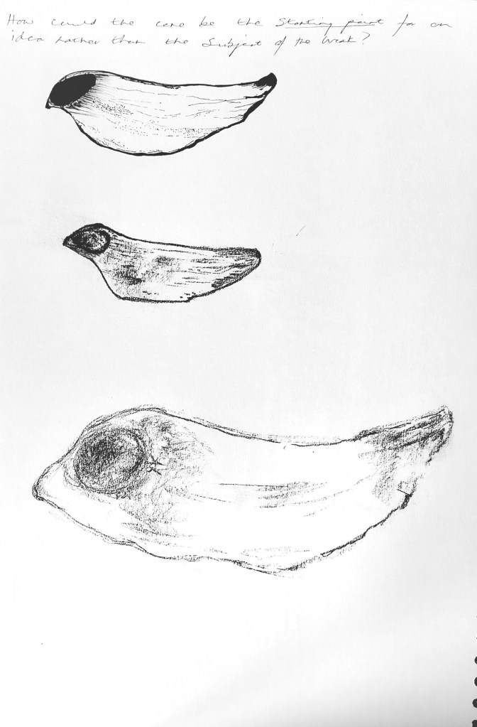
My chosen object is a pair of cones from the Maritime Pine (Pinus Pinaster), collected on my honeymoon on the west coast of Andalucia in 2009. As well as containing happy memories, I’m interested in its shape and texture as well as it’s function of containing maturing and ripening seeds over several years. It sits as one of several in a large circular Kava bowl, acquired by my husband’s missionary grandfather in Papua New Guinea some time in the early years of the twentieth century.

Week beginning 8 September: Workshop
Making an object from found materials in small group
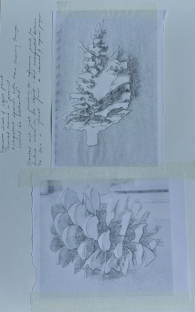
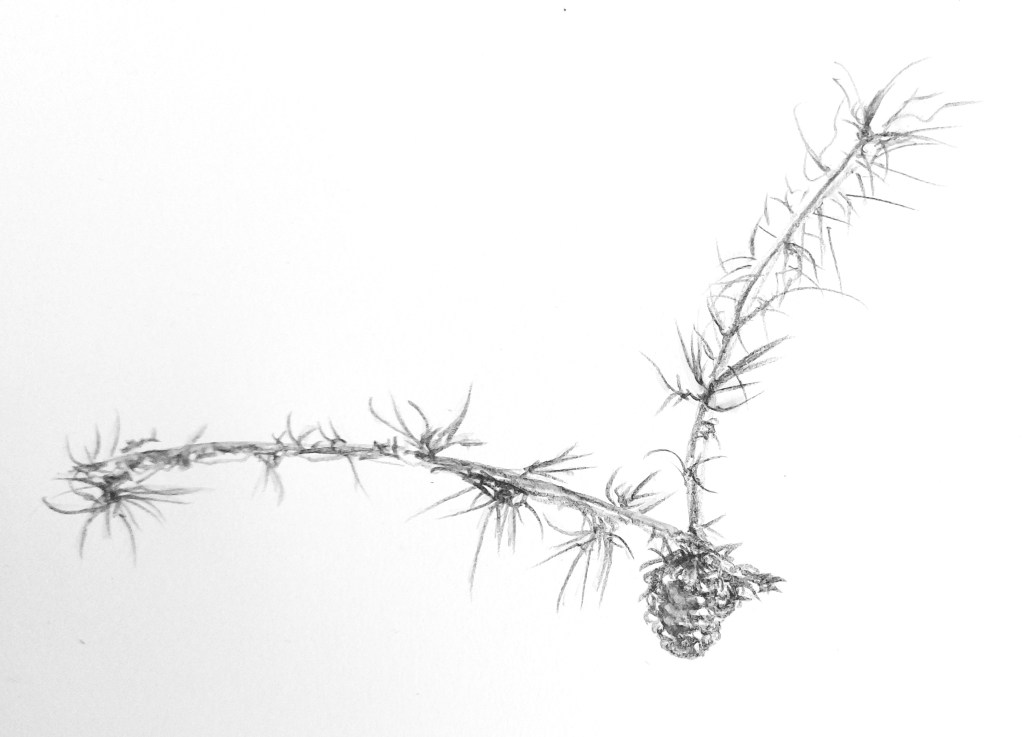
Week beginning 15 September: Workshop (drawing)
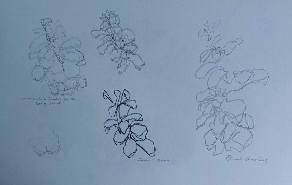
Continuous, blind and semi-blind drawings with pencil on long stick.
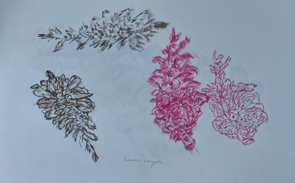
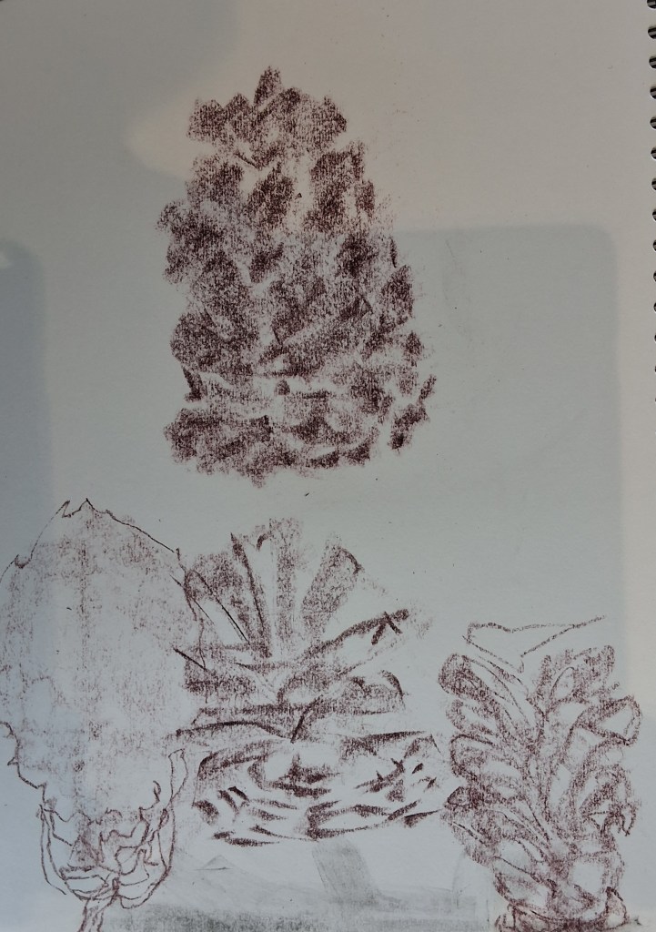
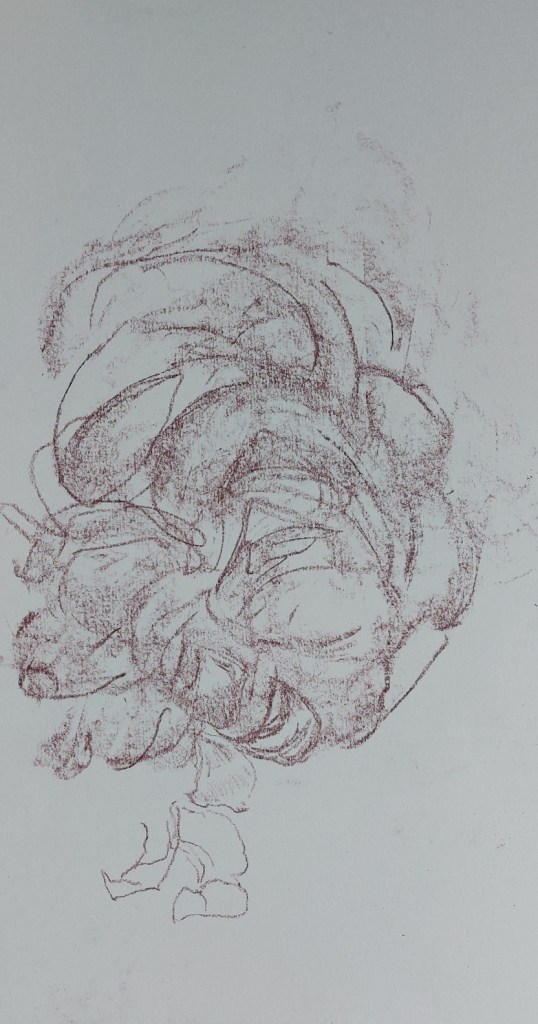
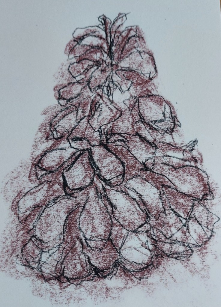
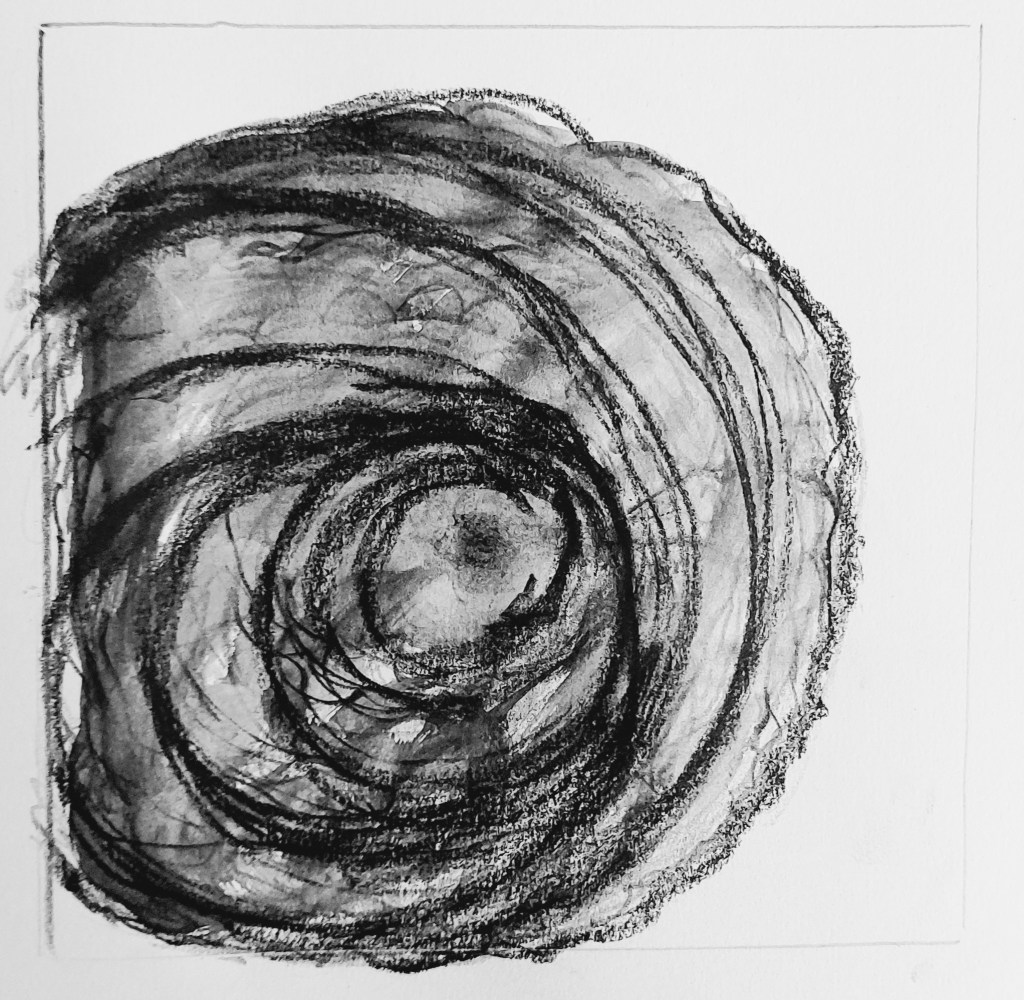
Sanguine and pink Conte crayon

Negative space, charcoal and Fude Pen
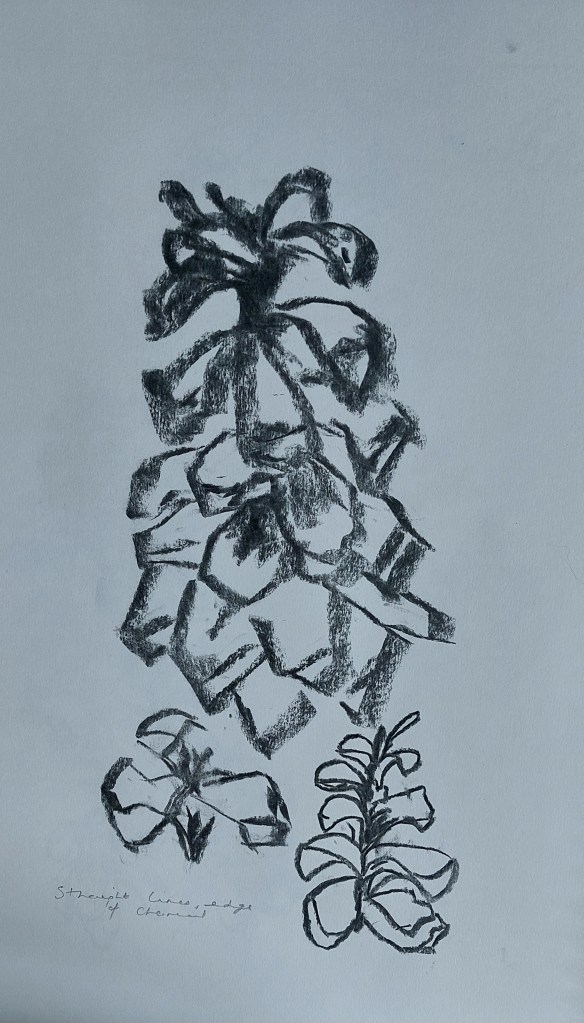
Charcoal
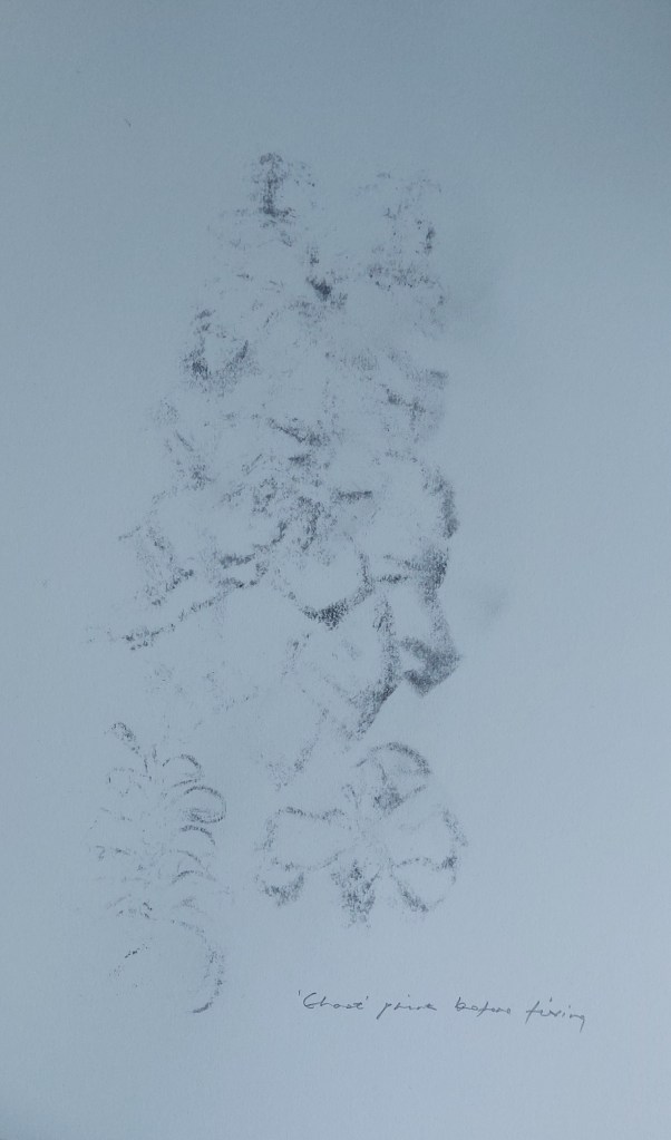
Ghost print from charcoal sketch
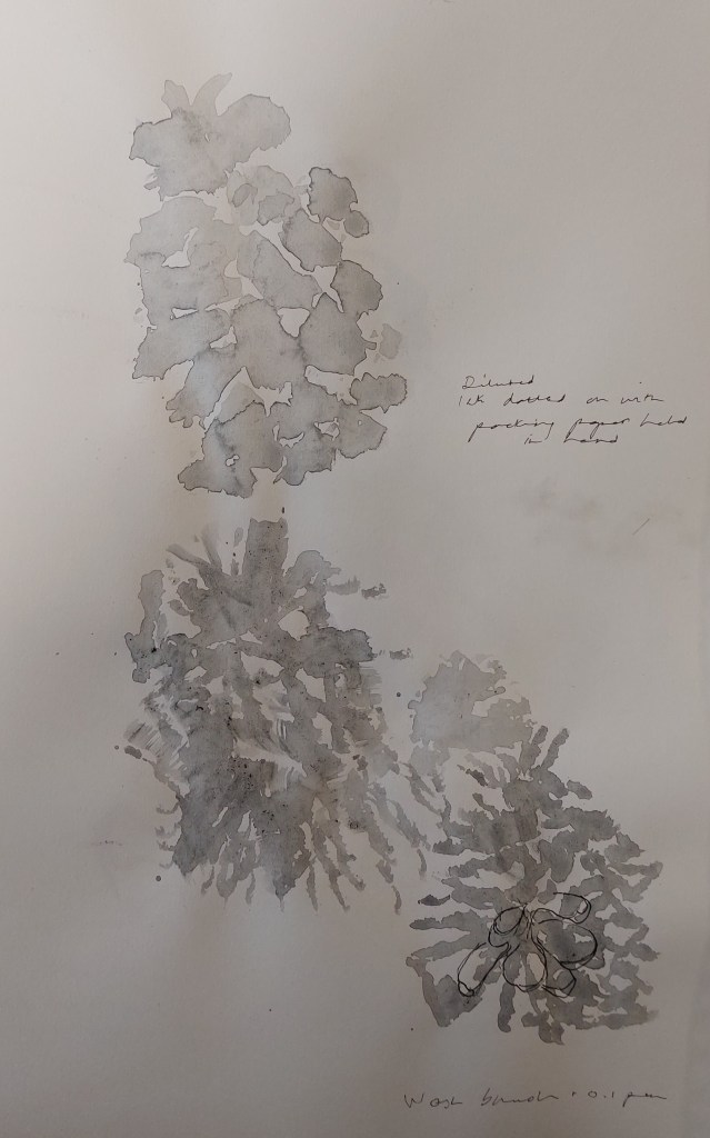
Diluted oak gall ink applied with torn up packaging
Week beginning 15 September: Sketchbook
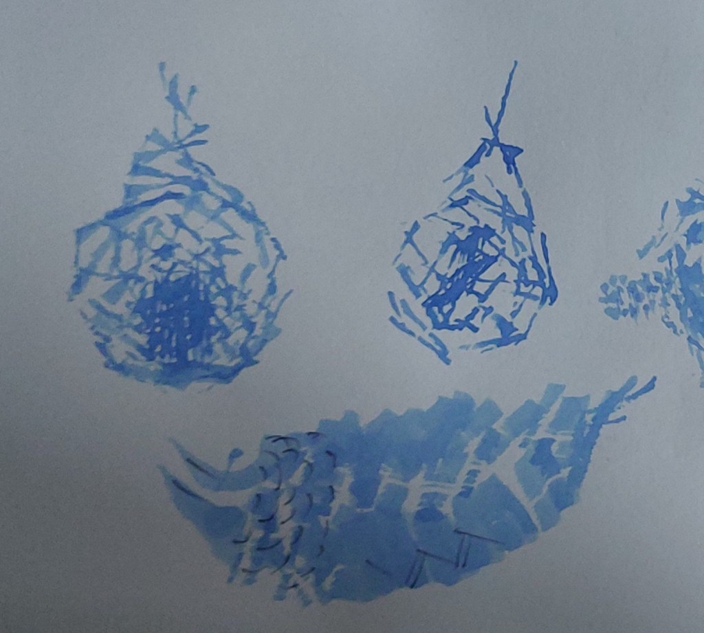
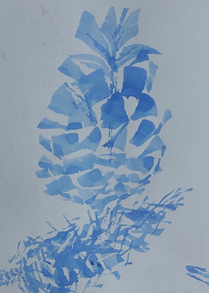
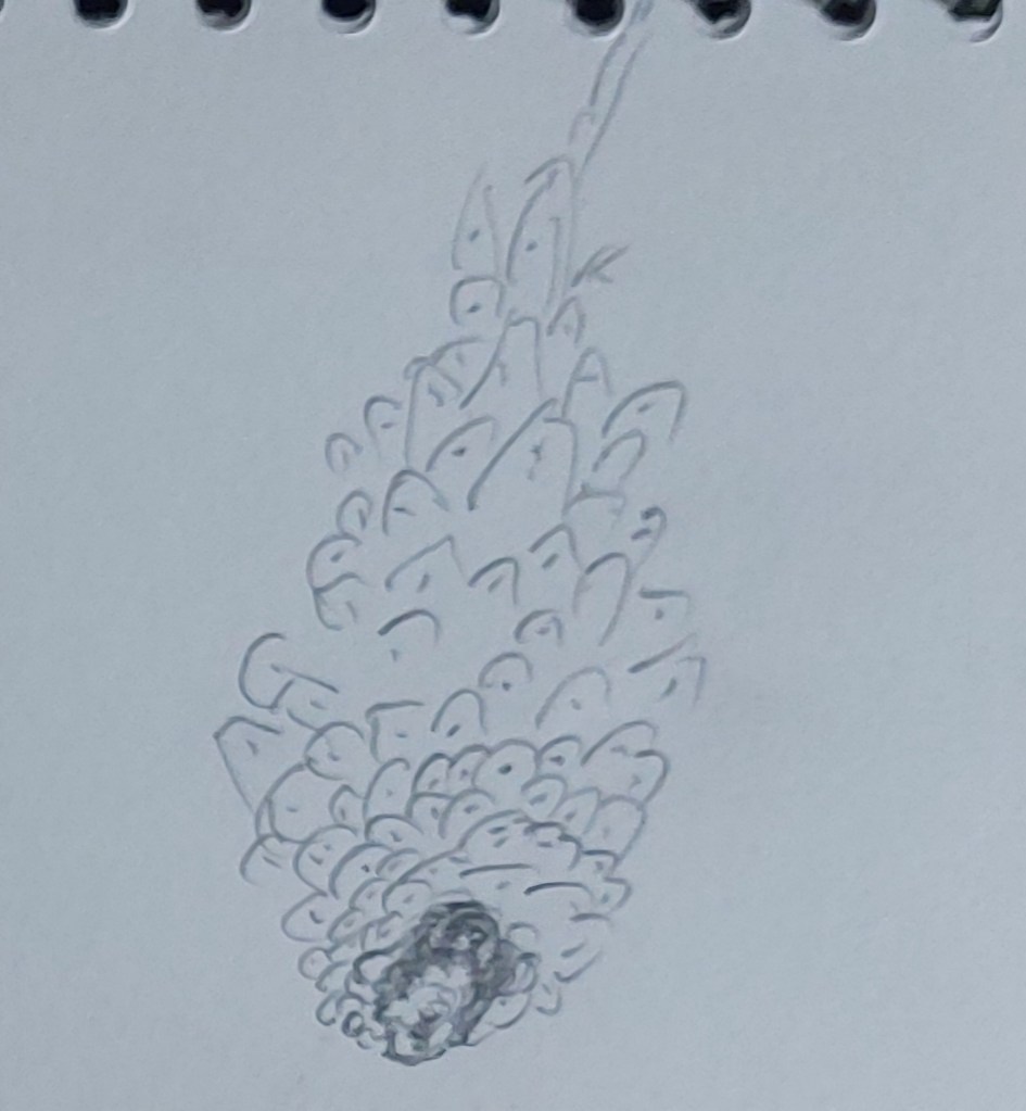
Experiments with diluted ultramarine drawing ink applied with 3/4″ flat wash brush. Graphite sketch.
Experiments stylised cones
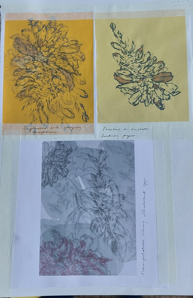
Digitally manipulated drawings
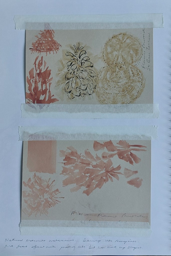
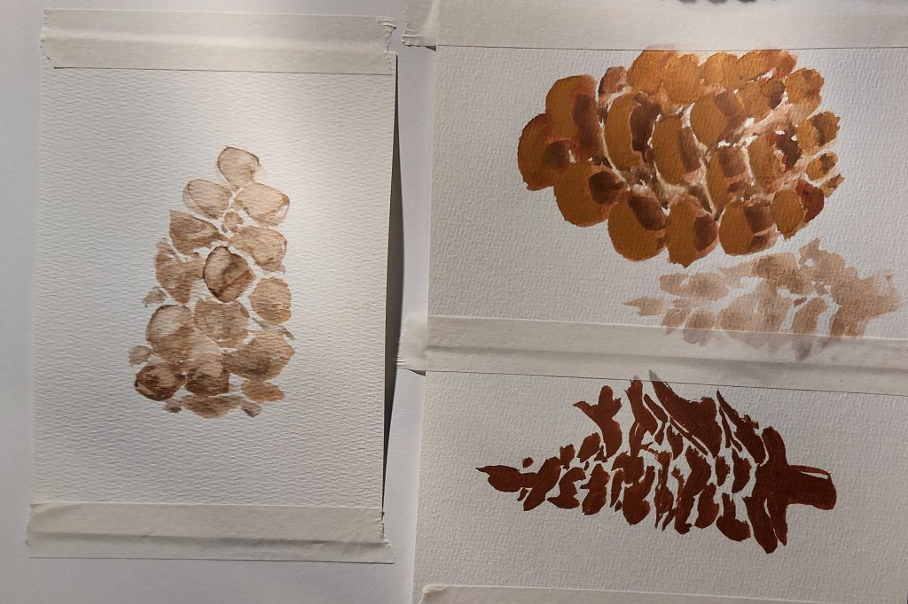
Experiments with watercolours ground from local stones
Week beginning 15 September: Workshop (clay)
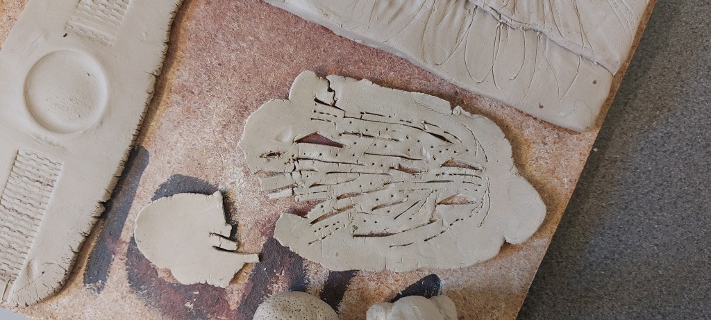
Clay rolled out and incised to resemble idea of imprinted form within the structure of the cone, a prototype of what it will become when seeded and matured.
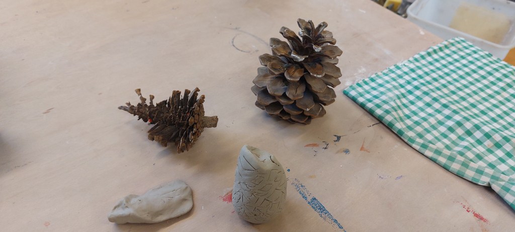
Clay on right formed into egg-like shape, wetted to make smooth, top shaped to resemble tip of cone. Hole carved into base to prevent explosion in kiln. Asymmetric diamond-like shapes incised. Clay on left shaped to resemble scale.
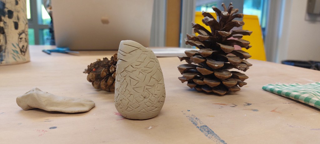
Within the available time, the probem of risking individual scales falling off without a secure centre was solved by not attempting this. Instead, I made a flat plate to represent the incipient pine cone I imagined as an actual presence hidden within the structure -something like a representation of a latent form – and a solid shape resembling the overall shape of the cone. The flat plate was too thin and as the clay dried, one end fell off. The entire cone was more successful in that it was capable of standing unsupported and once decorated with incisions was a satisfying abstraction from the reference object.
Week beginning 15 September: Sketchbook
Reverse side of inkjet print, redrawn and highighted in graphite.
Experiments with sharp and flat edges Conte crayon.
Perspective sketch with rounded off cone edges.
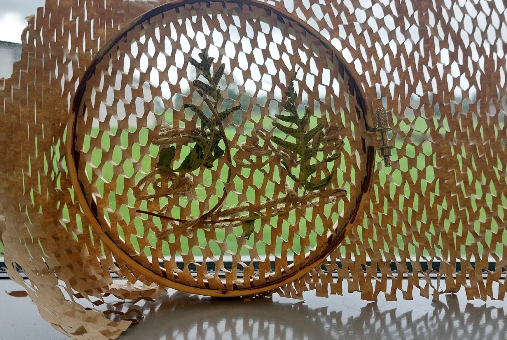
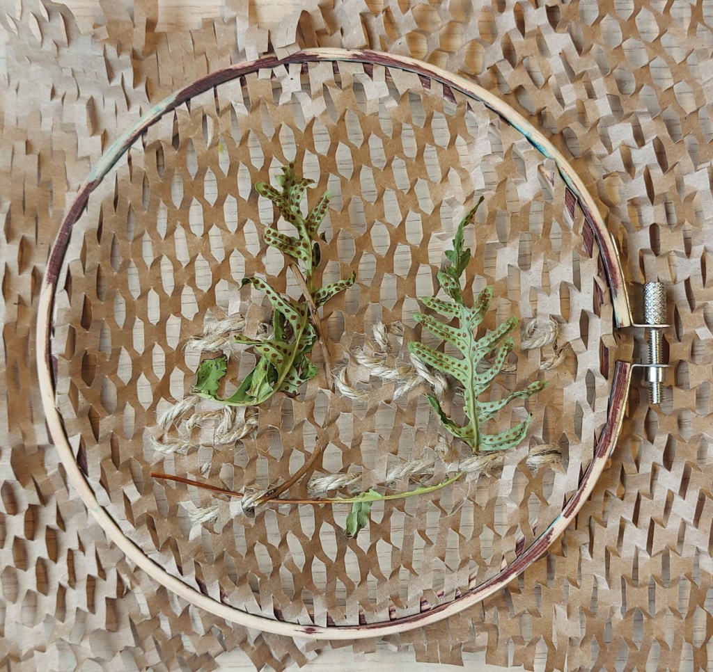
Week beginning 29 September: Workshop (textiles)
To interpret the object in textile I brought in paper packing material and hemp garden twine, both natural materials. I selected them to mirror the repetitive patterns of the cone, its rough texture and its organic composition. Using a large darning needle to stitch the twine through the holes in the paper like tapestry wool on canvas. It was necessary to use an embroidery hoop to keep the surface flat and even – there was a risk the paper would break with the pressure applied by i 1nserting the hoop but it proved strong enough. The results were mixed. The twine was a little too thick to make the stitches I intended and it’s weight was out of proportion to the delicacy of the paper, strong though it was. It was difficult to get it sufficiently taut without distorting the surface. I tied flat reef knots in the reverse but this made the stitches look bulky. The monochrome brown on brown was what I was looking for but thinner twine or even cotton string would give a more delicate effect and be easier to work with. Another stage might be to wrap lighter embroidery thread around the string or twine to show highlights/variations in tone.
Packaging material, garden twine, small twigs


1Week beginning 29 September: Sketchbook

In contrast to the rather crude, stylised gouache paintings on the left, the fineliner/gouache wash drawings of extreme close ups of the cone’s scales on the right were deliberately graphic and literal in order to continue exploring techniques. I found them very unsatisfying but doing them helped me clarify the kind of direction I do not want the work to take.

Conte crayon (left) and graphite extra large block/conte crayon (right). These are my favourite drawings so far, particular the black one bottom right, done last, as they have some energy to them rather than being flat and inert like the previous ones. They were each finished within a maximum of 2 minutes. I also like the the rather chunky brown one on the right even though the way I applied the graphite block using its flat side blocked out the spaces between scales. While not a particularly accurate or accomplished drawing, it at least has some life about it.
Week beginning 6 October: Workshop (monoprinting)
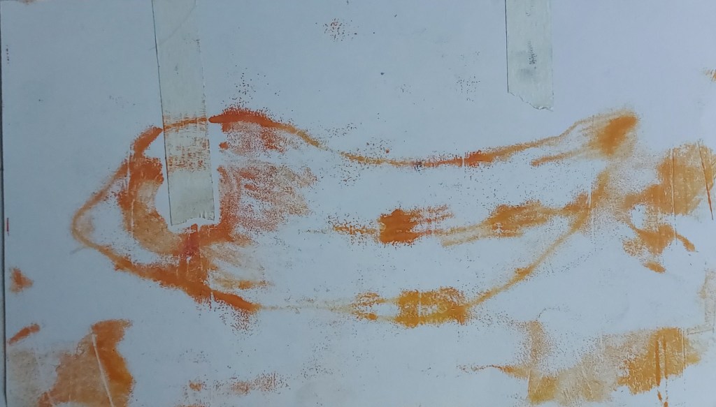
Using gelli plate with acrylic paint and sheets of newsprint inked with etching ink and drawn on reverse to make monoprints.
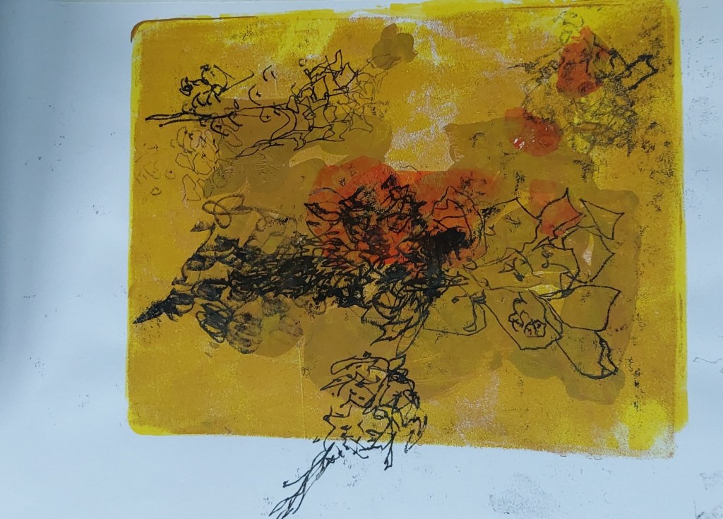
First layer yellow ochre on whole plate. Second layer yellow ochre applied in patches to plate with broad paintbrush strokes. Third layer cadmium orange applied with brush in blobs. Fourth layer newsprinted inked in sepia and drawn onto with combination of pencil point, pencil side, pencil end and flat side of conte crayon. Didn’t realise I had gone off the edge with drawing on bottom as didn’t watch carefully for what I was doing.

Monprint from drawing on reverse of black inked newsprint onto sketchbook.
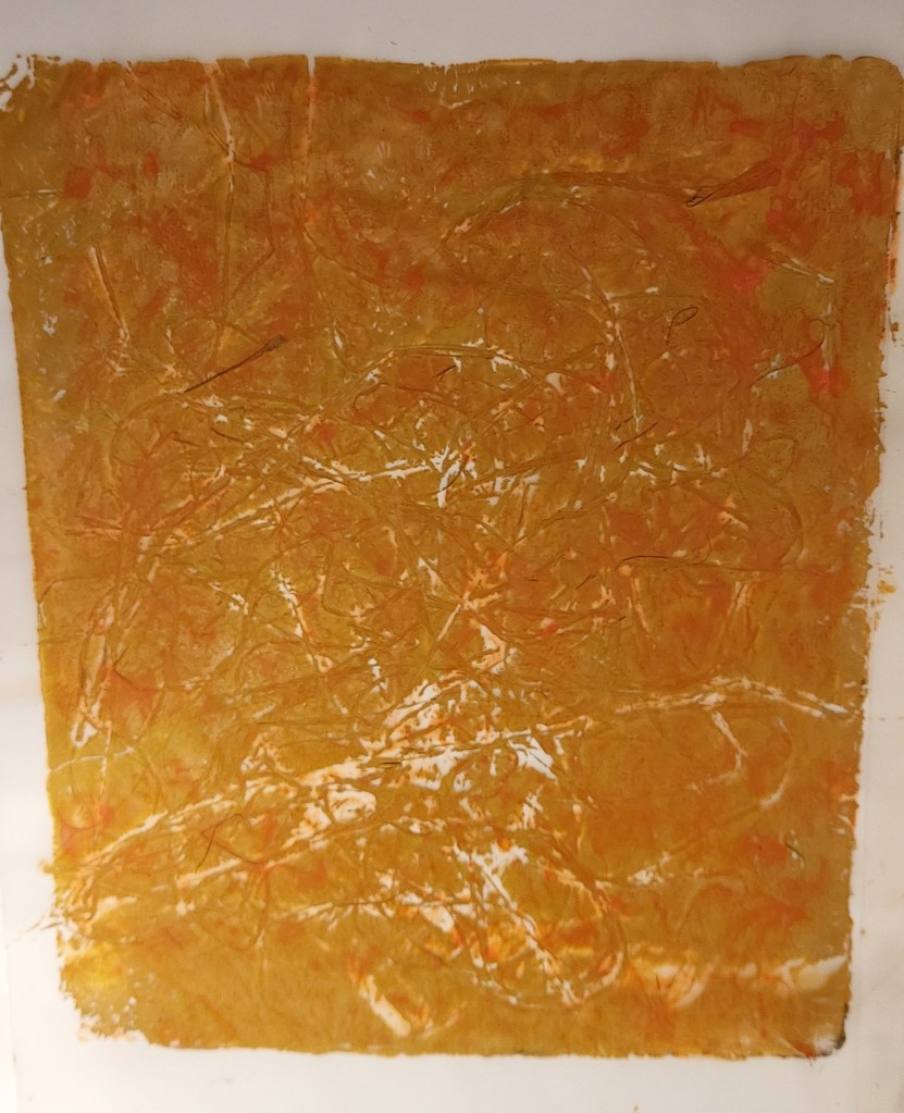
Strands of hay applied to yellow ochre rollover on tracing paper. Hay pulled off and second layer cadmium orange with more hay applied. Took longer to dry and became wrinked, leaving areas uninked as wet paint ran off the imprints of hay. When dry put between pages of sketchbook and it flatened out again. Considering whether to draw on top using inked newsprint, maybe one large drawing over the whole.
Week beginning 6 October: Sketchbook
Thinking of historical/symbolic significance of the pine cone and came across its use as a symbol of fertility.
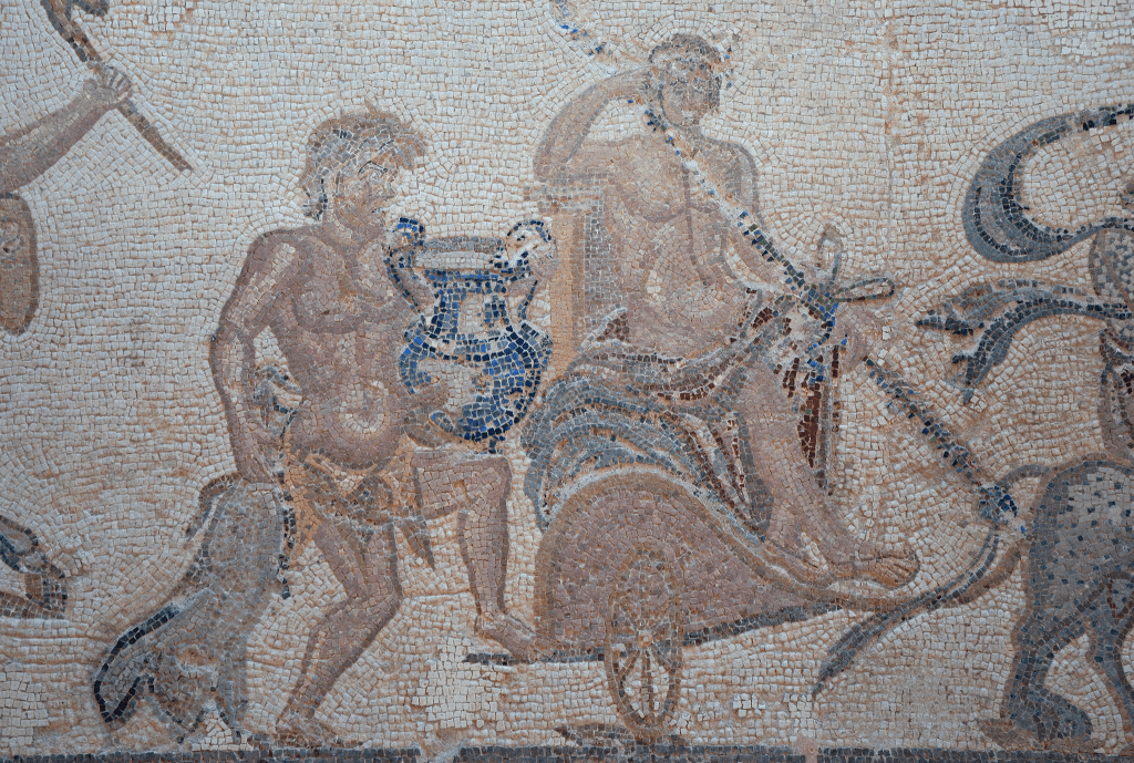
The Triumph of Dionysus, mosaic, Paphos, late 2nd/early 3rd century.
Dionysus typically depicted carrying a thyrsis, a staff made of giant fennel covered in vine leaves of tainia (a kind of ribbon worn at festivals or wound round cult objects) and topped with a pine cone. Carried by devotees of his cult and symbolising prosperity, fertility and hedonism. Perhaps not so strangely, the symbol has also been adopted by the Christian church and some papal ferules have been topped by a pine cone as well as orbs and crosses.
Religous/mythology
Greek/Roman beliefs carried over into Roman church.
Celtic – pine cones represent regeneration.
Resemblance to pineal gland – shaped like a pine cone, modulating responses to light, sleep patterns, circadian rhythms just as pine cones close in the dark and open in the light. Often called ‘third eye’, linked to spiritual enlightenment.
Decorative/architectural – archetypal? – forms
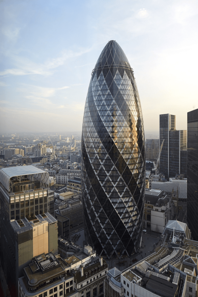
The Gherkin, London, 2003 (Foster and Partners) more closely resembles a pine cone than a gherkin
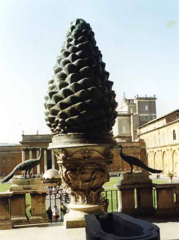
La Pignone, Vatican, 1st C
Began to get interested in pine cone seeds. See also research in Pine Cones page.
Some of my thoughts about what the pine cone means and what it means to me. Interesting that the particular species to which my cones belong is a massive, invasive destroyer of habitats when transplanted out of it’s native environment – it’s a particularly greedy consumer of precious water. Reminds me that I also dislike being out of my native habitat and no doubt also over-consume natural resources whenever I leave it.
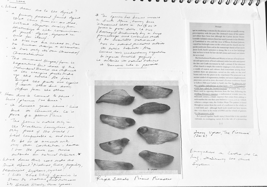
Remembered I had Jenny Uglow’s The Pine Cone (2013) on the bookshelf at home but hadn’t read it before. Plan to visit St Mary’s, Wreay near Carlisle the location on which the book is based.
Cones fan out in a Fibonacci spiral sequence in both directions, its growth factor being Phi (the Golden Ratio).
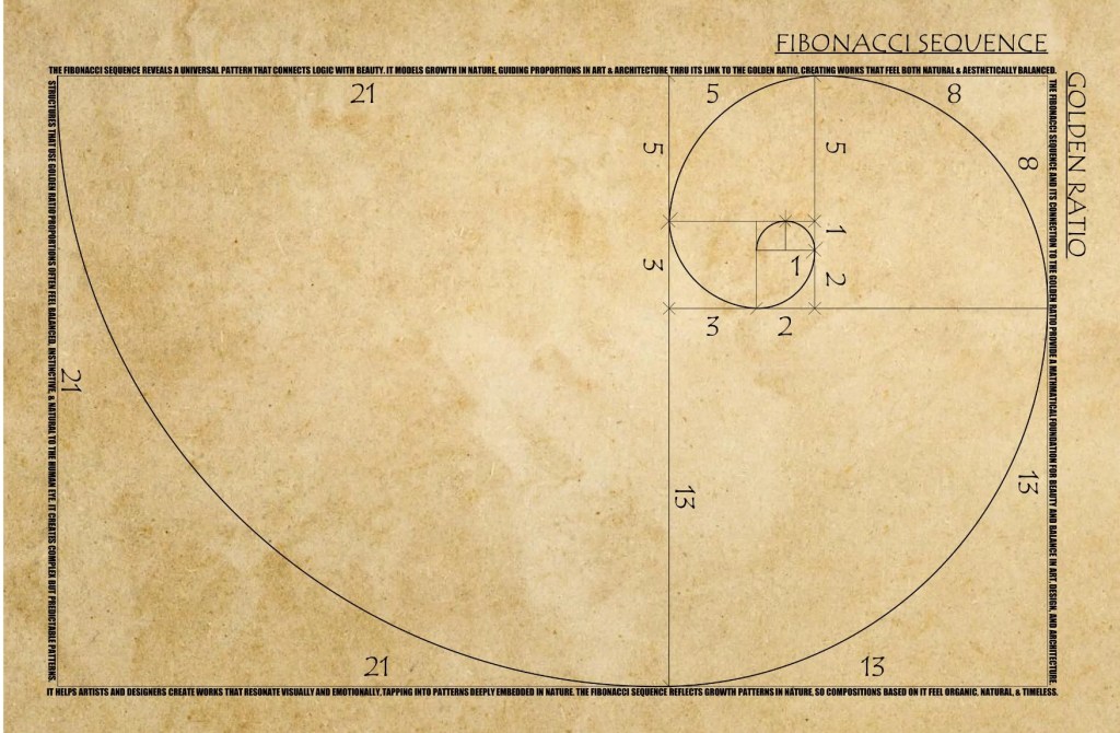
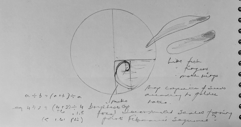
The pattern of pine cone growth accords with the Fibonacci sequence – very close to the the golden ratio (or golden spiral) of Phi. The spiral can also be found within the golden triangle. For each quarter turn the spiral makes, it gets further from the origin by a factor of Phi (1.68). Two quantities are in golden ratio when their ratio is equal to the ratio of their sum to the bigger quantity. Used as a principe of ‘perfect’ picture composition and nearly always in architecture.
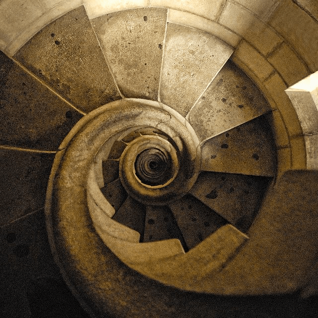
Staircase in one of the towers of Gaudi’s Sagrada Familia (found this in article ‘The Behemoth’ in the New Yorker of 6 October).
Mondrian used it in his geometric compositions and his work has been linked to that of af Klint (eg in ‘Hilma af Klint and Piet Mondrian, Forms of Life’ at the Tate in 2023).
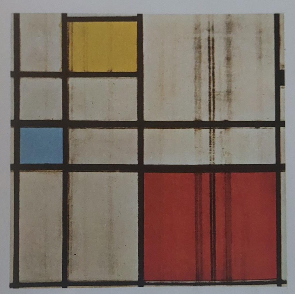
Piet Mondrian, Unfinished Commposition with Yellow, Red and Blue 1939-44, Oil and Charcoal on canvas
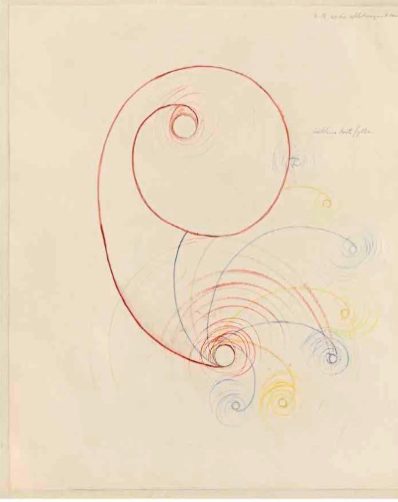
Hilma of Klint, study for Paintings for the Temple, 1906-15. Organic forms exploring spirals as sacred geometry, connecting the golden ratio to principles of cosmic order. The ‘mother’ of abstraction?
Hilma af Klint, Birch, 1922
Hilma af Klint, Guggenheim New York, 2018
Every seed different. Follow same design but individuated in form.
Top to bottom: fineliner, Conte crayon, charcoal
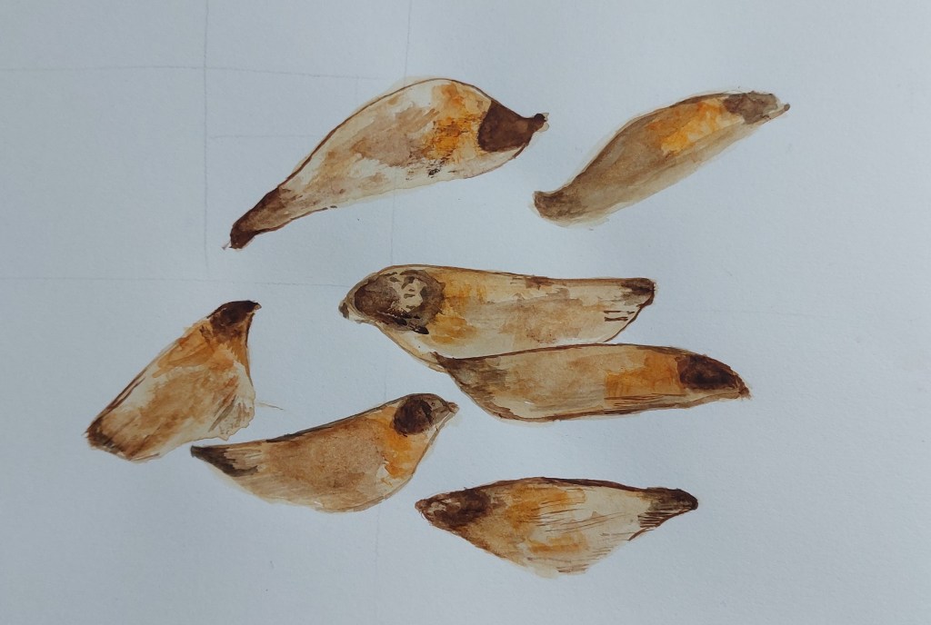
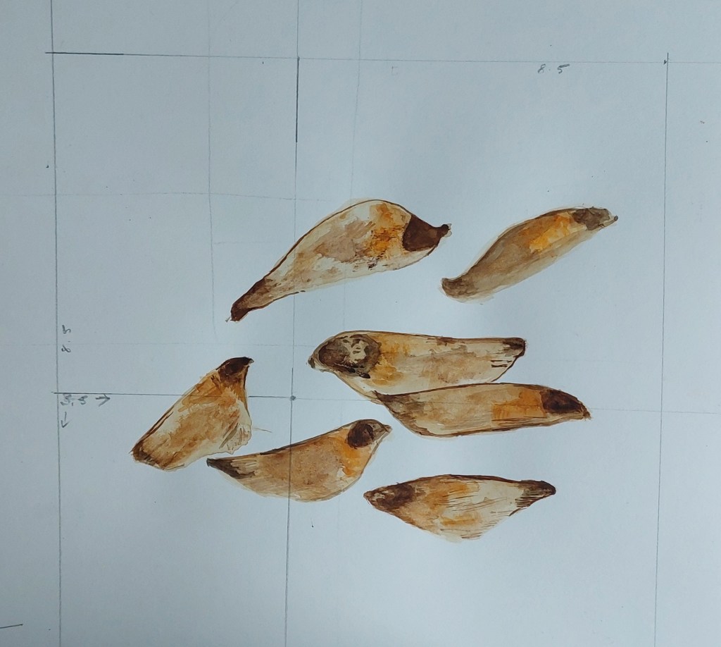
Pine seeds, watercolour painted directly onto sketchbook. I measured and drew the grid after finishing, having tested myself to see whether I would instinctively compose the seeds according to the the golden ratio. The seeds are arranged in a spiral and focal point of the picture is fairly near the intersection of the measured grid lines.
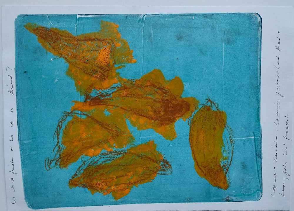
Experiment with gelli plate. Made hinge before printing. Second layer mixed up cobalt and viridian with heavy gloss gel and painted onto plate then lifted print. Added shapes with oil pastel . Very rough and ready but first attempt at abstracting from pine seeds in paint (neither fish nor bird but congruent outline).
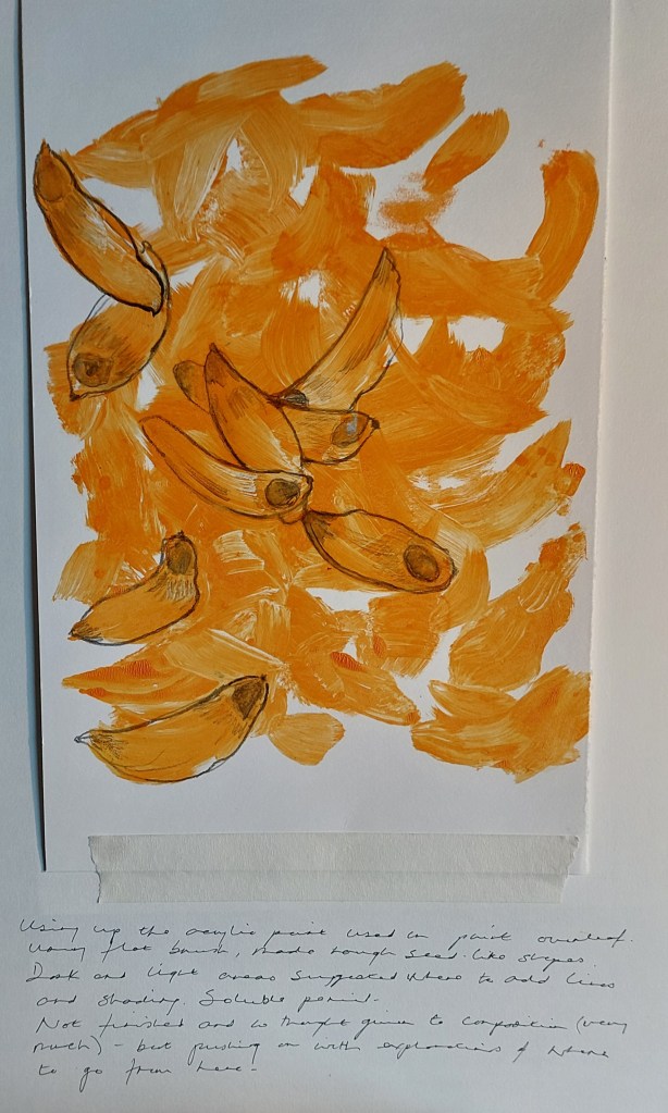
Left over paint from print, applied in broad strokes, lines drawn in soluble graphite. Thinking spontaneously of composition of objects as shapes emerged.
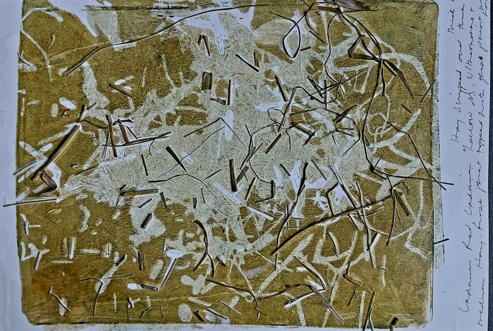
Mixed ultramarine with the cadmium red, cadmium yellow mix left on palette and added a little acrylic medium. Snipped thick and thin bits of hay to resemble needles and sprinked semi-randomly over plate. Rolled over and pulled print (having registered the paper). Too white in the middle so rolled the same hay on plate again and lifted ghost print on top of the first layer. Some of the hay stuck on the paper so decided to keep it there and brushed over diluted pva to glaze.
Monotype Printmaking for Beginners – Jackson’s Art Blog https://share.google/Re7XXXcaLk1GXnY1k
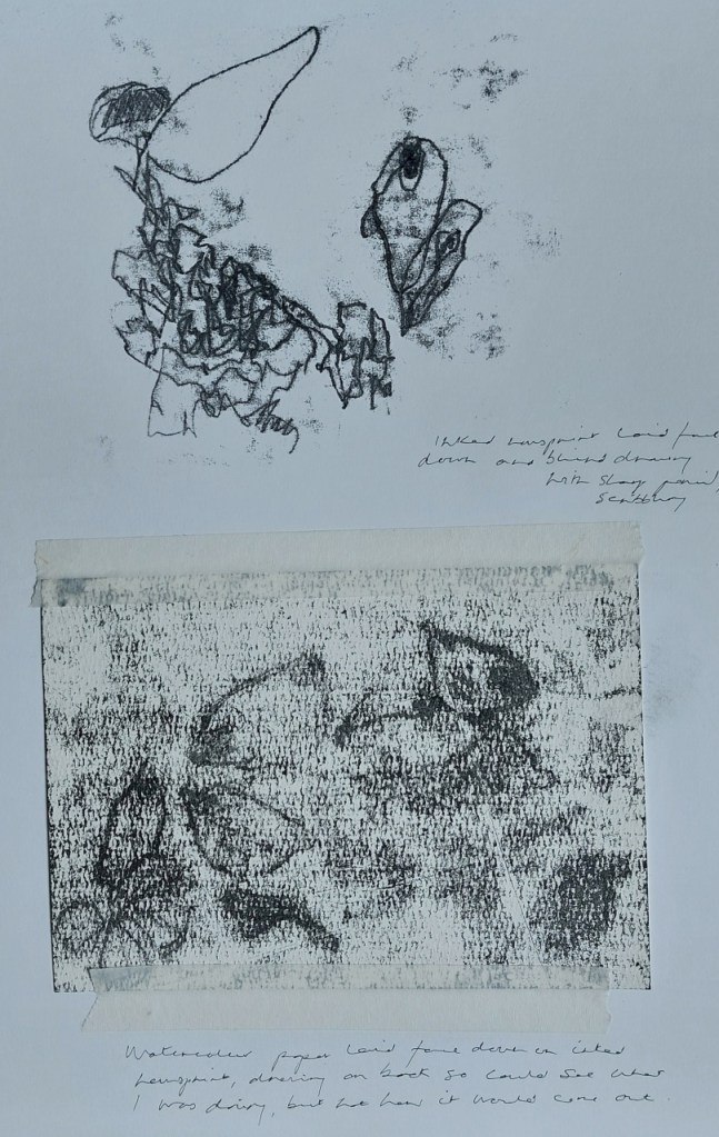
First print was inked newsprint laid face down on the paper and blind pencil drawing on the back. Second print on watercolour paper laid face down on the inked newsprint. This time I could see what I was drawing but not how it would turn out. The watercolour paper does not take up the ink nearly so well but I needed to see what effects would be achieved. Random patterns in the grain of the paper – like the fuzzy appearance.
Week beginning 13 October: Reseach/portfolio plan
As the experiments have progressed, I find myself thinking more and more about formal elements: composition, line, colour and find myself drawn towards early modern abstractions by Klee and Miro in particular. Colour, line, form, composition – not representation of objects. Both interested in the unconscious. As with af Klint, notions of the elemental meeting the transcendental.
Bridget Riley explains abstraction as:
Klee was the first artist to point out that for the painter the meaning of abstraction lay in the opposite direction to the intellectual effort of abstracting; it is not an end but a beginning. Every painter starts with elements – lines, colours, forms – which are essentially abstract in relation to the pictorial experience that can be created with them.
Bridge Riley, ‘Making Visible’ in Paul Klee: the Nature of Creation (Hayward 2002) p 15
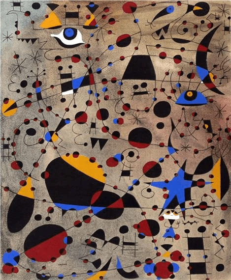
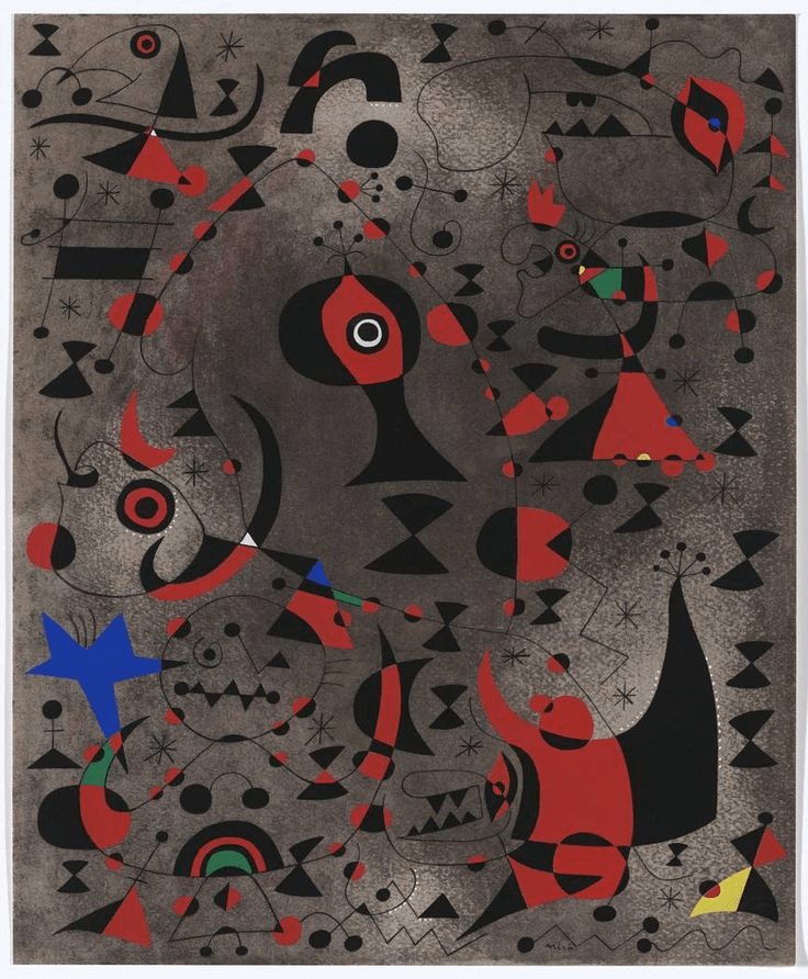
Joan Miro, Constellations 1940. Gouache and mixed media series of 23
[The series of paintings) were based on reflection in the water. Not naturalistically — or objectively — to be sure. But form suggested by such reflections. In them my main aim was to achieve a compositional balance. It was a very long and extremely arduous work. I would set out with no preconceived idea. A few forms suggested here would call for other forms elsewhere to balance them. These in turn demanded others. It seemed interminable. It took a month at least to produce each water color, as I would take it up day after day to paint in other tiny spots, stars, washes, infinitesimal dots of color in order finally to achieve a full and complex equilibrium. — Joan Miró 1948.
Sweeney, James Johnson (1948) Joan Miró: Comment and Interview. Partisan Review. 15(2) 206-212
Miró described some of his methods while working on the series —
After my work [oil painting] I dipped my brushes in petrol and wiped them on the white sheets of paper from the album, with no preconceived ideas. The blotchy surface put me in a good mood and provoked the birth of forms, human figures, animals, stars, the sky, and the moon and the sun. I drew all this in charcoal with great vigor. Once I had managed to obtain a plastic equilibrium and order among all these elements, I began to paint in gouache, with minute detail of a craftsman and a primitive; this demanded a great deal of time”.
Penrose, R, Miró, (New York, 1969) p 100
Joan Miro, Triptych Bleu I, II, III, 1961
Klee’s aphorism that ‘a line is a dot that went for a walk’ is manifest in almost all his works. Observation of nature informed his work thoughout his career and his use of colour theory, symbolism and line work inspired by musical rhythms and natural forms combines the abstract and the figurative. For Klee, there was complete affinity between colour and sound.
He was a major influence on Miro and they shared an interest in prehistoric art and childrens’ drawings – reminding me of Picasso’s saying that ‘it took me four years to paint like Raphael but a lifetime to paint like a child’.

Paul Klee, They’re Biting, 1920, Oil transfer drawing and watercolour on paper mounted on card
Paul Klee, Dance of the Moth, 1923, Oil transfer drawing, pencil and watercolour on paper with watercolour, pen and gouache marginal stripes, mounted on card
Strong use of line on colour harmony ground.
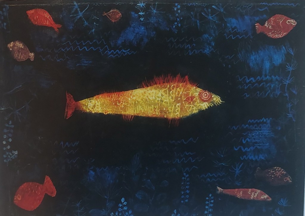
Paul Klee, The Goldfish, 1925, Oil and watercolour on paper
| Books I have been consulting: Gayford, M How Painting Happens (and why it matters (Thames and Hudson, 2024) Kudielka R, Paul Klee: The Nature of Creation: Works 1914-1940 (Hayward, 2002) Partsch S, Klee (Taschen, 2003) Lesberg S (ed), Abstract Art (Peebles, 19740 |
Week beginning 20 October: Sketchbook/Workshop zinc etching/aquatint Gracefield
Preparation for workshop – prepare drawings, get preliminary understanding of process
https://www.jacksonsart.com/blog/2025/05/05/introduction-to-aquatint-printmaking/
Examples of etching/aquatint
I chose these examples because they are examples of a very wide variety of techniques within the same medium and showing the wide range of possibilities within the apparent constraints of fine lines etched on a plate and tonal variation achieved through the use of aquatint. From the rapid, seemingly haphazard lines of Klee and Miro to the more painterly marks of Baselitz to the graphic, more illustrative qualities of pieces by Picasso and Rego.
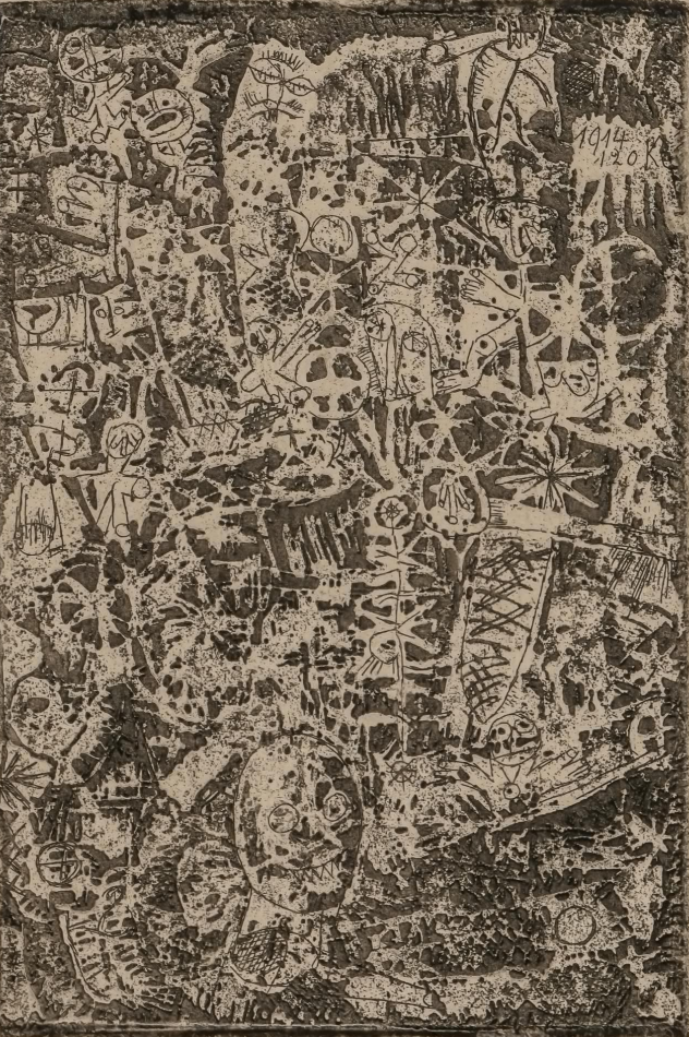

Paul Klee, Kleinwelt: From Die Schaffenden (Kornfeld 61 B b), Etching and aquatint on Japon paper (1914)
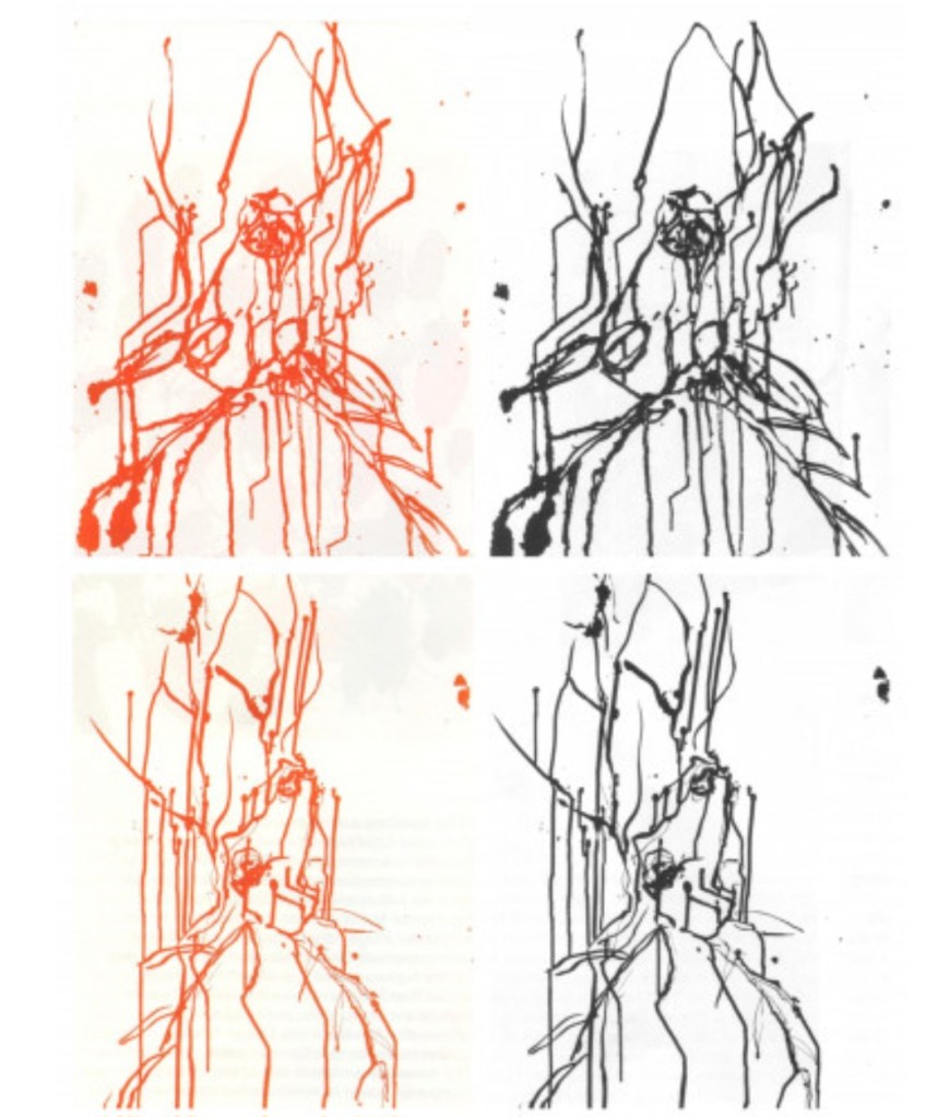
Joan Miro, Abstract Composition, 1965
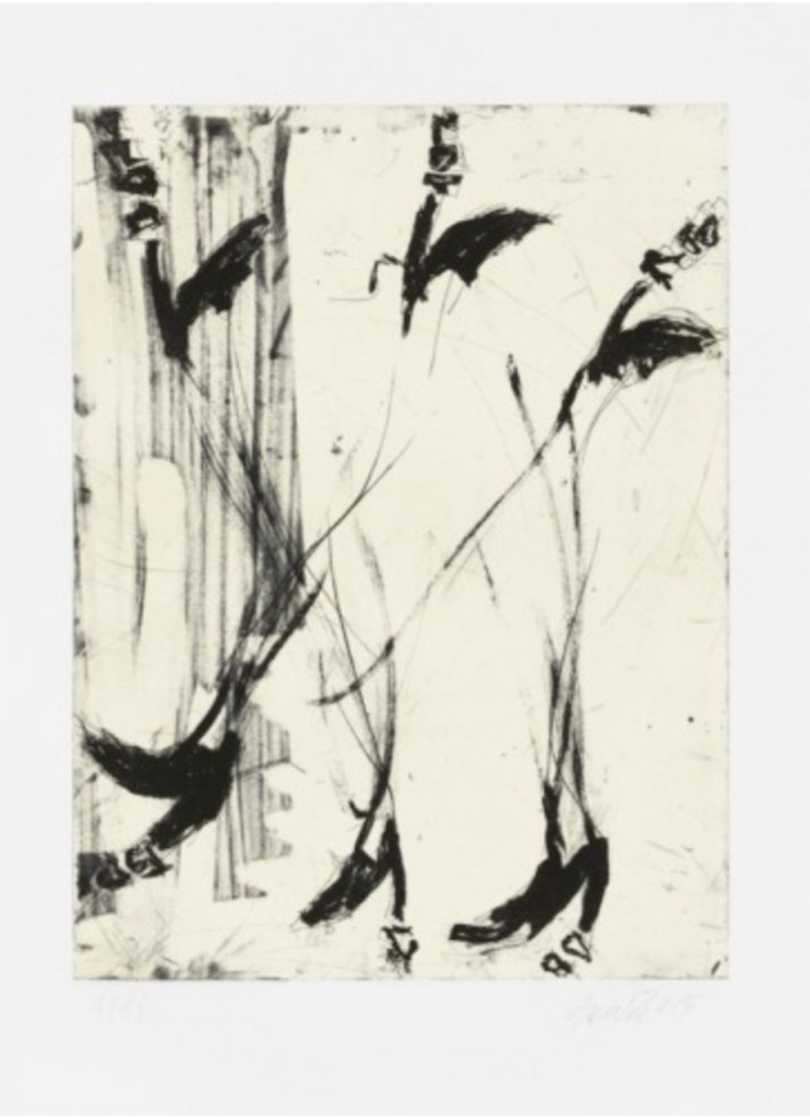
George Baselitz, Kirsch (set of 4), 2022
George Baselitz, Sono sei piedi, 2015
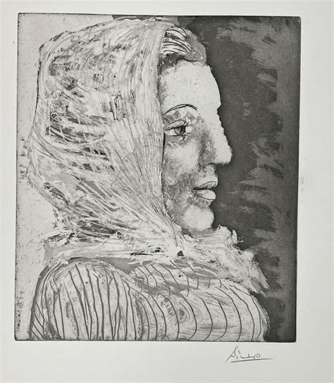
Pablo Picasso, Bust of a Woman with Scarf (1939)
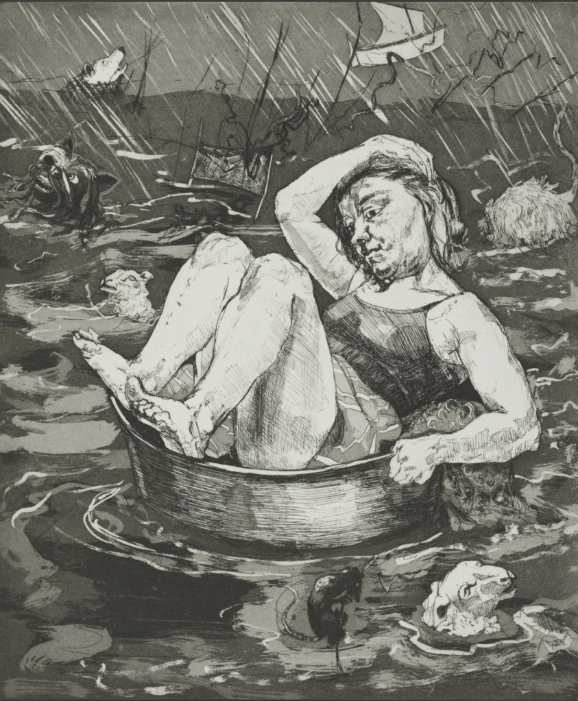
Paula Rego, Flood, 1996 etching and aquatint
Experiments for zinc plate images
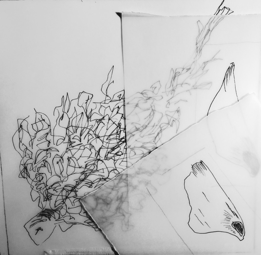
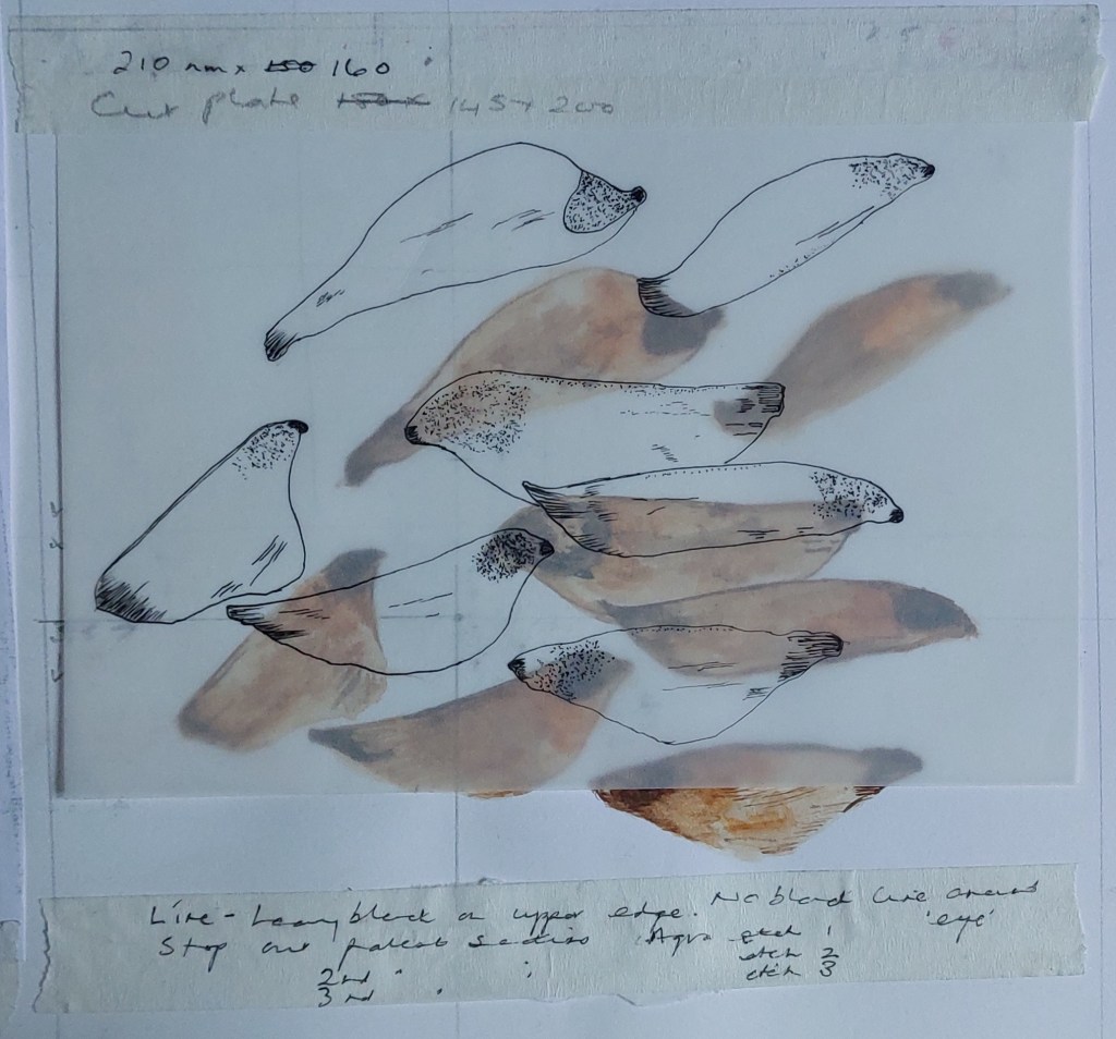
Found earlier drawing that fits within 15 cm square plate and copied using fineliner pen at same scale. Might add seeds. Hoping to make a fresh image though interested in the possibility of a sgrafitto approach to etching. However, chose this mainly as a backstop in case I don’t manage to come up with anything else for the workshop on Saturday.
How to expand the subject in a way that still understands and represents its form? Collapsed into comfort zone and drew sprig found from pine tree in the field. Medium wash pencil with fine wet brush over the top.
Frustration with problems of composition. Daunted by drawing out actual Fibonacci spiral as I’m no good with maths and anyway can be done later once I know more about what I’m looking for and why.
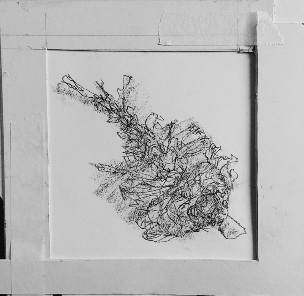
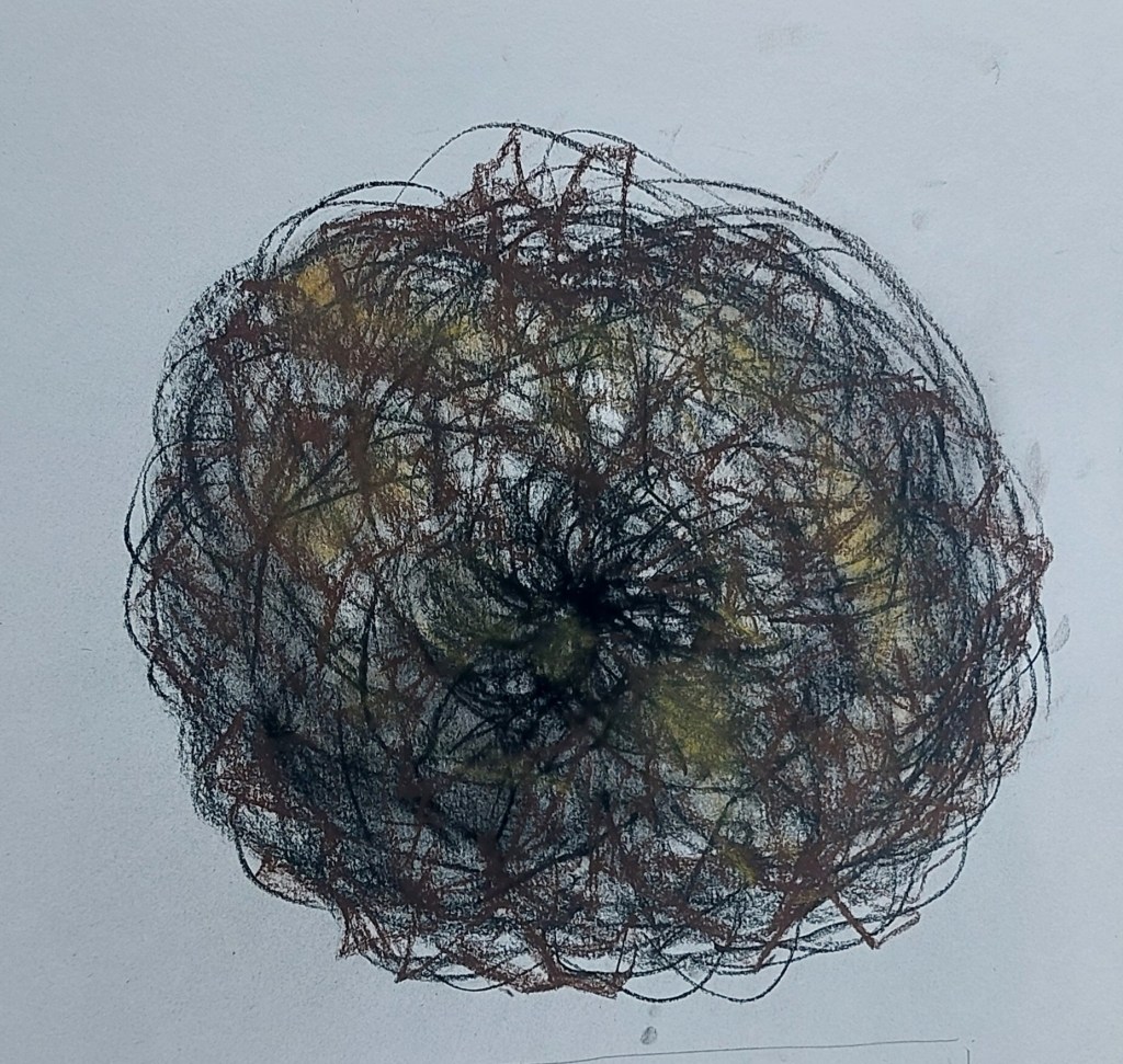
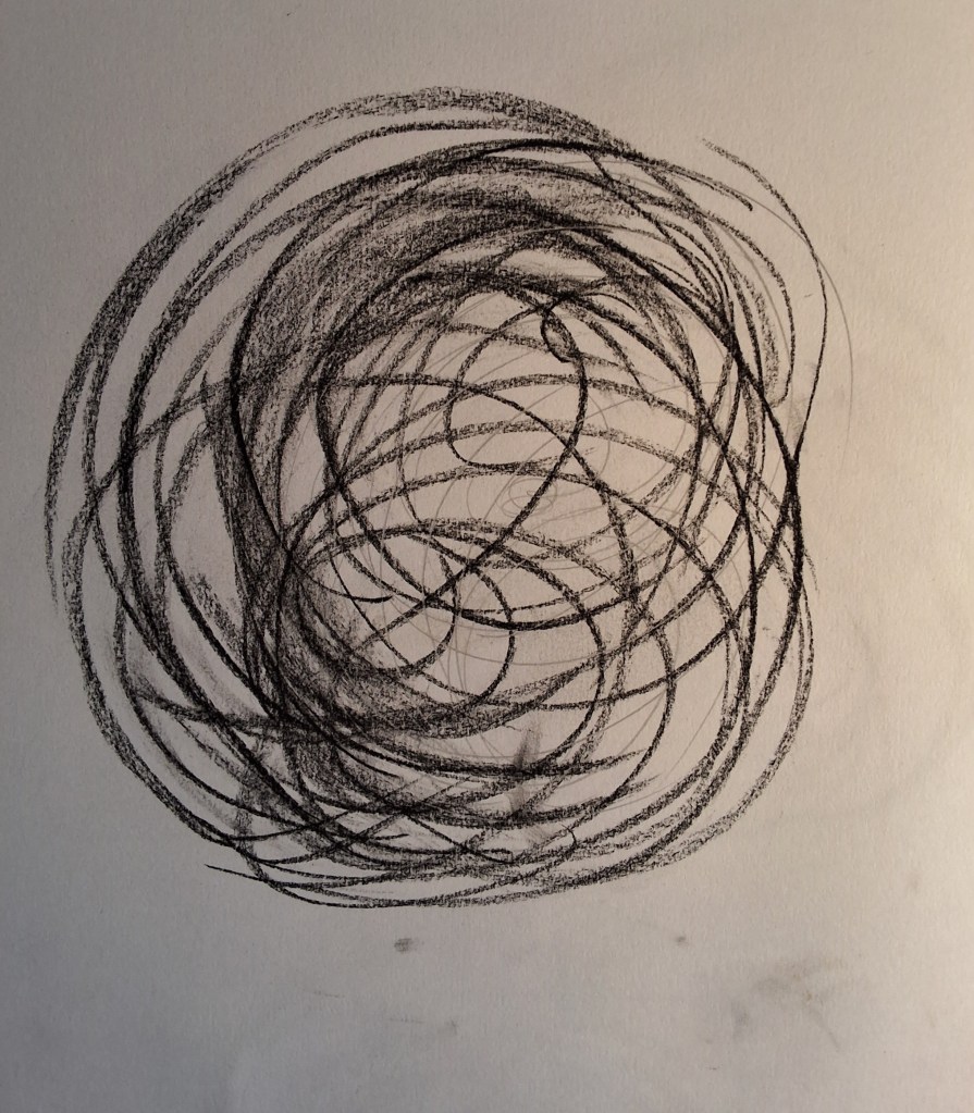
Began really looking at the spirals making up the scales on biggest (female) cone end on. Started with pencil inside 15 cm square frame then just went a bit mad with conte crayon – black, sanguine and yellow. Spirals may need to more carefully calculated/accurate but feel I’m getting somewhere. Trying to stay within 15 cm frame for printmaking.
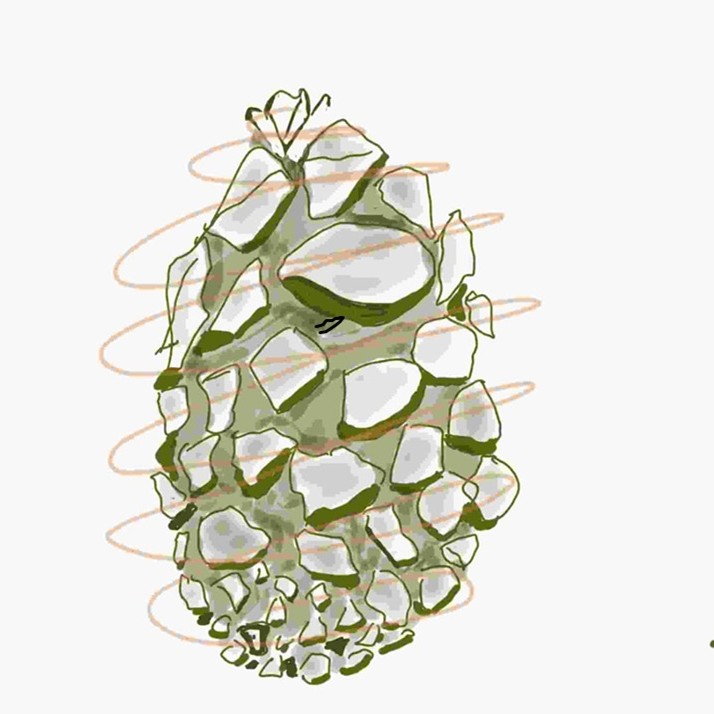
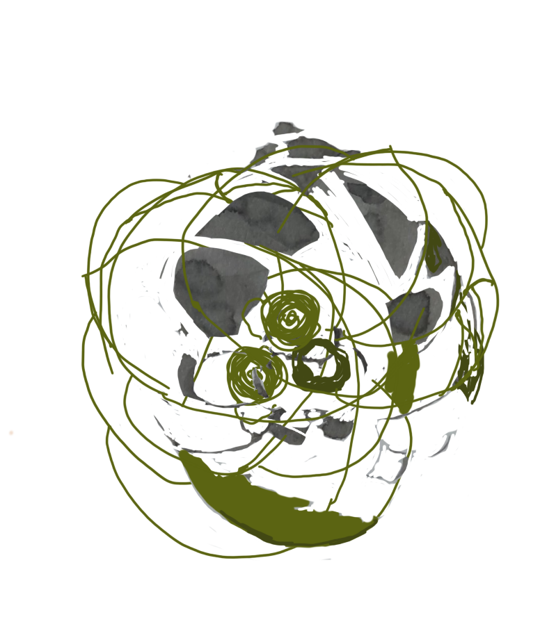
Played about with Sketcbook app. Drew freehand onto the tablet and added layers of tone to create volume. Uploaded and drew a cone in various layers – final below left. It’s far too stylised and I don’t like it at all – it’s very dead looking and not at all interesting. More like a cartoon. not what I want to achieve.

The image on right was a brush and ink drawing uploaded to Sketchbook. It was then manipulated, adding linear spirals, deleting sections and adding colour. The scribbled circles in the centre remind me of Margaret Macdonald’s rose motifs.
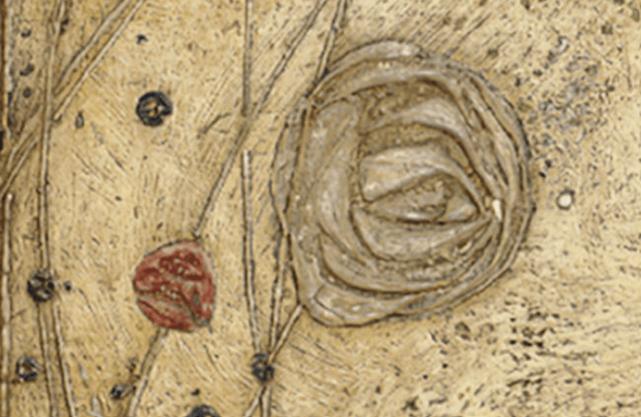
Margaret Macdonald, detail from The White Rose and the Red, 1902
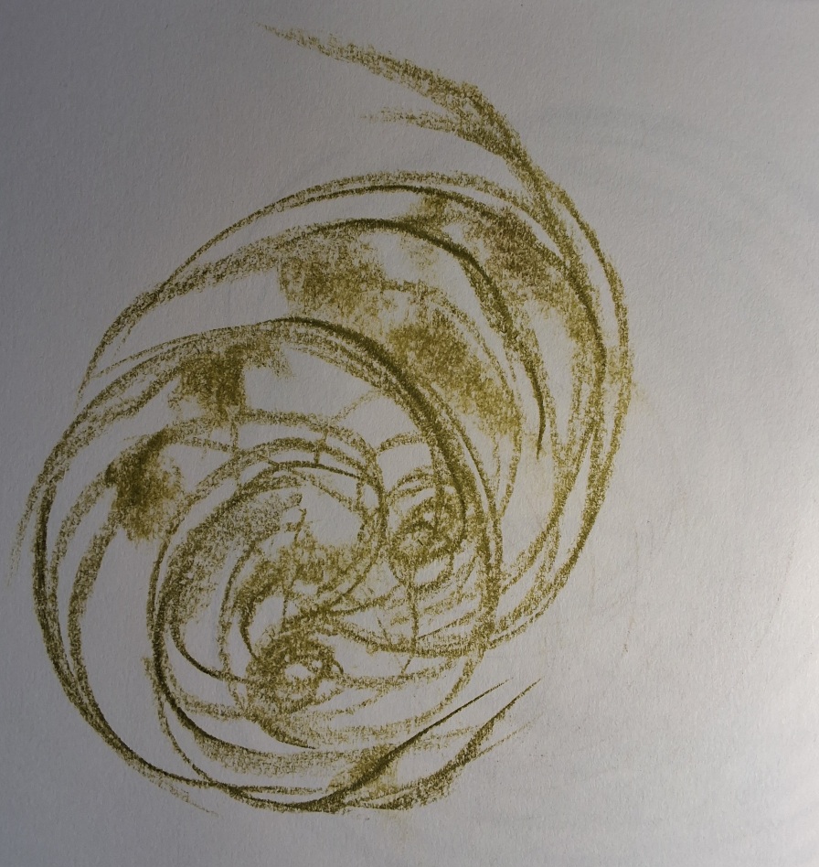
Not liking anything so just made marks hoping for a more dynamic feel. The drawing on the right is my favourite so far. Conte crayon applied heavy and light in spiral movements of whole forearm, imagining looking through the cone from the bottom with light filtering through from the top. Enjoying the physicality of the piece and want to work on this more, once I have explored more graphic approaches to printmaking through etching.
Zinc etching and acquatint workshop, Gracefield Arts Centre 25 – 26 October.
Very informative and experimental, discovering the possibilities of the medium. Trying linear and tonal effects with some stopping out. Not happy at all with the quality of the images or the composition but I deliberately drew very different kinds of images onto the plate to get a taste of what would happen in each case – a very valuable experiment. Have reflected on both the process and the outcome and think it possible that clearer, more graphic lines would be more appropriate at this early stage. Will try again during the week.
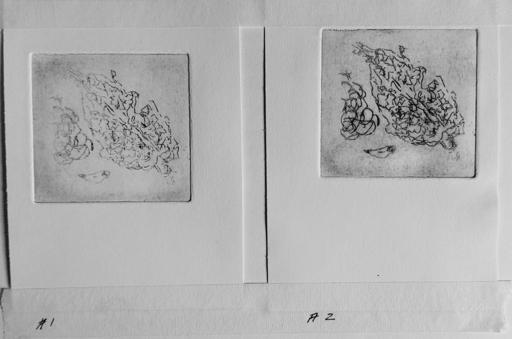
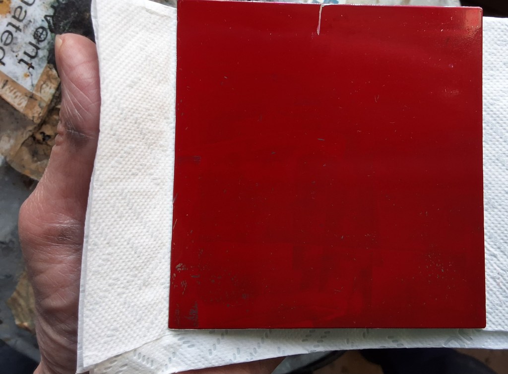
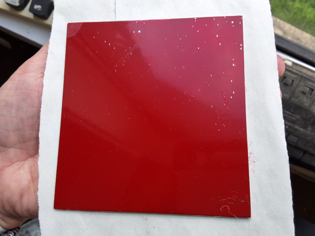
Test plate before aquatinting. Insufficient time in the etch the first time even though had 16 minutes. Cleaned plate and re-etched another 6 minutes to discover whether too pale because lines not scratched deeply enough as result of resist ground applied too thick or faulty inking. Better the second time – definitely caused by the lines not being deep enough and nothing to do with the inking.
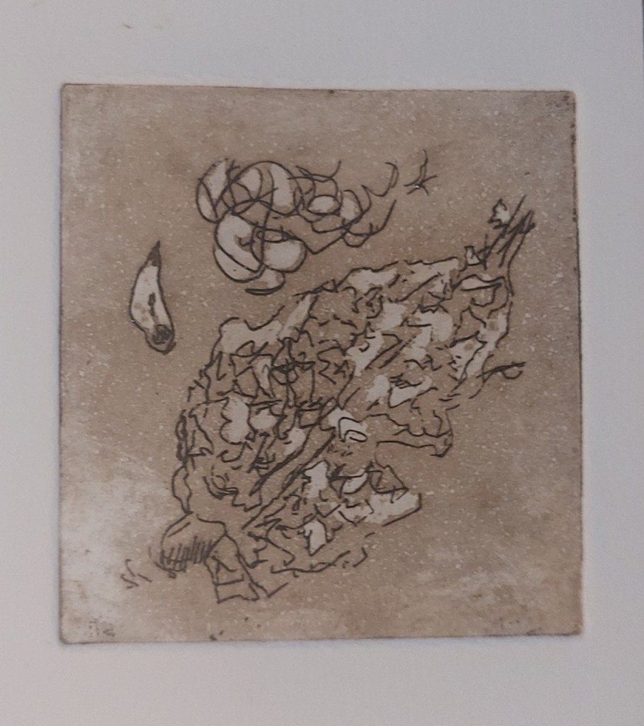
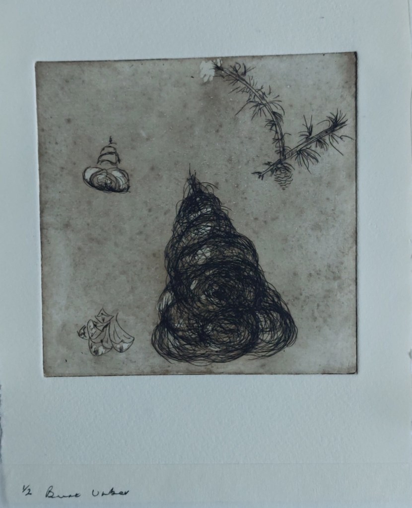
Test plate (above) and larger plate (right) after aquatint partly stopped out, printed in Burnt Umber oil based ink.
Week beginning 27 October: Sketchbook/Workshop zinc etching/aquatint Gracefield
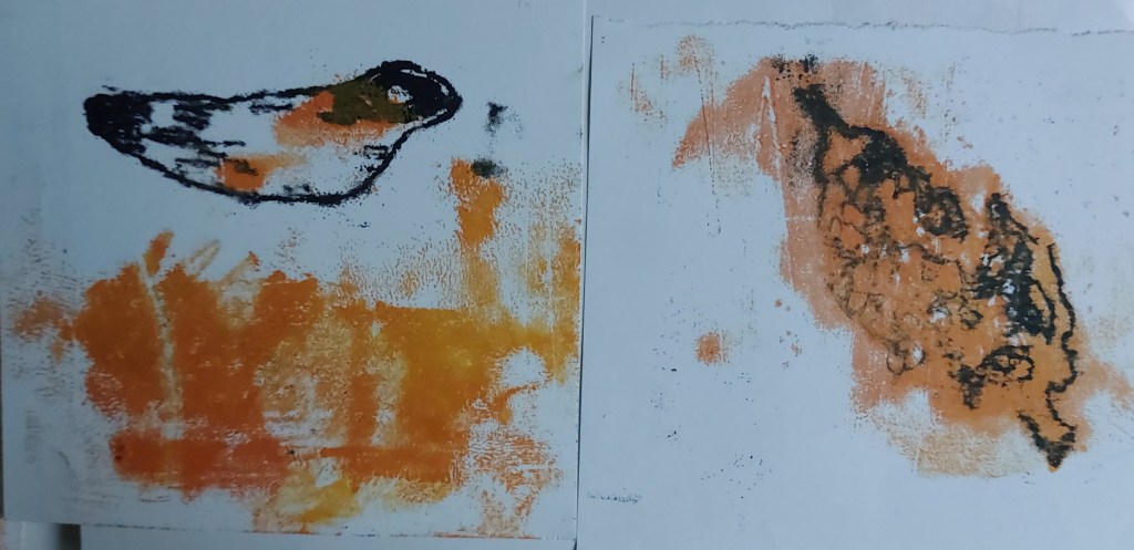
Tried more experimenting with monoprint using coloured ink. This time tried inking the plate and tracing over image – not so successful as inking paper and turning it upside down onto paper as far messier and less precise.

Bought a 250 x 200 zinc plate. Chose a very graphic image from my sketchbook and decided to use the same scale on a plate 145 x 200 mm and , leaving two smaller pieces of the plate for further tests. Figured out in theory how to achieve layers of tone using aquatint but not sure how well this can be planned in advance until I try it. Hoping that stippling very closely with etching needle with achieve blackest blacks though want it to be fading at edges of ‘eyes’.
Joined the Gracefied print studio and hired it for an afternoon session on 29 October, teaming up with wth two other people from the workshop last weekend to experiment further with etching zinc plates. I only got as far as cutting, filing and coating two test plates with BIG resist because it took a while to find everything we needed and it was taking so long to ‘cook’ on the hotplate – around an hour more than planned. Hotplate was too hot to start with and the resist started bubbling – will be interesting to see what happens to it in the etching process. Also scratched and got a fingerprint on one while moving it with small palette knife off the hotplate while still tacky. Quite a lot of cleaning up time too. Not sure the result is going to be worth the hassle of preparing the plates.
While waiting, had very interesting discussions about what effects we were all looking for and different etchng possibilities. Am interesting in trying to make images with aquatint only, possibly in the manner of Norman Ackroyd though it may be that the blackest blacks onlypossible with carborundum. Have arranged to meet again in the Gracefield studio on 14 November.
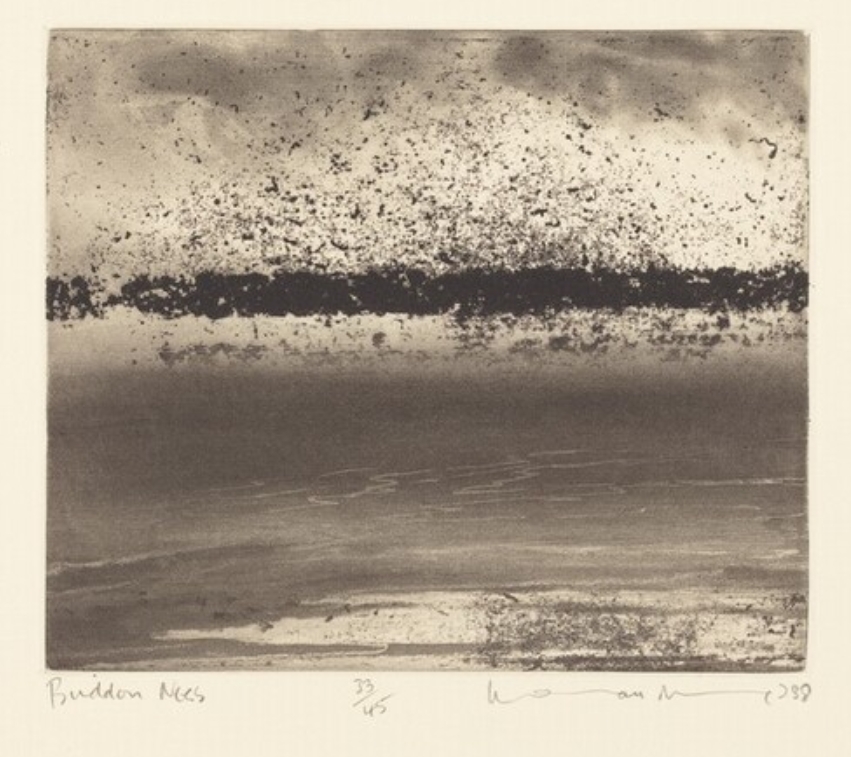
Norman Ackroyd, Buddon Ness, aquatint 1988)
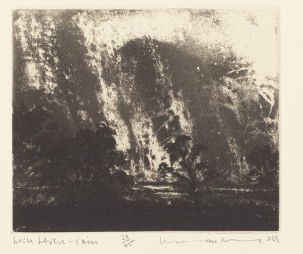
Norman Ackroyd, Loch Leven, Rain, aquatint (1988)
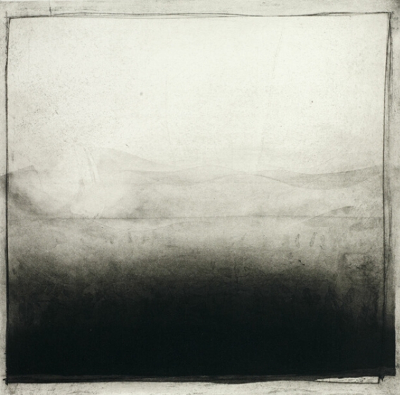
Norman Ackroyd, Nevada, aquatint (1970)
Trying out finer lines again – looking forward to the next phase of work trying to develop my concept, understand more fully and work through apparent conflicts between:
- fine, loose line work and heavy gestural marks/tone
- figurative and abstract or semi/abstract interpretations
Portfolio plan
The direction of work that has evolved over the session has been to consider how to represent and how to be inspired by the pine cone and its characteristics. Explorations of the pine cone and its seeds in the sketchbook have provided a range of possibilities for further work. Abstracting from a subject such as a pine cone rather than reproducing it figuratively presents a major challenge. The work is now heading towards further exploration of the visual elements of composition, using simple, repeating organic forms (that have proven not to be so simple after all), with the aim of resolving the problem of moving beyond purely graphic representations of the object to more haptic and energetic interpretations. In terms of medium, I am beginning to focus on printmaking. I have been looking a printing throughout the session. To some extent my interest was triggered by attending the ‘Great Print 10’ exhibition of printmaking at Rheged over the summer.
I have begun the process with some simple monotypes and now intend to explore working in intaglio and, in the process, developing skills in different techniques. There are a few challenges with printmaking that I will try to explore. The first is to experiment with intaglio printing to include ‘painterly’ images and to contrast this in my own work with its use as a medium more usually suited to more graphic, linear forms. The prints I have looked in particular at works by Picasso, Miro, Klee, Baselitz, Rego and Ackroyd. I am particularly interested in the contrast/overlap between linear and painterly approaches to printmaking- they exemplify for me how technique and medium differ but can also overlap (though I have selected only those of their works which show this clearly as they each adopt very different styles). A second, more technical, challenge is to achieve tone and colour as well as line. This would be simplest with monochrome prints but I intend to explore how to do this in intaglio or a with a combination of techniques; for example, etching over monotype or hand colouring.
As well as the publications cited in the sketchbook, printmaking books that have inspired me over the last few weeks include:
Jacklin E, The Art of Print: From Hogarth to Hockney: Three Hundred Years of Printmaking (Tate, 2021
Stanfield F and McGeown L, The Printmaking Ideas Book (Ilex, 2019)
This work is also informing the development of my ideas, both conceptually and technically, for the Creative Practice Project since this means that I can continue to pursue the process started in this course into the next trimester. It feels impossible to me to work on more than one broad idea at a time so working on the two courses together allows me to pursue my particular lines of enquiry and focus more deeply on them than if I were to try to work on entirely different concepts. Similarly, I will also be looking at printmaking in my Visual Arts in Context work, specifically the figurative printmaking of Paula Rego in her illustrative interpretations of Jane Eyre.
I will continue for the rest of the trimester to focus on the pine cone as my specific subject matter, using sketchbook work so far as a resource and a starting point, but may also investigate other organic forms in order to test techniques. I will aim to produce a further small collection of prints and drawings which will further explore – though not necessarily resolve – the issues outlined above.
A provisional outline of a timescale for further development is:
| Week beginning 20 October | Continue sketchbook work. Attend zinc and aquatint etching workshop at Gracefield. Attempt scribbled lines to see how it works intaglio. |
| Week beginning 27 October | Continue sketchbook work. More zinc and aquatint etching at Gracefield. Select more graphic drawings – maybe reproducing sketch of pine seeds. Buy solar plates and select images for following week – maybe drawing of pine sprig with cone. Experiment with more abstract monotype using coloured grounds and Japanese paper |
| Week beginning 3 November | Continue sketchbook work. Prepare solar plates and print. Research further print techniques – perhaps carborundum and image transfer. Assess the plates produced. Maybe more monotype. |
| Week beginning 10 November | Continue sketchbook work. Select further images from sketchbook. Continuing researching , refining and developing the work. Re-assessing timescale and scheme of work for submission of final portfolio. |
| Week beginning 17 November – 24 November | How the remaining time is spent will depend on progress with the prints produced and how these may be further developed. |
