The portfolio plan I submitted for Assessment 1 on 28 October was as follows:
| Week beginning 20 October | Continue sketchbook work. Attend zinc and aquatint etching workshop at Gracefield. Attempt scribbled lines to see how it works intaglio. |
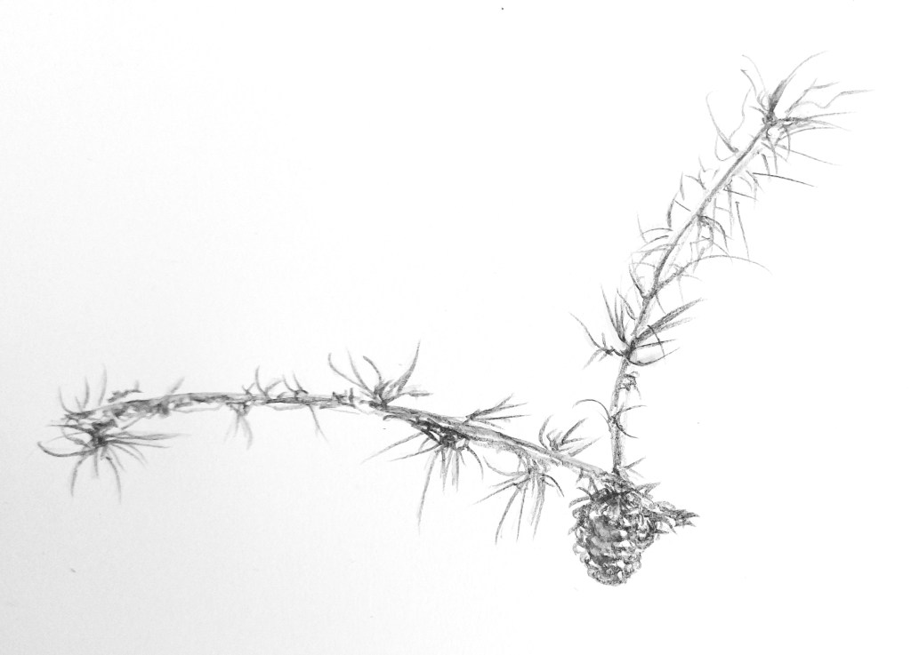
| Week beginning 27 October | Continue sketchbook work. More zinc and aquatint etching at Gracefield. Select more graphic drawings – maybe reproducing sketch of pine seeds. Buy solar plates and select images for following week – maybe drawing of pine sprig with cone. Experiment with more abstract monotype using coloured grounds and Japanese paper |
| Week beginning 3 November | Continue sketchbook work. Prepare solar plates and print. Research further print techniques – perhaps carborundum and image transfer. Assess the plates produced. Maybe more monotype. |
| Week beginning 10 November | Continue sketchbook work. Select further images from sketchbook. Continuing researching , refining and developing the work. Re-assessing timescale and scheme of work for submission of final portfolio. |
| Week beginning 17 November – 24 November | How the remaining time is spent will depend on progress with the prints produced and how these may be further developed. |
The work outlined in the plan for weeks beginning 20 and 27 October was included in the portfolio of work submitted on 28 October for Assessment 1.
Week beginning 3 November
I started trying out finer lines again and decided to move to the next phase of work, trying to develop my concept, understand it more fully and work through apparent conflicts between:
- fine, loose line work and heavy gestural marks/tone
- figurative and abstract or semi/abstract interpretations
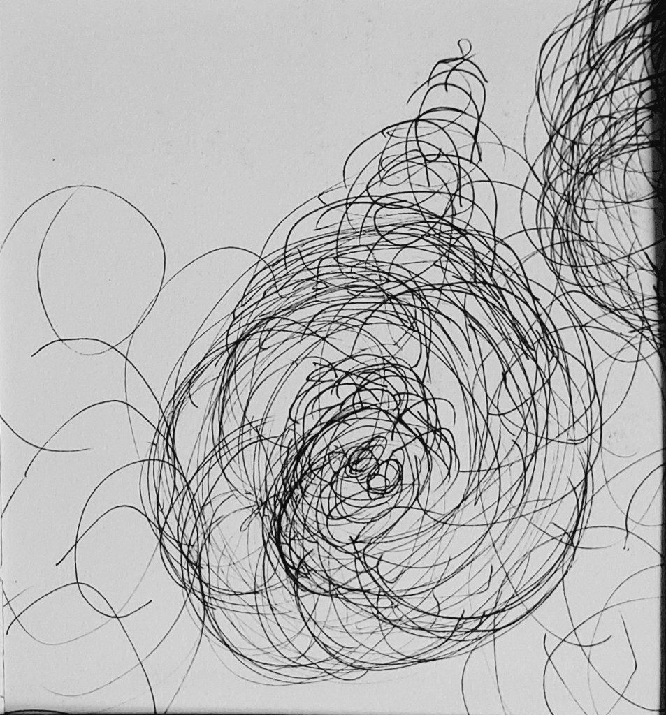
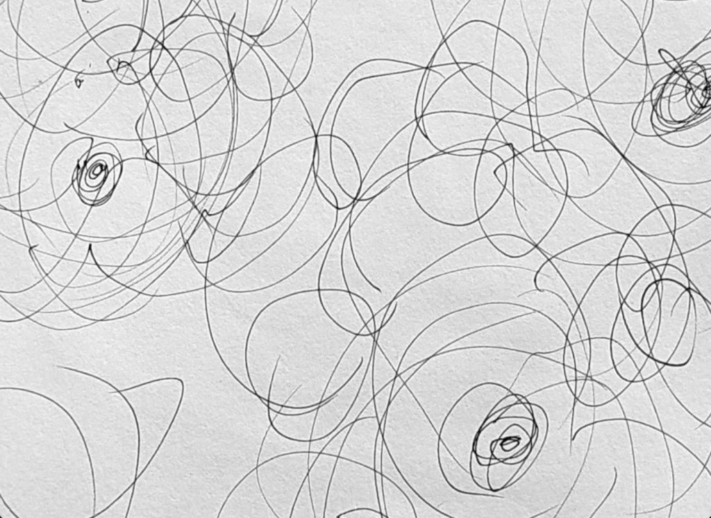
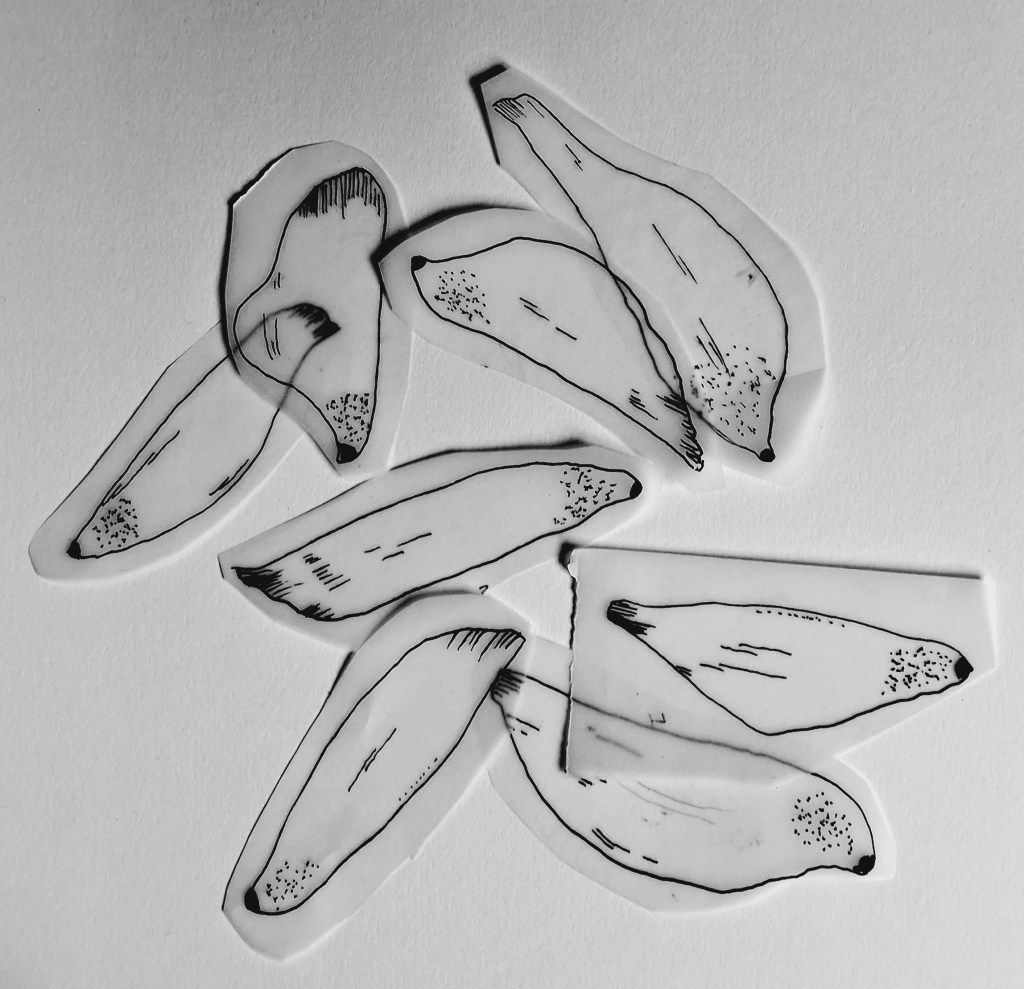
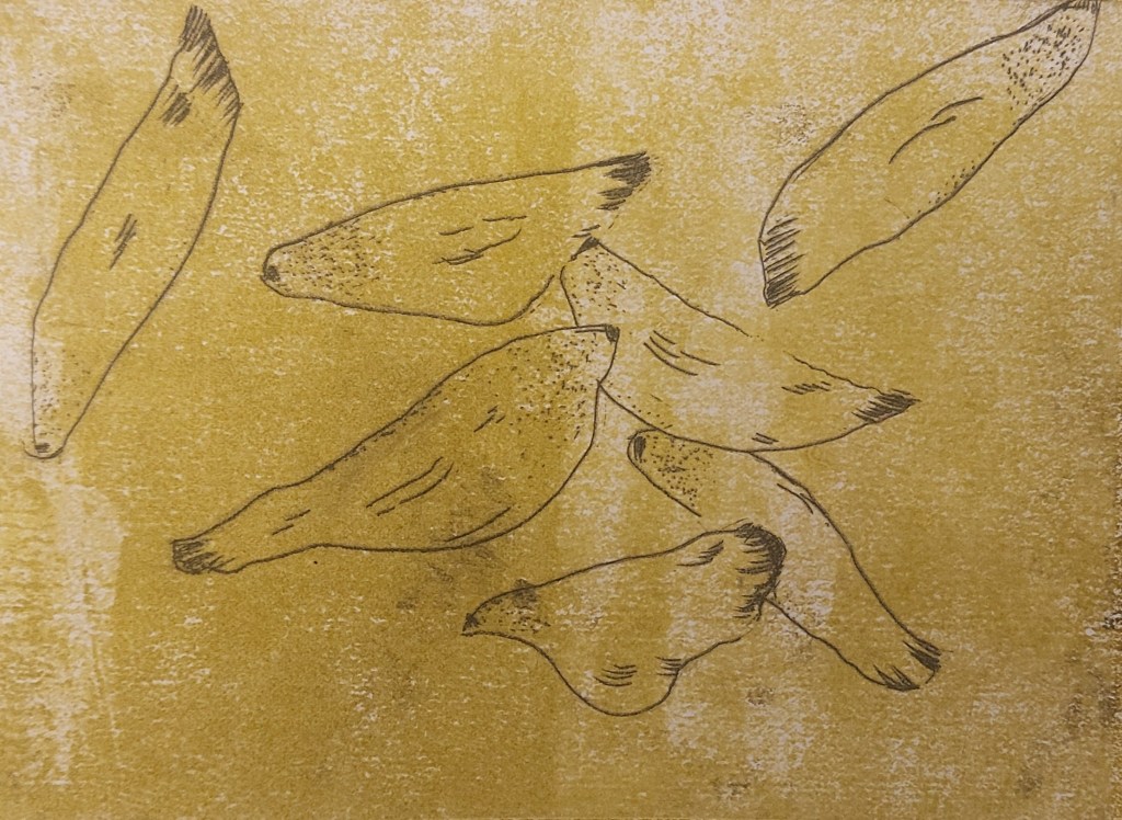
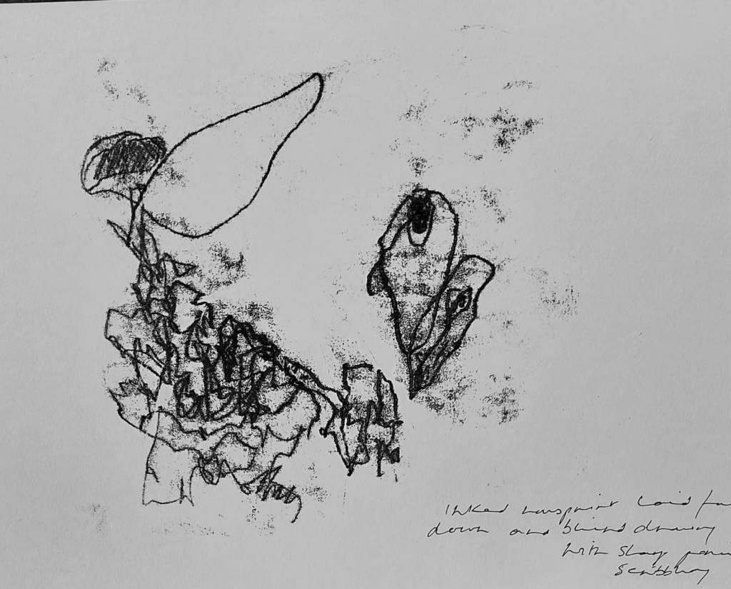
Two examples of exploratory fineliner sketches. I made several of these and began to investigate abstracting from the pine cone.
At this point, I began researching the etching and aquatint works of Paul Klee and discovered one particular image that seemed to represent the direction in which the work was beginning to go. I found the image in Kudielker R, (2002) Paul Klee: The Nature of Creation Hayward Gallery p 97.
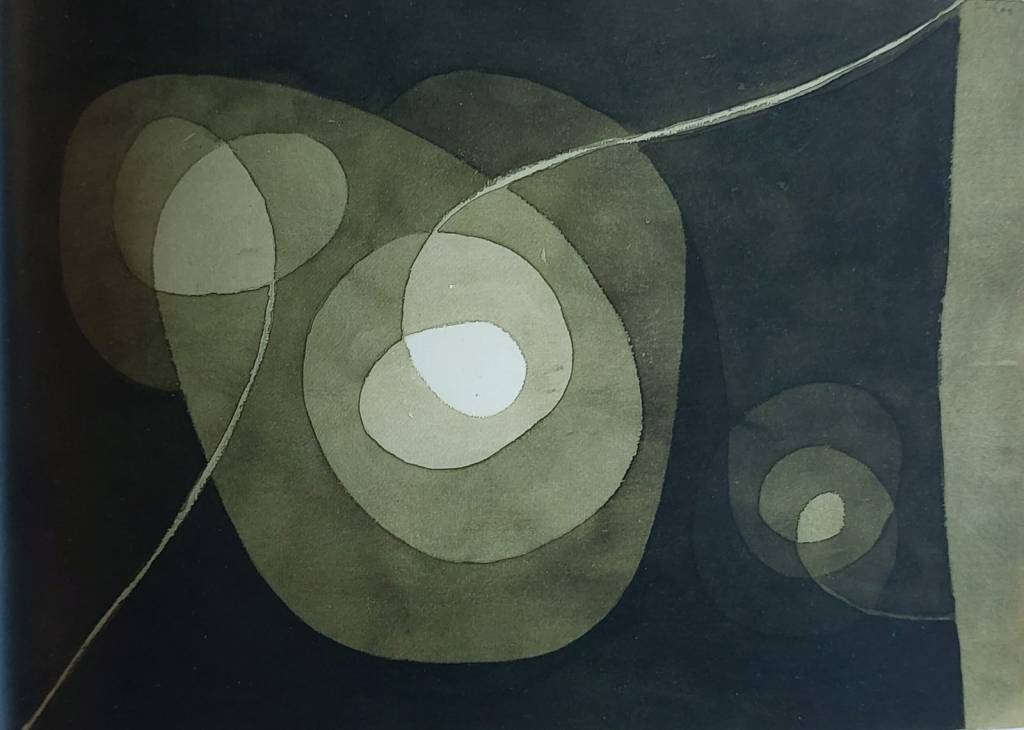
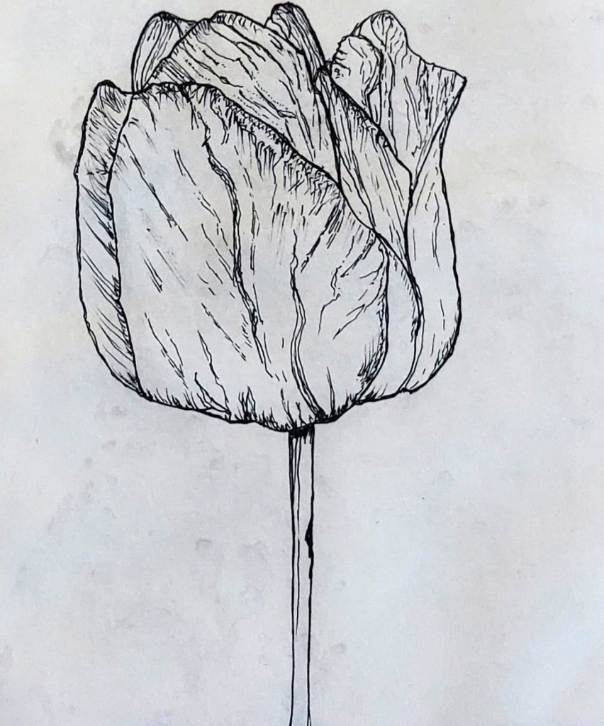
Paul Klee, Hellical Flowers, 1932
The book is the exhibition catalogue from the Hayward Gallery in 2002 and included in it is an essay by Bridget Riley on the true meaning of abstraction:
The rise of Abstract art, especially in the first half of the twentieth century, was accompanied by abstracted images from nature, schematic figures and objects … Klee was the first artist to point out that for the painter the meaning of abstaction lay in the opposite direction to the intellectual effort of abstacting: it is not an end, but the beginning. Every painter starts with the elements – lines, colours, forms – which are essentially abstract in relation to the pictorial experience that can be created with them … it is not so difficult to see that Vermeer is more of an abstract painter than many avowed ‘abstractionists’. The only really ‘new’ development of the twentieth century was that the abstractness of picture-making rose to the surface, literally and metaphorically.
Bridget Riley, ‘Making Visible’ supra pp 15-16.
In other words, abstraction is not some particular, self-contained style of art. Rather, marks of any kind of two dimensional surface start from the abstract and it is only through the placement of parts with the whole – and with the addition of the painterly elemens of lines, colours and forms – might they become representational of objects in the world in a more traditional sense, whereby the illusion of reality is created.
I tried this out for myself, looking a old masters. For example, looking at a close-up of a work on paper by Hans Holbein of Amalia of Cleves from around 1538, the abstract becomes immediately visible.
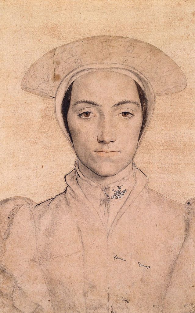
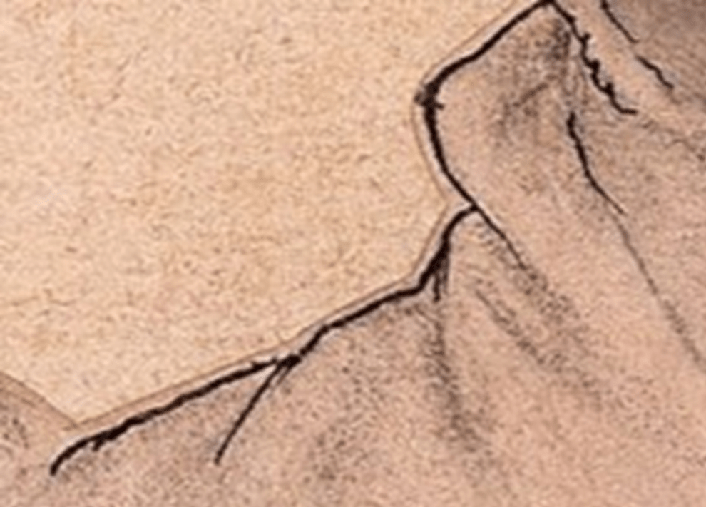
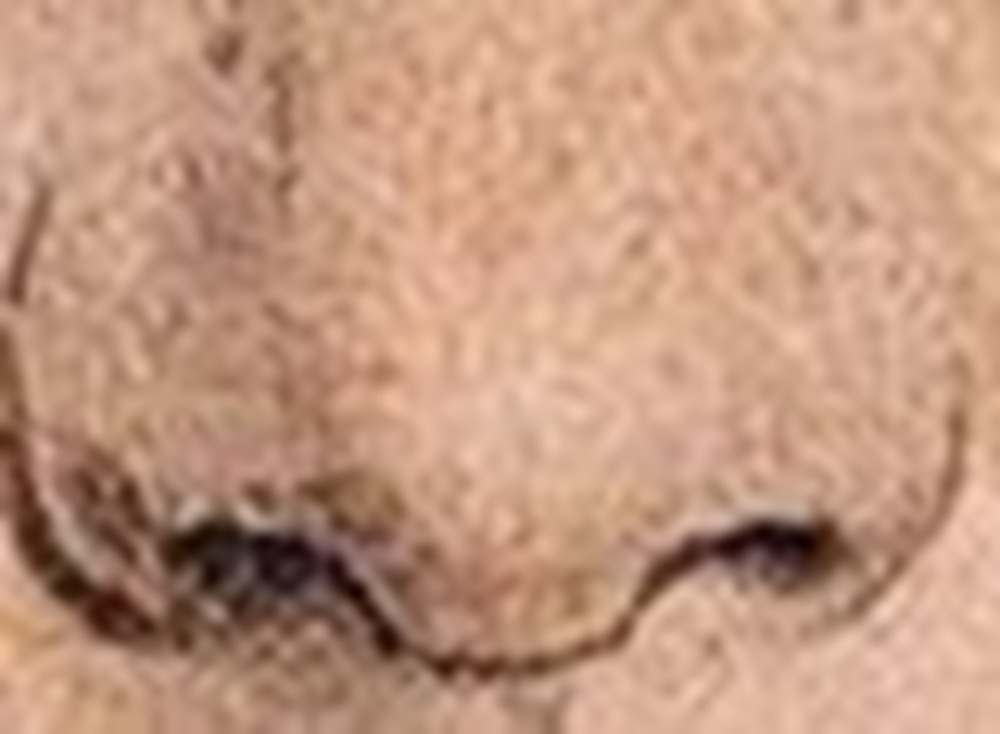
The middle image of a close up of the left side is an abstract line which is seen as the subject’s right shoulder only when placed between the arm and the neck. The image on the right is also an abstract line which we see as nostrils only because of the shading underneath giving it recognisably life-like volume.
Unfortunately, following unsuccessful experiments with solar plates in the week beginning 3 November I had to adapt my portfolio plan quite radically due to the practical and technical difficulties of creating the plates. I had made a solar plate at Gracefield in 2024 and had assumed the process would be just as straightforward and would allow me to produce flawless prints, regardeless of the quality of the image used.
,The process relies on the UV exposure unit and I assumed the college unit would operate in the same way as the unit at Gracefield. I was relying on college staff to know how to use the college equipment and had purchased in plenty of time several A4 plates and had them cut to the various sizes I would need. I selected and revised drawings carried out for Asseessment 1 to make the plates . I then attempted to make three plates in A5 and A6 as well as test strips but all were more or less a disaster due to difficulties in operating the UV exposure unit and developing them correctly. . For information but not for submission, the failed plates are shown below.
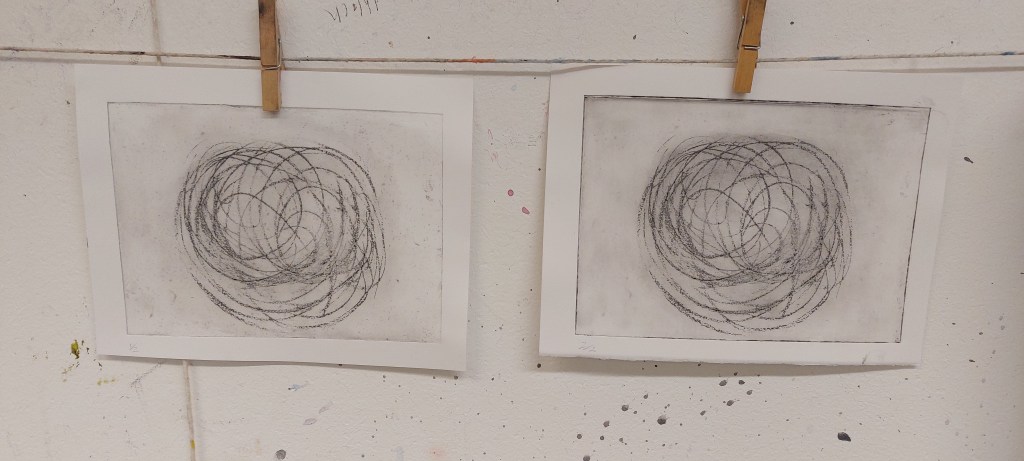
Left: image underexposed. Right: plate insufficently hardened.
Week beginning 10 November
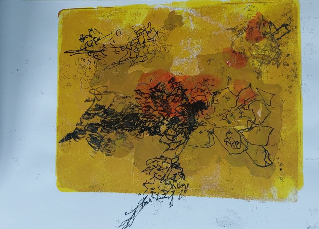
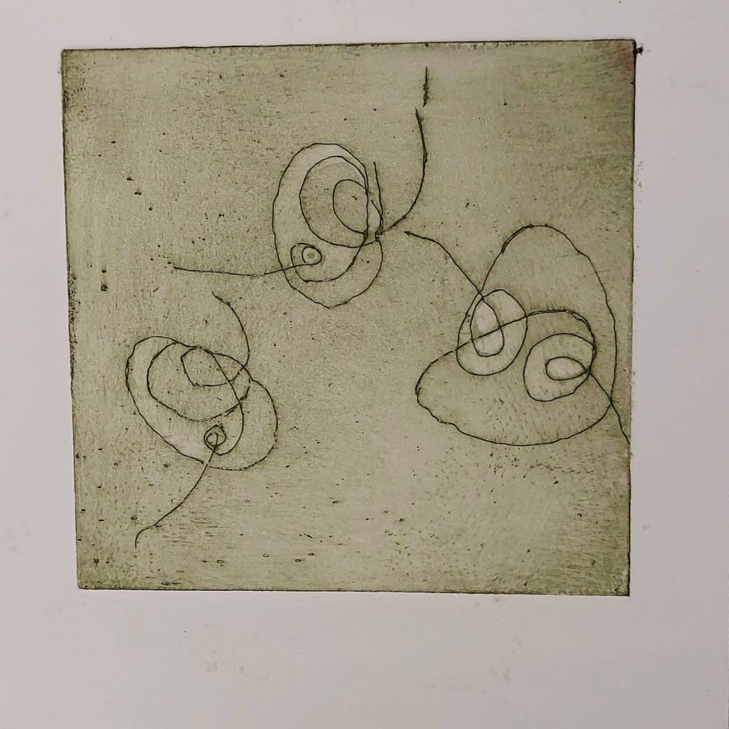
I made a digital drawing on similar lines to Klee’s Helical Flowers, chosen for the possiblity of introducing different tones into the work using different print methods so that I could compare, for example, the effects on the same drawing between solar and zinc etching plates.
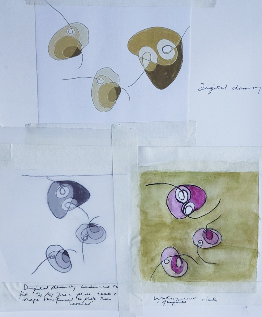
Initial drawings/studies
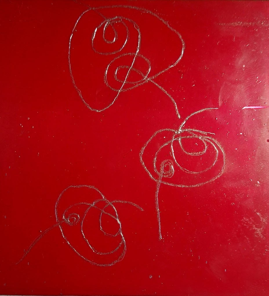
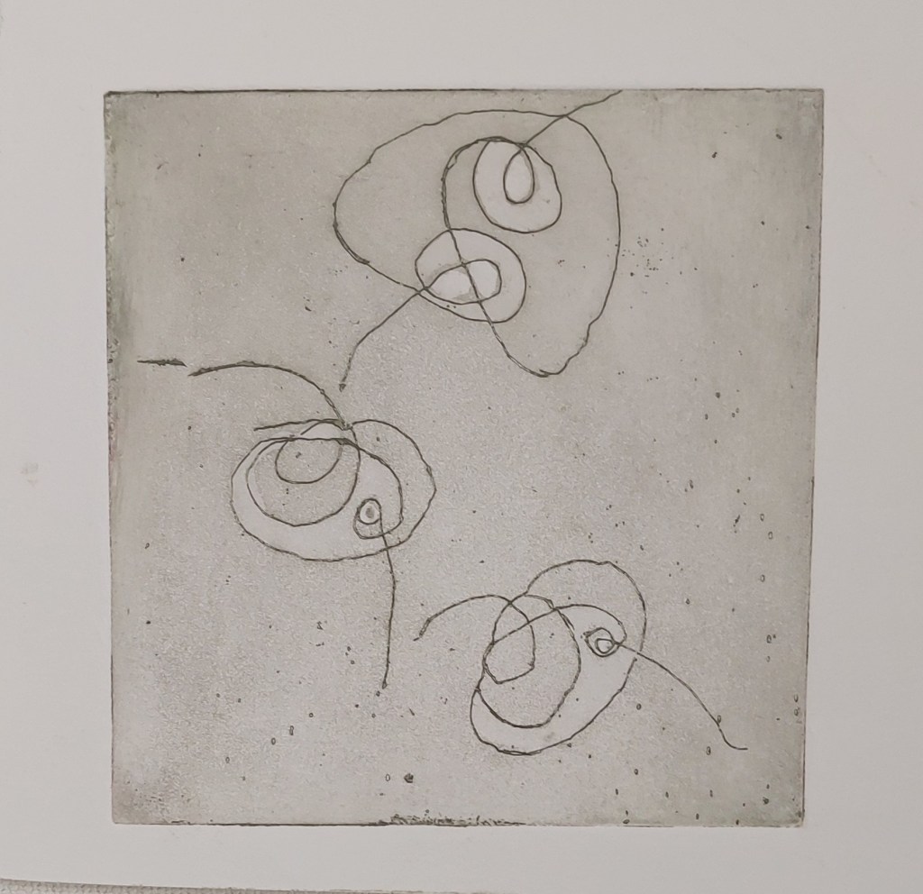
Prepared plate after image transfer and drawing onto it
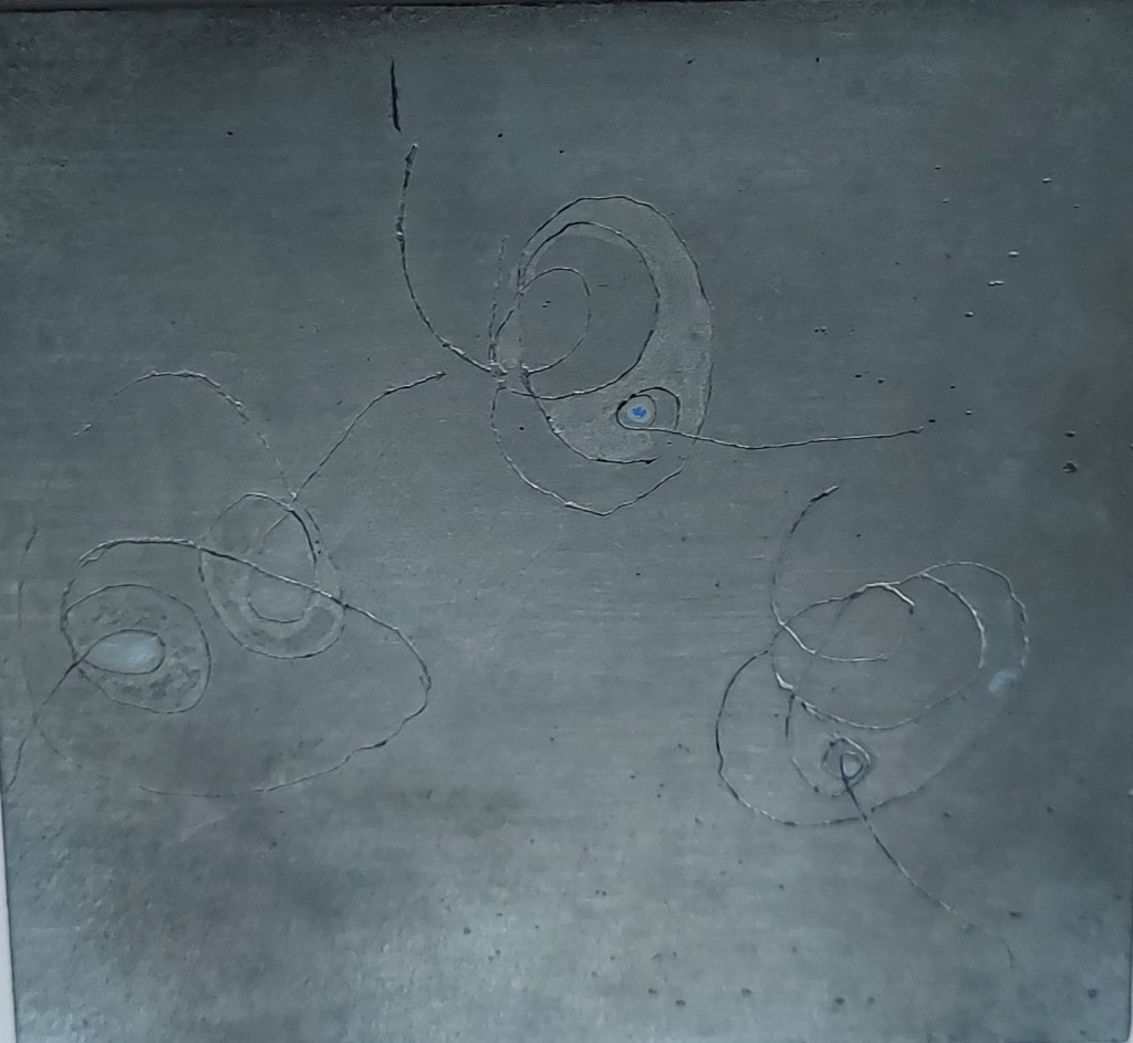
Plate following etching and aquatint. Etched three times in total, using top out fluid between each of the second two etches to create tone
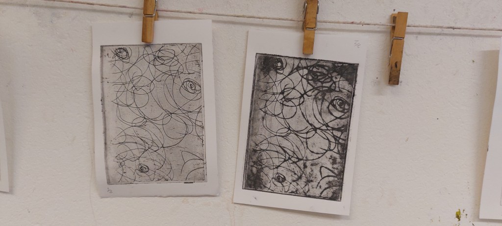
I had been at Graceield week beginning 27 October and prepared a zinc plate with BIG ground. This week I went back and transferred an image with transfer paper and drew onto the plate. The plate was then etched and aquatinted.
The initial deep etch was 15 minutes, followed by removal of the ground, degreasing and applying aquatint using the compressor. Areas were then stopped out to create varying tones. Several problems/flaws with the processing of the plate became very clear.
- The quality of the drawing with the etching needle is very poot. The lines are not as fluent as they could be with more practice because I was afraid of the needle slipping and found it unsettling to have to move the needle through the ground rather than making direct contact with the plate – it was a bit like walking through mud. In time, I would hope that practice will make perfect.
- The use of aquatint is poor. I think I should have stopped out the entire plate apart the very lightest centre cirlce for the first aquatint etch). Instead, I added stop out once for the very centre (then etched 30 seconds) and again for parts of the outer circles (1 minute). Other parts were intended to be much darker – I should have re-etched with aquatint at least four times and probably for a total time of about four minutes in order to get the darkest darks. only twice – I think it should have been etched at least three times and for a total of a five minutes.
Week beginning 17 November
I went to Gracefield again to print the plate and spent most the day there preparing another zinc plate with BIG ground for etching later and taking prints from the finished plate I made last week.
Prints on Snowdon paper. Oil based Intaglio ink in mix of process yellow, cyan, raspberry red and white.
Despite the problems I can identify, I find the general design and overall aesthetic of the pitted plate pleasing . Overall this was an excellent learning experience and I feel fully confident to repeat it with better results next time. However, it is extremely time consuming: I spent an entire day drawing and creating the plate and a full afternoon printing the test pieces shown above.
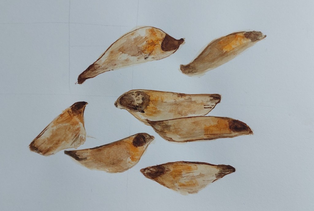
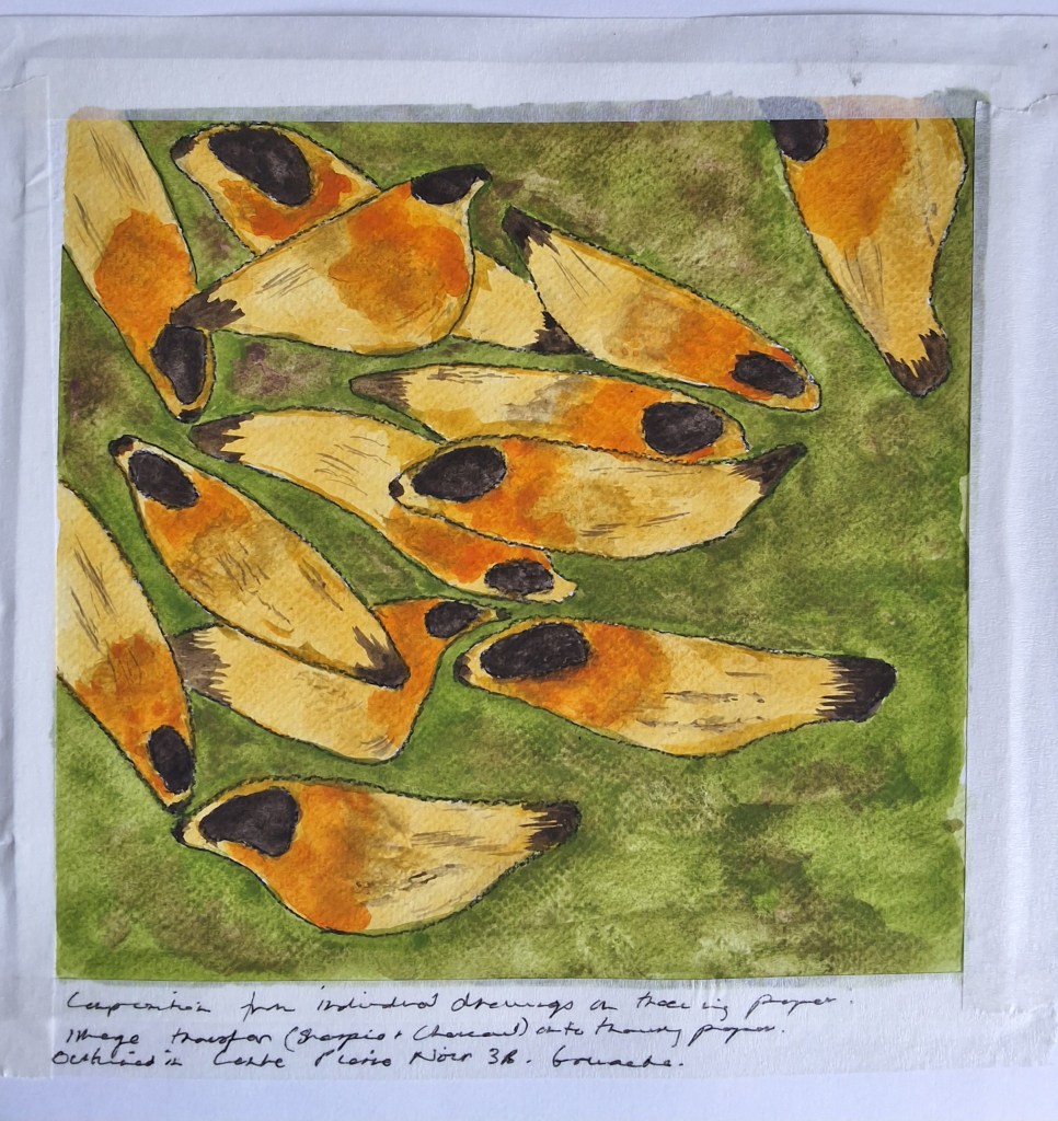
4I re-visited one of the watercolour studies I did earlier in the course.
I then worked more on the composition and did another, re-configured study in gouache.
I made another attempt to make a solar plate, this time using an image from a drawing unrelated to the pine cone project as it included a fair amount of both line and tonal contrast and the composition meant it would fit on the narrow test strip. It also allowed the opportunity to try out the aquatint screen as part of the process of experimentation before making plates related to the pine cone project. However, the result turned out to be worse than the previous attempts. Despite the best efforts of the member of staff assisting me and making careful test strips, it turned out worse than the previous attempts as only a partial image emerged and the aquatint was too strong, perhaps obscuring some of it. There were also issues with development/hardening as when I printed the test strip, part of it stuck to the paper.
While the unintended result is not unpleasing, it is not what was intended – one of the advantages of the solar plate method is that it can be controlled more effectively than metal plate etching. More importantly, it’s doubtful the plate could be used again so that even if I wanted to leave to chance how a new plate would turn out, it could mean only getting a single – and expensive – opportunity to print it.
I immediately arranged for outside professional help but, unfortunately, this will not be possible until after the submission of Assessment 2. I also considered trying to learn to use the UV exposure unit at Gracefield myself instead of the unit at the College but since I had already wasted two week’s work in failing to make a satisfactory plate and was reluctant to waste more expensive plates only to risk poor results, I decided I would have to make an alternative plan to that set out in Assessment 1.
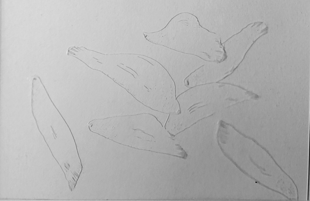
I made drawings based on the sketch, cut them out and arranged them until I had the composition I wanted. I then fixed them under a sheet of tracing paper and traced over them to then put under the drypoint plate. I will print the plate next week.
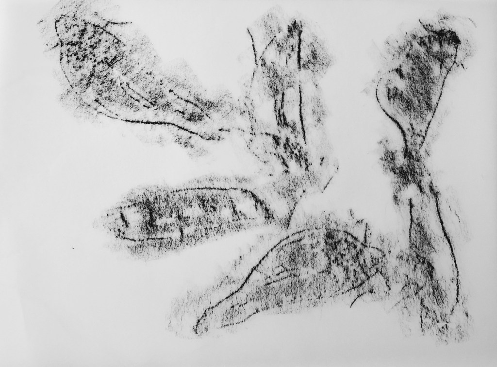
I then made the drypoint. When it was done, I rubbed over it lightly with charcoal to check the whole image was complete as it was difficult to see in the light.
I decided to use another drawing done earlier in the course to experiment with digital prints.

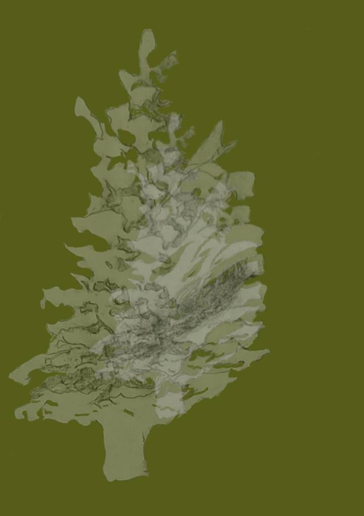
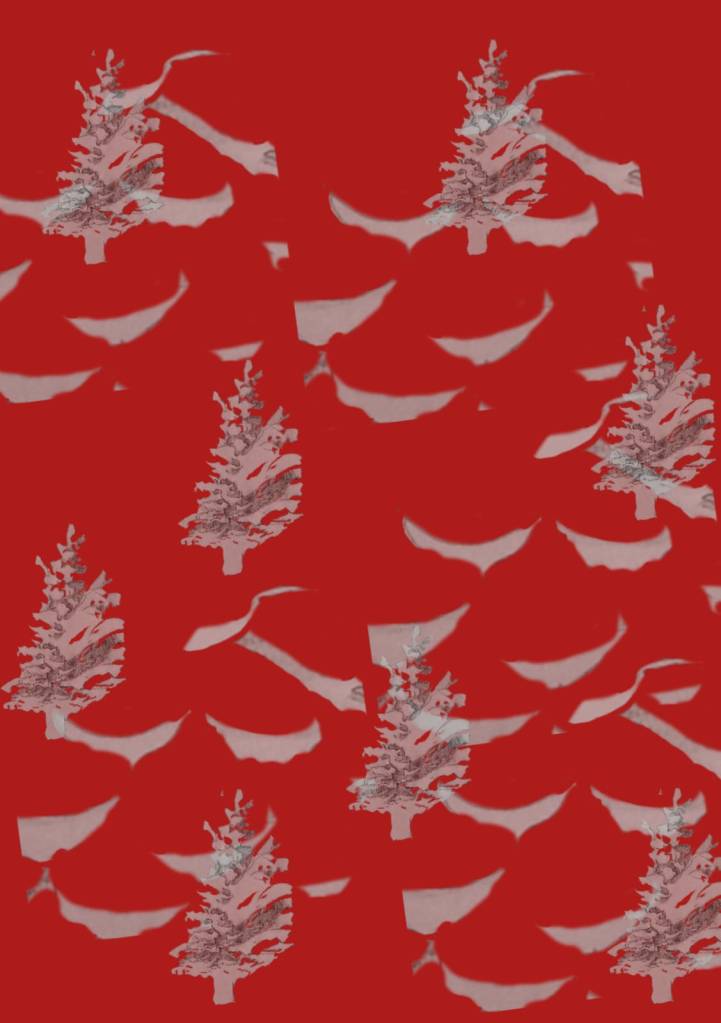
There are an infinite number of ways the images could be developed and these are just two of them. This kind of work is very much design led – with further experimentation and developement, the image could be a very effective wrapping paper design, perhaps for Christmas.
Week beginning 24 November
After making drypoint at the weekend of the final composition I printed it on the Monday. I pressed damp Snowdon paper onto the board surface with a mix of sepia and process yellow and inked the plate in sepia.

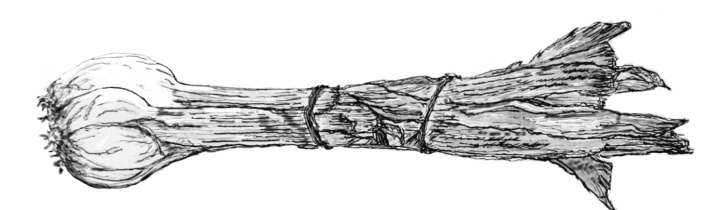
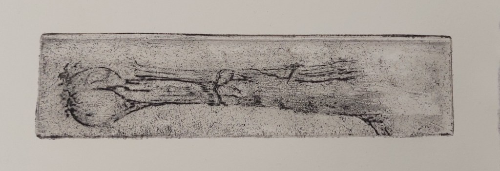
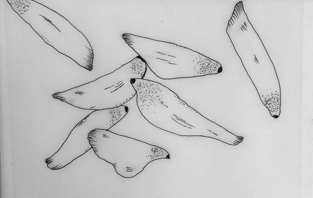
I also had another, more successful attempt at making a solar plate print in order not to waste more plates. I made an A6 copy of the original pencil drawing on an acetate, adding fineliner to the inkjet print to make the black stronger.
Original drawing
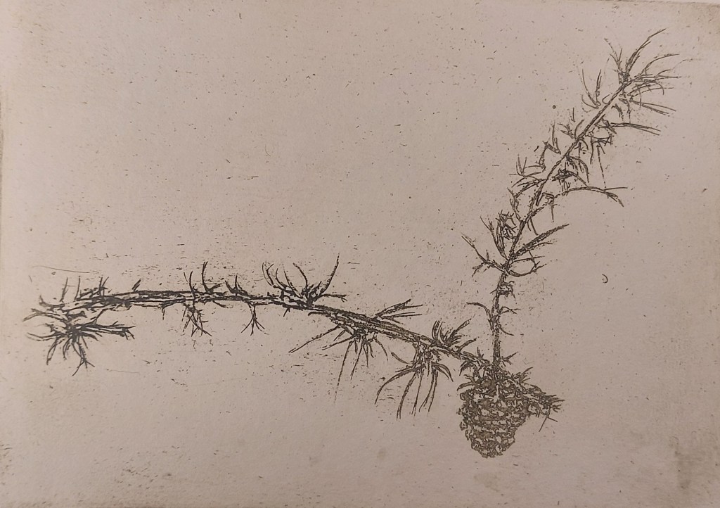
A6 print in sepia safe wash ink on Snowdon paper
The plate isn’t perfect yet. The plate was thoroughly wiped with tissue paper so the speckles on the print may be either dust on the acetate or the plate not washed enough after developing – I forgot to give it a final rinse. I also don’t have another test strip so guessed the exposure as 15 seconds. This time, I did not do repeated exposures in 5 second increments as previously suggested to me but did one single exposure in case the fraction of a second when exposure was interrupted had made a difference and I think it did.
Akua ink transfer